
 Lessons: 12Length: 1.7 hours
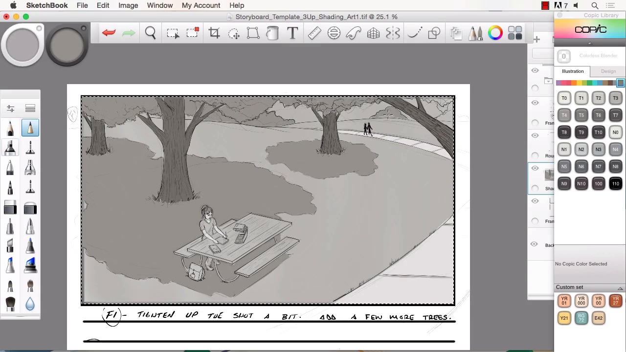
- Overview
- Transcript
4.2 Creating the Refined Artwork
In this lesson I will show you how I use Sketchbook Pro's many features to refine the storyboard artwork. We will go over how to adjust and move lines to save time. We will also cover how to study the reference material but still incorporate your own style into the work. We will then add tone and textures to complete the storyboard frames.
1.Introduction
1.1Introduction01:11
1.2Tools and Resources02:05
2.Creating a Frame Template in Sketchbook Pro
2.1Understanding Scale and File Size When Creating Storyboards05:27
2.2Creating a Template for Our Storyboard Frames07:34
3.Taking the Script to Rough Pencils
3.1Briefing Over the Script07:12
3.2Laying Out the Rough Pencils15:00
3.3Revisions to the Rough Pencils and Camera Angles11:25
4.Refining the Artwork
4.1Understanding When and How to Use References14:46
4.2Creating the Refined Artwork17:16
4.3Looking at the Finished Work Objectively04:53
4.4How to Save Files for the Client10:57
5.Conclusion
5.1Course Conclusion and Main Points02:42
4.2 Creating the Refined Artwork
Welcome back to Storyboarding in Sketchbook Pro. I'm Robert Marzulo. We'll now be going over chapter 4.2, Creating the Refined Artwork. So now to refine the artwork. So the method I use is just basically a soft erase or dropping the opacity of the layer and sketching over top. With the rough sketch and lines that I've given myself, I can now find it a little bit easier to refine it, and figure out what lines I wanna keep and what lines I wanna embellish and change. You'll notice I use the ruler, the interactive ruler there quite a bit for my straight lines and the rest I just freehand organically. If I feel that it's a easy enough line work to accomplish without using the French curves. And really the only thing that I focus on at this stage is just trying to make each layer of sketching that I do, a little bit more refine than the layer before. So as I redraw something I just tried to get it a little bit more defined. And make the information easier to understand for the viewer. And keep in my mind that it's not always perfect, in fact it's probably rarely ever perfect. But, I just focus on trying to improve it with each pass that I do. And if I find myself struggling on a particular topic of the art piece. Like say, the trees in the background, like I'm working on there. Then I just pull reference, and I look at the reference and redraw it. I try to do my best to still give it a little bit of style. Unless the boards actually need to be more of a realistic or a photo-real depiction. Then, I'm gonna copy the reference material very strictly, almost verbatim, but a lot of times for the type of boards that I do an animated field suits them real nice. I think a lot of times the beauty of doing some kind of animated or surreal look is a benefit because it allows you to create kind of a world that you're used to creating versus working strictly from photos. So, you see here, I'm using the picture and I just, I'm using her as reference. I'm not copying or tracing the character. In that way, it's a little bit of my own style and uniqueness that's involved in there. But it is good to look at the reference and have a basis for some kind of reality so there's not too much distortion in the style. And if you notice I closed her mouth there just to show that often times, you're gonna have to make changes, just like how her hair is different and the pose is from the other photo. You're never gonna find just the right photo that's gonna have all the right elements. That's probably the strongest reason why you have to be able to practice some style and some freehand drawing. Cuz although photo reference is great and it helps out tremendously. Again, you're never gonna find the perfect shot for everything that you need to draw. And you could get a phone call into the project and they could change everything. So if you did find the right photo chances are that might even get thrown to the side anyways for one of the changes that are needed to make. You gotta remember when you're doing this stuff, you're actually working for a whole room full of people, and everybody's got an idea. So here, you see, I struggle with the hand a bit, I keep reshaping it, and I probably should have gone to reference quicker on something like that. I even use a technique, where I would hold the pen up, and kind of look into a mirror that I keep by my art table. So that's another way to address stuff like that. But if you find yourself struggling too much on something as, I don't wanna say as basic as a hand because hands are actually pretty complex, but something that's so easy to pull reference. A really neat technique for that is the camera on a laptop are perfect for hand poses because you can just simply pose that into a camera, snap a shot and you're ready to go. So it's really quick, it's already in the system, you don't need high resolution images for a lot of that type of work. Especially when you're doing line work or these would be considered tone boards or frames. Then you don't need a high def image for that. Now if you're trying to do photo real and you're gonna digitally paint over photos then yeah, then you're gonna really want some high resolution images to make your job a little bit easier. But I actually don't do much of that so I get more of the style that you're seeing here. So here I just kind of keep refining little things like the book now. Keep in mind, the perspective tools inside Sketchbook are fantastic. So I could have easily just used those to do those but for simple objects like that I'll tend to just use the ruler, it's a little bit quicker. And you see some of it there, I just entirely freehand. If it's a really simplistic perspective, I just find it a bit easier to do it that way. But, you've got to keep in mind that whatever works best for you. If you can't see perspective real well, the perspective tools inside Sketchbook here are fantastic and easy to use and easy to understand. So there just adding some texture to the trees. A lot of times you can convey a lot in a scene with just a slight amount of texturing. A lot of foliage, leaves, trees, all work that way where you can kind of see I'm doing the same thing on the table where I just kind of draw a little bit of the texturing of what I would think a table would look like. So a lot of that just allows you to separate elements from the background and help define the scene relatively quickly. And you see I try to add a little bit more of a solid line around the table. And if you notice I grab those lines, crop, and move them quite a bit. And that's kind of one of the processes I find myself doing inside Sketchbook a lot is instead of oftentimes redrawing everything, I'll move my lines around quite a bit just by using the selection tools and the move tool. So to me it's a way to move through the drawing process quicker and not having to keep restarting a frame. And proportions is a really big one for me. If I feel my proportions are off, I'll just resize them interactively instead of redrawing the character. So there you see, I grabbed the head, I copied it, moved it to another layer. I'm cropping out the hand. And just a huge time saver, cuz the only real difference here is the head's a little more tilted, it's an open smile, you don't need to be a little bit more happier look to this frame. So there's gonna be times like that when you can save yourself a tremendous amount of time and just kind of reuse some of your own artwork. And it's good to make enough changes where it's obviously a new frame, but there's no sense in redrawing something over if it makes better use of your time to just reuse what you've already got. Can you see I still try to make a fair amount of changes to it, and then I move to the shading. So, now with the shading, what I like to do is place in large areas of value. And then just work up from there. So you can see here I toned down the entire image and I have added big chunks of the shadows from the trees and I just kind of keep building those values. I tone it all down and then I work back up and highlight. Darken a little bit of shadows, and it's kind of amazing what you can define just with tonal value like this. You can really build up a scene and keep in mind if you're gonna move to color after doing this, it's very simple. You just would add a layer over top and set it to color mode and color away. So, really the predominant amount of work is gonna be in areas like this building up your values. And if you can make the scene look right in gray tone then the rest is simple from there. So, it's amazing how much really is conveyed with just line and tone. And there's a lot of storyboard frames that are just done this way, so, felt this would be a good way to explain the process. And you see I just keep toning things down, adding little highlights here and there. I'm using the Alt key a lot right now. I can select from tones that are already in the scene. I'll even a lot of times, need a lighter tone or white I'll select that outer edge of the scene and paint back in. So it's really nice to just be able to hit the Alt key and select whatever tone that's in there, keep painting away it's really good time saver. And if you notice I'm using the air brush a lot for my soft tones and the hard pencil tool for just kinda blocking in shapes of value. And every now and then I'll grab the smudge tool and blend off certain edges. So, those are predominately the tools that I use. There's obviously a good assortment of brushes inside Sketchbook here. And you can modify them really quickly and get some unique effects. But I find that I can get a lot done with just the hard pencil tool, the air brush, and the smudge tool. I find that it's best to try to get the best results with the most meager of tools before delving into all of the possibilities, because you can get slightly distracted. Now here I use a spatter tool just to get a little bit of texture into the grass. Another thing to keep in mind is if you're a little bit skeptical of something you're getting ready to try, just add a new layer, set it to multiply or overlay. And then try your effect and then if you like it just merge it down by hitting Cmd or Ctrl+E. Ctrl+E if you are on a PC and Cmd+E if you are on a Mac. So it's a really neat way to work so that you can kind of experiment and see if something is gonna work before you commit to it. So here, repeat the process now. Something to keep in mind, I always say that when doing storyboard frames, the hardest frame is the first one. And then the second hardest is the second and so on and so forth, the reason being is because once you've created that first one, it gives you a basis, a starting point. So you can now sample from your tones, or if it's a color frame, you can sample from your colors. You can look at the artwork that you presented before that was accepted. So all these things give you a leg up for the next frame so on and so forth. So you'll basically just use that. So you'll see me going back and forth, sampling the other frame previous to whatever one I'm working on and sampling tones of her skin. Tone of the shadow there and if it looks too dark in the next frame, I'll mess with the opacity and lighten it. Like I just did there. So, it becomes easier as you progress through the boards. I always feel that as I get to the final frames that everything starts to move a little bit better. Everything seems a little bit more natural by that stage of the process. You see I messed with the opacity there. I'm just looking at both frames. And same thing, sample the tone for the trees, block in the major value of them and then work in the dark and light into it. And the other great thing about working in this fashion, especially when you create new layers for each element if you're not opposed to having a lot of layers is you can just lock the transparency by hitting that little lock key to the bottom right of the layer. And it becomes really quick and efficient to paint because you can't go outside of that layer. So you block in the first overall shape, and then lock it. And you paint red inside of there without going outside of the edge, which is nice. And another thing I like to point here is that if you notice, I'm getting a lot done with just adding one main value, and then a highlight, and then a shadow. And because the values themselves are separated from each other. Meaning, the grass is a different value than the trees, the trees are a different value than her skin. You really don't need to build in an exorbitant amount of highlights and shadows. Maybe if you were doing something a little more photo-real, but, for something like this, you can get away with just a few tones in each dividing value, and you'll have a pretty nice look by the time you're done. So you see I am just working some little shapes. And there I do the hair and a little bit too dark, but I know I can just shade that back out. It's mainly just that I have it as a solid. And I take the air brush and then blend in some lighter tones, and then some stupor highlights on the edges and the top of the hair, And again I utilize that effect where I paint in a solid, get it to look the way that I want, and then merge it down to the overall layer. Well, using multiple layers really saves you time, because not only can you manage the edits you do a little bit better. There's a certain amount of freedom I use in those layers so it allows you to work with a little bit less fear factor involved. So there you see, I kinda paint in some highlights in the face, then I use a smudge brush to soften the edges. There's really a number of ways that you can do that. You can even create a new layer. And just soft paint with the highlight color on top of the face. You can then use a soft erase or a hard erase to erase and give yourself some different edges. And then merge that layer down. You really just wanna look at it like there's a lot of different ways to skin a cat. You can just really kind of approach it from different angles. There's no one right or wrong way to use the software to create your art. So there again, I separate the table into another element, another layer. And paint in some solids. And then work in some of my shadows. I find that being my favorite way to work, just because it's so easy and user friendly. Something about it is just really easy to understand, and digest, and work through, and that's what I like to do. One of the reasons I really enjoy this program is the fact that it makes tasks like this simple and easy to follow. You don't spend so much time trying to figure out the program as much as you do just creating your art, you should spend most of your time and your energy into figure out the scene not how to figure out the software to create the scene. So that's one of the reasons why I really enjoy this program. So again, sampling colors from the previous frame. This is obviously the most simplistic frame to do, which is nice. I love close-ups for that reason. I enjoy close-ups too because of the, I like just drawing the detail of the face, so I enjoy scenes like this. But I can kinda simply fill in these areas, get the skin tone, the hair tone, and then again, work into a few shadows and highlights, and get to a usable frame relatively quickly. And so that's about it. I just basically keep repeating the process of adding the highlights and a little bit of shadows. And I'll do the same thing to the hair to bring that out a little bit more. And the only thing to keep in mind is if you're trying to do a more finished frame, you just spend a little bit longer time adding these tones. And then you can also tone back the line art. And let the tones take over to get a more painterly look. So that pretty much wraps this up and completes these frames here. So that will conclude this chapter. Next, we'll head over to chapter 4.3, looking at the finished work objectively.


