
 Lessons: 17Length: 1.3 hours
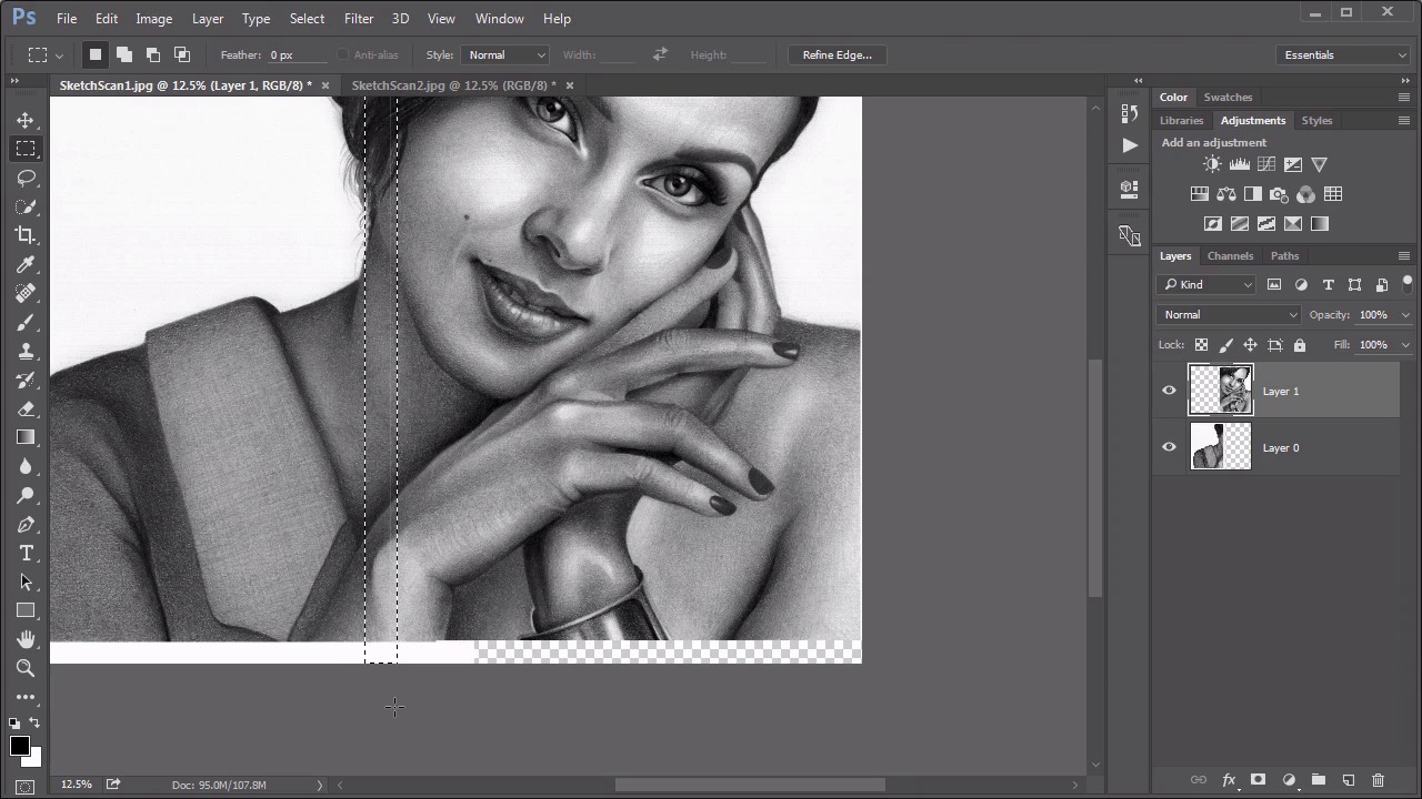
- Overview
- Transcript
6.2 Inversion Modes: Drawing Effects
In this lesson we address some useful techniques for using the Inversion modes, such as aligning scans and creating an interesting faux hand-drawn effect.
Related Links
1.Introduction
1.1Introduction01:34
2.Normal Set
2.1Normal and Dissolve02:37
2.2Practical Uses for the Dissolve Mode06:27
3.Multiply Set
3.1Darken and Multiply06:15
3.2Color Burn, Linear Burn, Darker Color05:25
3.3Adding a Digital Tattoo06:01
4.Screen Set
4.1Lighten and Screen03:36
4.2Color Dodge, Linear Dodge, Lighter Color04:36
4.3Coffee Ghost07:25
5.Overlay Set
5.1Overlay, Soft Light, and Hard Light04:39
5.2Vivid Light, Linear Light, Pin Light, Hard Mix06:20
5.3Nondestructive Dodge and Burn06:03
6.Inversion Set
6.1Difference, Exclusion, Subtract, Divide05:52
6.2Inversion Modes: Drawing Effects03:53
7.Component Set
7.1Hue, Saturation, Color, Luminosity05:58
7.2Luminosity Mode: Soft Focus02:45
8.Conclusion
8.1Conclusion00:47
6.2 Inversion Modes: Drawing Effects
Hello everybody, welcome back to Mastering Blending Modes in Adobe Photoshop. This is lesson 6.2, where we look at some practical uses for those inversion modes. I want to start off with one of my favourite blending mode tricks, it's one of the oldest ones in the program, and it still works well today. In the course files for this lesson, there's two JPEGs, a sketch scan one and a sketch scan two. Let's presume that this is a pencil drawing that has been scanned in, but because the drawing was so large, it didn't fit under the scanner all at once. It had to be scanned in two separate scans and your task is to assemble those two scans together into one seamless file. While the difference blending mode is ideal for this, if you remember when we went through the descriptions, the difference blending mode renders pixels black when they're identical. So the general idea here is the first grab this first portion of the scan, we'll just use a rectangular marquee tool to outline that and we'll go to edit > copy, back over to the other file, and then go to edit > paste, and it comes in as a new layer. Use the move tool and we try to go over and line these up. We can try to just go ahead and align them visually, just to try to get it to match up right by just moving things around, and we might get a pretty decent alignment there, but by using that blend mode, we can get a perfect one. If we set this top blending mode to Difference and we zoom in enough so that we can see the pixels that are being rendered differently, then we can start moving this around until we know it matches perfectly and you'll know when you hit it because it pops in as perfectly black. And look at that, that solid black stripe all the way down means that this layer is perfectly positioned. So we'll change it back to normal. Use the crop tool to expand this canvas to include the entire drawing. Now I do have this little line of pixels here, that's just because the selection around this one was a little bit wide and just grabbed that one little thin line of white pixels. That's easy enough to take care of. We'll just use the selection tool again, and I know there's some overlap, so I don't have to worry about deleting too much. I just hit the delete key, and it removes those pixels and now we have a perfectly aligned drawing from two different scans. Let's go ahead and fill in that background with white, just so it's consistent all the way around and that's one of the best uses of that difference blending mode. The other blending modes in the set can actually produce some pretty interesting digital effects. Let's start with this little girl.jpeg, which is also in the course files for this lesson. I'm going to make a copy of this background layer, rename this to duplicate, and then just turn this into a smart object, because it'll be a little bit easier to see what we're doing with it. And if we change the blending mode of this duplicate to divide, it creates a really strange blown out effect here. But now watch what happens when we add a Gaussian blur to this. Go into filter > blur > Gaussian blur. If we keep it at a low enough setting, it produces an almost digital sketch like effect that is pretty interesting. And if we get up high enough, it creates a pretty attractive high key effect, and it's easily controlled just by the amount of blurring that we add to this. So really, that's two totally different effects that you can easily get just with this one divide blending mode. Now if we changed it to subtract, we can get a very similar type of effect, but it's inverted. So the idea then is to add an invert adjustment layer above that, which creates yet a totally different sketchy type of effect. And again, just by adjusting the amount of blurring, you can increase or decrease the amount of that sketch effect. Although with this approach going too high with the Gaussian blur creates a very weird looking result. So you wanna keep it fairly low, it's just an easy way to get the beginnings of what looks like it could be a digital sketch. But overall, my preference is for the divide technique, and I really enjoy the way this gives a very interesting sketch like effect, at least a good starting point for you to then build on if you wanna create more interesting and creative effects with this. Now it's time to move on to chapter number seven, which is the last set of the blending modes, and that's the component set.


