
 Lessons: 17Length: 1.3 hours
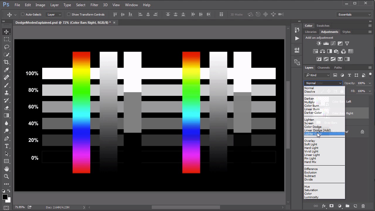
- Overview
- Transcript
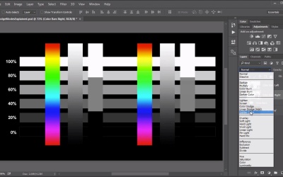
4.2 Color Dodge, Linear Dodge, Lighter Color
While these tend to be seen as the “lesser modes” of the Screen set, they do have their purposes. In this lesson we review what the Color Dodge, Linear Dodge and Lighter Color modes actually do.
1.Introduction
1.1Introduction01:34
2.Normal Set
2.1Normal and Dissolve02:37
2.2Practical Uses for the Dissolve Mode06:27
3.Multiply Set
3.1Darken and Multiply06:15
3.2Color Burn, Linear Burn, Darker Color05:25
3.3Adding a Digital Tattoo06:01
4.Screen Set
4.1Lighten and Screen03:36
4.2Color Dodge, Linear Dodge, Lighter Color04:36
4.3Coffee Ghost07:25
5.Overlay Set
5.1Overlay, Soft Light, and Hard Light04:39
5.2Vivid Light, Linear Light, Pin Light, Hard Mix06:20
5.3Nondestructive Dodge and Burn06:03
6.Inversion Set
6.1Difference, Exclusion, Subtract, Divide05:52
6.2Inversion Modes: Drawing Effects03:53
7.Component Set
7.1Hue, Saturation, Color, Luminosity05:58
7.2Luminosity Mode: Soft Focus02:45
8.Conclusion
8.1Conclusion00:47
4.2 Color Dodge, Linear Dodge, Lighter Color
Hello everybody, welcome back to Mastering Blending Modes in Adobe Photoshop. This is Lesson 4.2 where we take a look at the remainder in this screen set of blending modes. This is the dodge modes, the color dodge, linear dodge, and lighter color. Once again we have our gray bars along with our color bar graphics over the top of them to help us to illustrate what these blending modes do. We're going to start with the color dodge and linear dodge. In many ways these are the exact opposite of the color burn and linear burn. The names themselves should give you a little bit of a tip off to that. So start with the one on the right. And we'll assign this one the color dodge. And the set on the left will go ahead and set to the linear dodge. Which has the word add in parentheses. First of all, we should know that both of these modes makes the black, completely disappear. And also makes the white, completely white. That's sort of a common theme with everything within this screen set. Other than that there are some similarities and differences between these two blending modes. We'll start with the color dodge mode. This one evaluates the pixels in both the base and the blend layers and then it decreases the contrast until the base pixel color more closely represents the blend pixel color. Which is why when it's positioned over a solid black, there is no change. And we also tend to get a very muddy appearance in many cases because it's not simply brightening up the base color. It is actually decreasing contrast. Whereas the one on the left set to linear dodge, tends to be a little bit more vibrant. And that's because it's evaluating the differences between the blend in the base colors. It's increasing the brightness value of the base color to more closely match that of the blend color. So this one, while using black on the blend color is rendered completely invisible, when you place it over the black in the base color, it does add color to it. Which is why we can see these color bars over the black background, and we couldn't on the color dodge blend mode. And so then the last one we need to talk about in the set. Is of course, the lighter color. Which you may recognize as the polar opposite of the darker color blending mode. That we went over before. And again, the lighter color is just another implementation of that pixel replacement idea of the lighten blend mode. The difference being the lighter color blend mode actually works with that idea on the colored pixels. Whereas the lighten blend mode will tend to actually blend the colored pixels a little bit. Again that's arguably a more useful feature. The lighter color one does a strict replacement based on which pixel has the brighter luminous values. Whether it's the blend pixel or the base pixel and it displays whichever of the two is brighter. Which also means that the resultant displayed color has to be at least one of the blend or the base colors. There's no blending between the two. Then let's address how these blending modes work over our color photograph here. The color bar on the left, we will set to color dodge. The one on the right we'll set to linear dodge. And look at the differences now. Again, the black pixels completely disappeared. The white pixels are completely white in both sets. But there is some significant differences especially when we look at the color bands over that background layer. The Color Dodge because the way it is decreasing contrast when it detects a difference between the brightness of the two pixels. Often creates a more pixelized in almost a dirty looking effect. Whereas the linear dodge is much cleaner. We get a much clearer gradient. Because that blending mode is simply increasing the brightness of that background layer to further match the blend pixel brightness. And then if we take a look at what's the difference between the lighten and the lighter color, we'll see a similar type of change. Whereas the lighten does some blending effects with the colors in the background based on the colors within our color bar here. Whereas the lighter color is much more strict in its color replacement idea. You can create some very psychedelic type of effects. And while these two blending modes have similar concepts, their implementation means that you get some vastly different results. Next lesson, lesson 4.3 we look at some very practical applications for these blending modes. We'll create a steamy ghost coming out of a mug of coffee.


