
 Lessons: 17Length: 1.3 hours
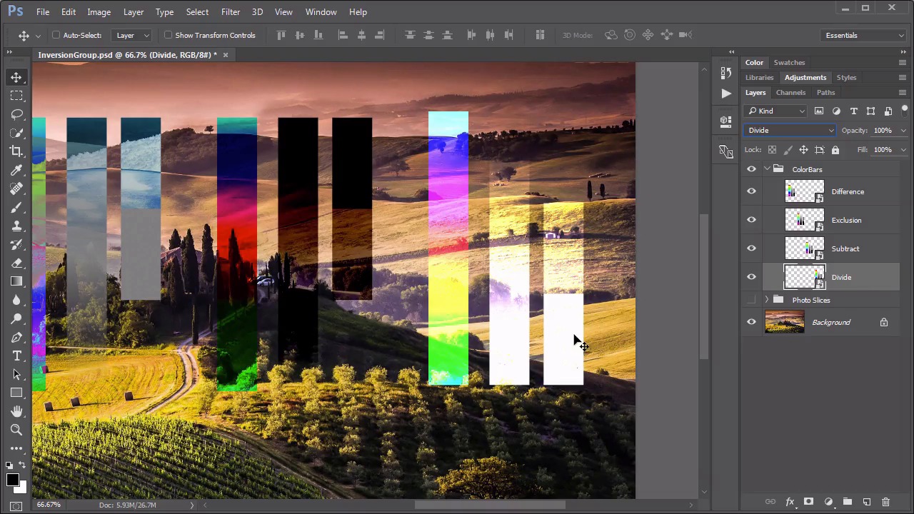
- Overview
- Transcript
6.1 Difference, Exclusion, Subtract, Divide
This set is more mathematically geared than the previous sets and can be useful in a handful of very specific circumstances. In this lesson we explore what these modes do and why they are in the program.
1.Introduction
1.1Introduction01:34
2.Normal Set
2.1Normal and Dissolve02:37
2.2Practical Uses for the Dissolve Mode06:27
3.Multiply Set
3.1Darken and Multiply06:15
3.2Color Burn, Linear Burn, Darker Color05:25
3.3Adding a Digital Tattoo06:01
4.Screen Set
4.1Lighten and Screen03:36
4.2Color Dodge, Linear Dodge, Lighter Color04:36
4.3Coffee Ghost07:25
5.Overlay Set
5.1Overlay, Soft Light, and Hard Light04:39
5.2Vivid Light, Linear Light, Pin Light, Hard Mix06:20
5.3Nondestructive Dodge and Burn06:03
6.Inversion Set
6.1Difference, Exclusion, Subtract, Divide05:52
6.2Inversion Modes: Drawing Effects03:53
7.Component Set
7.1Hue, Saturation, Color, Luminosity05:58
7.2Luminosity Mode: Soft Focus02:45
8.Conclusion
8.1Conclusion00:47
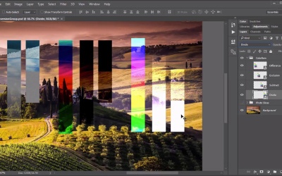
6.1 Difference, Exclusion, Subtract, Divide
Hello everybody, welcome back to mastering blending modes in Adobe Photoshop. This is lesson 6.1, where we take a look at the Inversion group of blending modes. The Inversion group is that next set of blending modes that goes from different to divide. There's only four of them and they all do something rather similar. We'll start with the Difference mode and that's using these color bars over here on the far left. If we set this to Difference, we can see that the black completely disappeared. The gray tones are a little bit darker, the white is generating a negative effect with those background pixels. Officially, what this blending mode does is a selective inversion. Whereas, the black color in the blending mode gets completely removed and doesn't do any inversion at all. The white color always does a complete exact opposite inversion, creates a negative effect. And the rest of the colors create an inversion based on the brightness levels on a channel by channel basis. One of the most notable properties and arguably the most useful property of the difference blending mode is that similar colors are rendered as black and we'll see why that's important in just a few minutes. But first, let's move on to the second one, which is the Exclusion blending mode. So if I take this next set of color bars and set this to exclusion. Now the exclusion is also a selective inversion mode, where the black never gets inverted. The white inverts absolutely, as in, it always creates a complete negative of the background pixels, but the gray is completely untouched. In the Exclusion mode, the gray is excluded. Also, similar pixels cancel each other out like they did in the Difference mode, but this time instead of being rendered as black, they're rendered as gray. Moving on, let's take a look at the Subtract mode with the next set of color bars. So we'll set this one to subtract. Now at first glance Subtract is actually pretty similar to the Difference color mode with a couple of very noticeable differences. First is that the white color on the blending mode here is rendered completely black, because it's being subtracted from the colors that are behind it. The black color that was on the color bar here is rendered completely invisible. But only full black if you take a look at the gradient here. As it goes down, it's only the very bottom of this white to black gradient that's being rendered invisible. And in the color bar, we're seeing something a little bit different there. On the color gradient here we're getting an inverted color that's overlaid over the background color. Look at the difference in between the Subtract blending modes color bar and the Difference blending modes color bar. While the Difference mode is creating an inversion of those background colors, the Subtract mode is actually inverting the colors in the blending mode and then overlaying them over the background. Now let's move on to the Divide. We'll change this last group to Divide. And this one does almost a direct opposite of what we see done on the Subtract mode. In the Divide mode, it is the white pixels that are completely removed. The black pixels are now rendered white, and the grays are creating a much lighter color, whereas in the Subtract mode, they were creating a darker color. Also the color gradient is creating that inverted color of the blending colors. But this time it's almost screened over the background as opposed to the overlay or multiply that we saw with the Subtract. So using these color bars over this background photo, we get a feel of what these blending modes do. But it's kind of difficult to envision why we would use these. They seem rather, kind of obscure as to what their effect is. And for that reason, I wanna show you something that's a little bit more practical and helps you to understand these. What I've got in this group is the photo slices. So if I turn off that background, you can see I've got these four slices of that background area, and if I move these around, you can see what they are. I just created rectangles around these individual spaces and created slices from the background. So if I change these now to those different blending modes you'll see what happens. First of all, let's use this Difference blending mode. Notice how that all turned black. That's because the pixels are identical to the pixels behind it. In the Difference blending mode, when pixels are identical they're rendered as black. Watch what happens when I take this layer and just move it slightly. We start to see some more strange little colors coming into play there. And that's one way of using this blending mode to know exactly when layers are lined up on top of each other. You can keep moving it around until it's rendered black, and then you know it's exactly in place. Next is the Exclusion mode. So we take that next box, we change this to Exclusion. And notice the difference here. As we move this one around, we get a wholly different effect as we did with the Difference one. In this one, Photoshop is attempting to take pixels that are very similar in color tone and rendering them as gray. And we can see that that doesn't always create the results that we would expect. Because we would expect this entire square to be gray. But that's not how it looks. That has to do with the way the math works behind this mode and its selective inversion, where the black never gets inverted. Let's now move on to the Subtract blending mode. We'll set this one to Subtract. And like the Difference mode, this one produces exact black when the pixels are aligned. And by moving them, we get almost an outline type of effect. And then with the Divide mode, we'll change this one once more to its namesake. We get a similar thing, except this one creates white when similar colors are overlaid. And if we move this one around, it's a very similar effect to both the Subtract and the Difference, but it's completely inverted. Now, admittedly, these are not blending modes that are used very often, for a creative or artistic effects. They tend to usually be used in a more mathematical way to do things like aligning layers together. But that doesn't mean that they can't be used artistically. And one of our challenges as digital artists, is to find useful ways to use the tools that's provided to us. Next up is lesson 6.2, where we look at some practical applications for this inversion group.


