
 Lessons: 18Length: 55 minutes
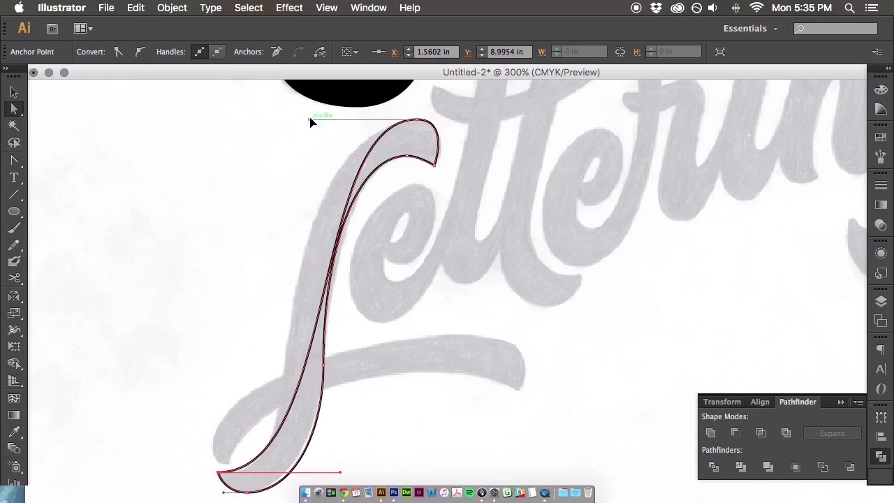
- Overview
- Transcript
3.6 Vector Techniques
We’ve finally made it to the vectoring stage! Throughout this time-lapse I will describe the entire vectoring process, show you where to place your anchor points, and cover many other vectoring techniques to perfect your curves.
Related Links
1.Introduction
1.1Introduction01:22
1.2Supplies01:01
1.3What Is Script Lettering?02:33
2.Formal Script Lettering
2.1Breaking Things Down02:10
2.2Understanding the Proper Angle08:02
2.3Smooth Connections02:52
2.4Thicks and Thins03:18
2.5Flourishing04:28
2.6Uppercase01:52
2.7Extremum Vectoring02:49
3.Informal Script Lettering
3.1Utilizing Handwriting05:03
3.2Varying Angles and Rhythm03:26
3.3Stabbing Connections01:45
3.4Alternate Letterforms04:27
3.5Process to Final02:09
3.6Vector Techniques04:42
3.7Further Research01:59
4.Conclusion
4.1Conclusion00:43
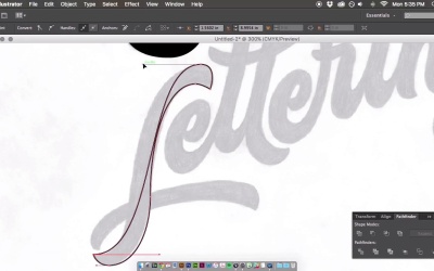
3.6 Vector Techniques
All right. So let's begin vectoring out the informal script that we developed within the course. The first thing you're gonna do is scan it into the computer, open it up into Photoshop, and the rest of this video is going to be a sped up time lapse of that whole process that I went from sketch to the final vector. So, I will play this time lapse and I will describe the process of everything that's going on as time goes on. So, let's get to it. So the first thing you're going to do is open up a Photoshop document. Play with the levels and the contrast to essentially see your lettering more clearly. Bring it into Illustrator and knock that back to like a dull. 10% opacity, so you can trace on top of it, and then here we are going through, and just placing those vector points, like I mentioned in a previous video. You're going to place those anchor points on the extremum. Essentially the north and south, east and west, the most points of your letters. Each of them is going to be vectored out separately. So as you can see with this S, I'm finessing those points. You want to use as few as possible to get those smooth curves, and you want to distribute that weight evenly with all of those bezeya handles. So, again just like finessing those points until I move on to the next letter form. Here we go to the c. You're gonna wanna vector out each of these letter forms separately, into separate shapes, so that way when it comes time, you can move those letter forms around, if need be. Again, you can see in the crotch of the R that I applied a crossover technique, essentially having the anchor points extend into the letter form. And then, you can navigate outward from that anchor point to get that sharp corner in the crotch of the r. And I did that throughout a couple of the other letter forms throughout this process. This is just a very back and forth process using the pen tool. It's never an easy process, it's always trial and error. So, it's gonna take some time to get used to this sort of thing if this is your first time doing it. There's definitely no easy way of vectoring your letter forms. Obviously you could use the auto trace feature, but ultimately your letter forms really aren't gonna look the best, especially if you're developing something, such as a logo type that really needs to be perfected in terms of your color and your weight and all sorts of aspects of a logo type. So, I guess it just depends on what the end goal is. But, using that pen tool is, it's gonna be your best friend throughout all your vectoring projects. So, throughout this process you can see, especially in this g, I utilized some shapes as well. With something like the g, it just makes sense to use the shape tool and create a circle and then alter those forms to fit your letter forms. Once everything is all outlined and vectored out, in this process that you're seeing here, I am still correcting those anchor points and the placements cuz you can see after everything is filled in with a solid color, you'll see all those minor inconsistencies in your letter forms. So I'm going back through and correcting a lot of those things, smoothen out the curves. Fixing everything that I think needs more weight or less weight or maybe even need to kern some letter forms and that's the great thing about vectoring is you can move these letter forms pretty easily without having to draw and re-draw using a piece of paper. So this is just a very straight forward process, and then here we go at the end. I changed the colors, you can see that it is now finished piece. There's still some minor things that I might go ahead and change, but through that whole entire process, it definitely took me about an hour and a half or two hours just to vector out those two words. So to vector out the rest of them, it's the same sort of process. Drawing the outline, filling it in with a solid color, and then going back and forth and finessing those handles until perfection. So, if you have any questions regarding anchor point placement or anything at all related to vectoring, feel free to reach out and I will get back to you.


