
 Lessons: 18Length: 55 minutes
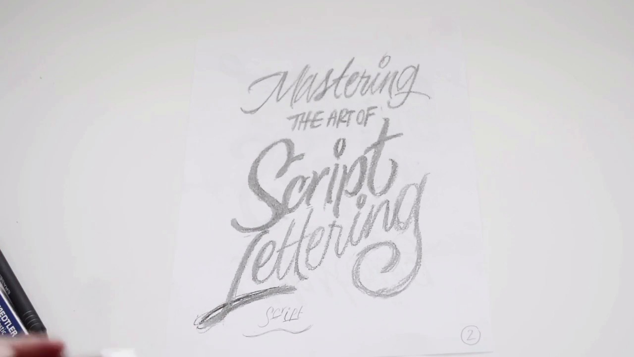
- Overview
- Transcript
3.2 Varying Angles and Rhythm
Unlike formal script, informal script allows us to utilize varying angles and a varying rhythm as well. We will understand how to balance our letterforms and overall composition by editing the scale, our baseline, angles and overall letterform structure.
1.Introduction
1.1Introduction01:22
1.2Supplies01:01
1.3What Is Script Lettering?02:33
2.Formal Script Lettering
2.1Breaking Things Down02:10
2.2Understanding the Proper Angle08:02
2.3Smooth Connections02:52
2.4Thicks and Thins03:18
2.5Flourishing04:28
2.6Uppercase01:52
2.7Extremum Vectoring02:49
3.Informal Script Lettering
3.1Utilizing Handwriting05:03
3.2Varying Angles and Rhythm03:26
3.3Stabbing Connections01:45
3.4Alternate Letterforms04:27
3.5Process to Final02:09
3.6Vector Techniques04:42
3.7Further Research01:59
4.Conclusion
4.1Conclusion00:43
3.2 Varying Angles and Rhythm
All right, so with your selected piece of lettering, we're going to scan that one piece into the computer and I would just blow it up really, really big on 8.5 by 11, which is what I did here. I even added in, mastering the art of script lettering, at the top. And so this is that exact piece of lettering, although it's just scaled up. Don't worry about like, the roughness of it because from now on we can really fine-tune what these letters look like by putting on another piece of tracing paper and just drawing it over and over until we perfect it, essentially. I wanna discuss varying angles and rhythms within informal script lettering. You can change the angles and the rhythm of your phrase. For example, you can see how the c sits a bit higher than the r, and the i sits a bit higher as well. The p jumps down, the t is up. So it has this sort of almost undulating, like it's got like this crazy up and down baseline. That's the sort of thing you can get away with, with script lettering, as long as everything is consistent. Because if you drew the word script, for example like this. Like that I, for example, just looks really almost out of place, right, because it doesn't have anything else that it's balanced with. Everything is very upwards along here and then everything is very lower along the second half of the word. So you wanna just make sure that there's a balance between everything. Everything is still consistent, like the stroke weights, and the slope of the letter form, but sometimes the slope of the letter form can change as well. As long as you balance that, everything will look a little bit more normal if it's balanced with the rest of the letter forms. For example, if you drew the word script again, but like, let's say that S has got a angle like this. Maybe the c has an angle like that. That would mean your r needs to be very similar to the S, right? It needs to have this sort of balance to it. Everything needs to either go back and forth, or it depends on the word, depends on the structure. A lot of things will vary between informal and formal, but the main thing to take away is if you're doing something crazy like that, you just need to make sure that you balance it with the other letter forms. But the one great thing about this crazy baseline is everything has like, this nice rhythm, this nice flow to it. It's not just a very structured straight baseline, right? Everything it's, it almost appears more energetic, more vibrant. It just has a bit more energy to it when it has this flow to it, so that's the beauty of informal, is like things can be a little bit crazy and that's what makes it so unique. So within this part of the chapter, again, scan in your handwriting, blow it up, and we will begin fine-tuning it with a piece of tracing paper throughout this course.


