
 Lessons: 18Length: 55 minutes
- Overview
- Transcript
2.5 Flourishing
Flourishing can be easily overdone or poorly created. The key to flourishing is to understand the balance and relationship that the flourish has with the existing letterforms and the space around it. This section will describe the basics of flourishing and when/where it is appropriate.
1.Introduction
1.1Introduction01:22
1.2Supplies01:01
1.3What Is Script Lettering?02:33
2.Formal Script Lettering
2.1Breaking Things Down02:10
2.2Understanding the Proper Angle08:02
2.3Smooth Connections02:52
2.4Thicks and Thins03:18
2.5Flourishing04:28
2.6Uppercase01:52
2.7Extremum Vectoring02:49
3.Informal Script Lettering
3.1Utilizing Handwriting05:03
3.2Varying Angles and Rhythm03:26
3.3Stabbing Connections01:45
3.4Alternate Letterforms04:27
3.5Process to Final02:09
3.6Vector Techniques04:42
3.7Further Research01:59
4.Conclusion
4.1Conclusion00:43
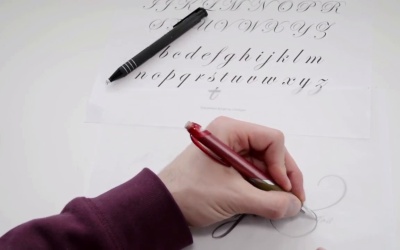
2.5 Flourishing
So now that you guys have an understanding of the thick to thin relationship, we can discuss flourishing. Now, you can see a good amount of flourishing within the capital letter forms that we have here. Each letter form has its own sort of unique flourish going on, but we can break those down, as well, into just about four separate flourishes. We have a spiral shape, which can be customized anyway you want it to. For example, you can see the spiral shape within this B, but it still doesn't look exactly like this spiral. So it can be customized. The next shape we have is a loop, and then we have a swelled line for a horizontal-like stroke, like it the L or the F. And then, lastly, we have a tail. And the tail could be customized, as well. Maybe something similar to this H or the other stroke of the H, as well. So with our piece of tracing paper, let's begin drawing some of these flourishes. And you can see, it's exactly like our thick to thin relationship within our lower case and capital letter forms. You're gonna be pulling this down to create the thicker stroke, pulling it across to create a thin stroke. This could be thin or thick, it depends on the letter you're trying to draw, or where this sits on a composition. It's all up to you and your eye. And then, of course, going across is gonna be thin, pulling it down. It's the same sort of relationship. So I would begin by practicing drawing some of these forms. You could even utilize the previous drawings that we've done with your word. And for example, if you wanted this n to exit with a flourish, let's go ahead and try that. So instead of exiting with just a regular old exit stroke, maybe it comes down like so. And it has some sort of tail like flourish. And then, you would add in your thick stroke here similar to what we have going on here. This would be thin. And this could end in any sort of like, maybe it's a teardrop terminal or a ball terminal, you can draw a circle at the end. Any sort of ending that you'd like. It's up to you. But the key to flourishing is to make sure everything is very smooth, everything is very elegant and not so forced. I've seen a lot of forced looking flourishes, for example, if you drew, let's have like a t, a h, an e. Sometimes people just like to flourish everything, connect everything, and then bring this around and it's almost too much flourishing. You want to balance the composition with flourishing. Flourishing should be a secondary thing. It should also add to the piece. It shouldn't take away from the piece, if that makes sense. So you wanna be able to, for example, in the word design, just this one single flourish I think adds to the design. It doesn't take away from the entire design. So you wanna be very nitpicky almost with the flourishing that you're doing, and you don't want to overkill it, you wanna be very sparse with your flourishing. So go ahead and begin drawing some of these basic flour shapes. Gain an understanding of how they are drawn. Make sure you keep that consistent smooth line along, and everything feels as if it was drawn by the same hand. Because you want your flourishing and your letter forms to look the same as well as flow from the letter forms in the same similar, graceful manner. So go ahead and practice that and we will get into the next chapter.


