- Overview
- Transcript
2.4 Thicks and Thins
The most common issue among lettering artists is trying to understand where the thick and thin relationships occur. Within this section I will explain exactly where and why those thick to thin relationships exist. It all relates to the history and tools of the formal script!
1.Introduction3 lessons, 04:56
1.1Introduction01:22
1.2Supplies01:01
1.3What Is Script Lettering?02:33
2.Formal Script Lettering7 lessons, 25:31
2.1Breaking Things Down02:10
2.2Understanding the Proper Angle08:02
2.3Smooth Connections02:52
2.4Thicks and Thins03:18
2.5Flourishing04:28
2.6Uppercase01:52
2.7Extremum Vectoring02:49
3.Informal Script Lettering7 lessons, 23:31
3.1Utilizing Handwriting05:03
3.2Varying Angles and Rhythm03:26
3.3Stabbing Connections01:45
3.4Alternate Letterforms04:27
3.5Process to Final02:09
3.6Vector Techniques04:42
3.7Further Research01:59
4.Conclusion1 lesson, 00:43
4.1Conclusion00:43
2.4 Thicks and Thins
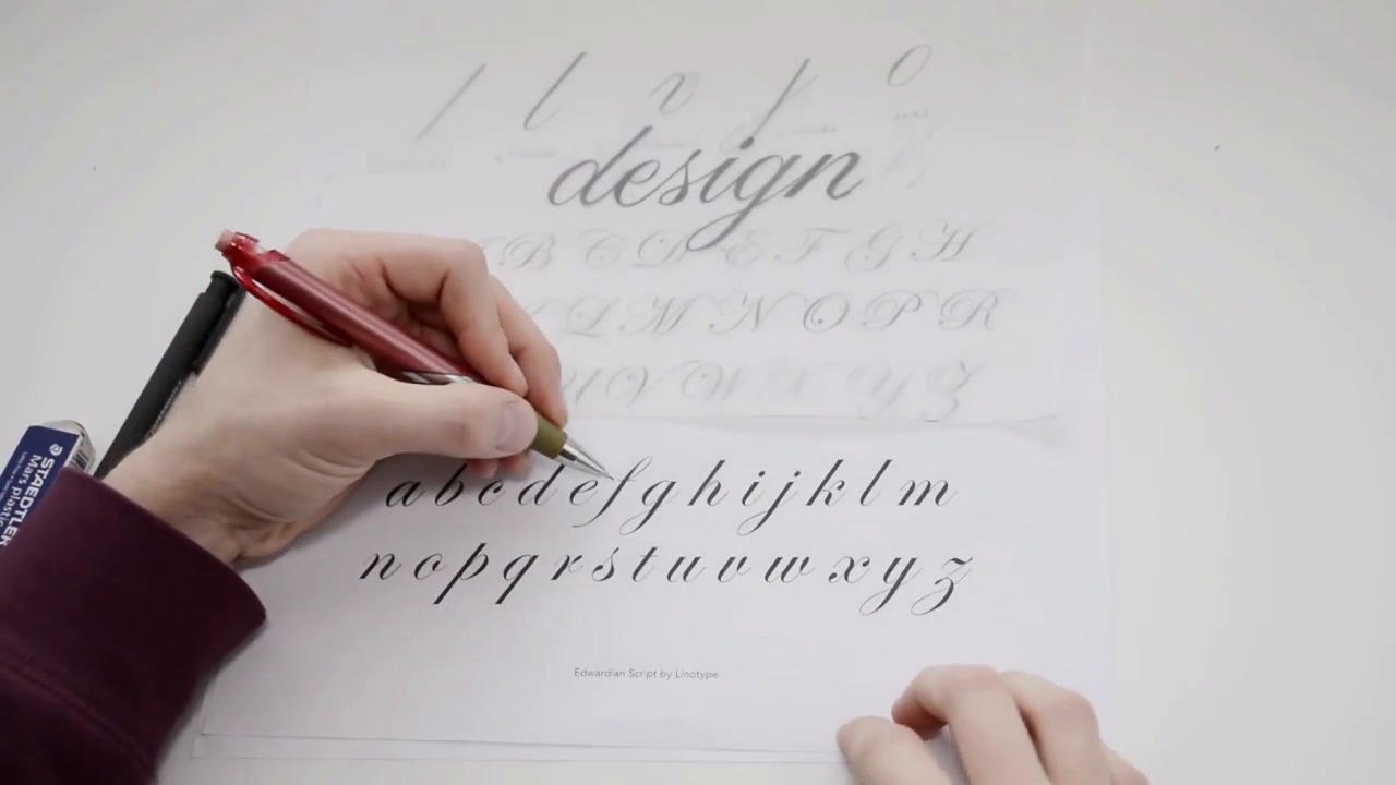
All right so now that you have an understanding of our connections as well as spacing and the basic understanding of each of these strokes, let's discuss how the weight is distributed with general calligraphy you're using a pointed nib pen right? And you're going to be taking that pen and dipping it into a canister of ink essentially. And when you pull your pen across and apply pressure as your pulling it down, more ink is being released from that pen to create this thick stroke here, right? And then you come across and come back up and when you're pulling it up, you're not applying pressure, so, therefore, no ink is being released to create a thicker stroke there. So same thing goes with the next stroke. You're pulling it down, which creates the thicker stroke, and then you're pulling it back up, which creates the thinner stroke. And that is the same throughout all of our letters forms. When you're pulling a letter form down from top to bottom the ink is being released. So, that sort of idea is being distributed across all of our letter forms. So, when you're drawing your letter forms it's easy where those thick to thin ratios occur because you just need to understand how the pen would generally react when you're drawing those forms. One thing to be aware of as well is when you're drawing a horizontal stroke like the f or the t, you're pulling it across, right? You're doing something similar as pulling it up where the pen is not releasing any ink. It is just a hairline thicker because you are going horizontal. But other than that you can see how it is just ever so slightly just a tad thicker than when you are pulling the pen upwards. So one common mistake I see is when you, for example if you're drawing a T, and it looks exactly like the one we have up here right? You have your thin stroke there. Some people tend to cross a thick stroke with a thick stroke. And you don't wanna do something like this because then it creates a large amount of positive space and it's almost become, it becomes an eyesore. If you're drawing a entire word for example, and let's say, let's say I cross a thick stroke here with this g, right? These two thicks crossing creates a very heavy space down in this word, and it just disrupts the readability of the word in my opinion. So just pay attention to these little things and always think back to okay what would the pointed pen be doing. Or what would the flat nib pen be doing if you were using a flat nib as well.


