
 Lessons: 18Length: 55 minutes
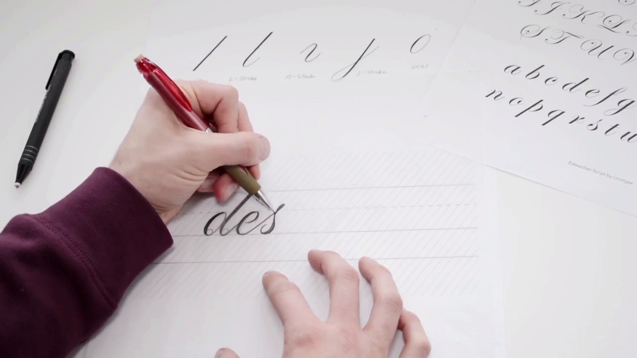
- Overview
- Transcript
2.2 Understanding the Proper Angle
We will dive into understanding the overall slope of our formal script letterforms to ultimately help you draw your letterforms on a consistent angle. Utilizing our separate shapes from the previous video, we will begin drawing a word/phrase within the formal script style.
1.Introduction
1.1Introduction01:22
1.2Supplies01:01
1.3What Is Script Lettering?02:33
2.Formal Script Lettering
2.1Breaking Things Down02:10
2.2Understanding the Proper Angle08:02
2.3Smooth Connections02:52
2.4Thicks and Thins03:18
2.5Flourishing04:28
2.6Uppercase01:52
2.7Extremum Vectoring02:49
3.Informal Script Lettering
3.1Utilizing Handwriting05:03
3.2Varying Angles and Rhythm03:26
3.3Stabbing Connections01:45
3.4Alternate Letterforms04:27
3.5Process to Final02:09
3.6Vector Techniques04:42
3.7Further Research01:59
4.Conclusion
4.1Conclusion00:43
2.2 Understanding the Proper Angle
All right, so now we're going to essentially understand our slope of our formal script letters. On this guide page, you can see I included some diagonal lines throughout the page, which gives you an understanding of how the letter forms need to follow this consistent angle across our word. So with our strokes in front of us, as well as our example letter forms to just reference while we're drawing, keep those in front. And we are going to place a piece of tracing paper on top of our guide page. That way the guide page stays free and clear of all of our pencil marks. And in case you don't understand what's on this guide page. The top line is our ascender which is essentially the top of your b, your d, h, k, etc. And then this dotted is the x-height. That is where the top of your lowercase letter form will sit. For example, if you're drawing a letter a, the a will touch the x-height and then touch our, what we have is the baseline down below. And then lastly, we have our decenter. So the strokes that follow down such as the P or the Q, Y and Z, etcetera, those will reach down to the decenter line. So now with our tracing paper on top, we're gonna begin drawing our word. In this case, I'm gonna draw the word design. We will begin combining an oval shaped and a L stroke. So lets begin doing that while following this diagonal fifty-two degree line that we have going on. Just draw our oval. Keep it nice and light and then once you get it to a good spot, add in your weight. It's okay to keep it rough, because we will just continuously edit this throughout the chapter, until we, essentially reach, reach perfection. Next we'll draw the L stroke. And one thing to keep in mind with our formal letter forms is that every curve, such as this counter form in here or this loop at the end of the L stroke. Everything needs to be very circular. So you need as if you could fit an entire circle within our curves. So, fill that in, and next we'll draw the E, another oval, make sure you follow that axis. See how that line cuts straight through. Then we'll add in our weight. And then just erase this part of the e so that counter opens up. And next we have our S, the rather difficult letterform, but it's pretty simple if you break things down. We will, let me draw it real quick and I'll explain it, in just a bit. Alright, so with this S you have to pay attention to where the weight is distributed. With the top of this knot of the S, essentially, that is going to exceed the X height because if it were to touch the X height along with the E and D It would almost appear as if was lower so to compensate for that we have to extend it above the x-height and then bring our weight down towards the bottom. Make sure you have another very circular counter form and we're going to connect that to an I. When you're drawing all of these letter forms you want to make sure the weights are consistent throughout each letter form. So as you can see our I almost appears a bit bolder than the rest. So to fix that I might either add weight to everything else or reduce the weight on the I. But like I said we're gonna be editing this throughout the course. So we do, we'll throw a piece of tracing paper on top, and then correct it later. So let's not worry about it. We're just gonna get the structure of it down first. Cause this, the beautiful thing about lettering is it's all editable. And we will be going back and forth with our eraser, adding in weight, removing weight. And we'll just. Continue to do that throughout. So next we'll have our G, another oval. Add in the tittle. The dot of the I, called the tittle. All right. Add in our j stroke. All right, and lastly, we're going to finish off with our n. We're gonna have half of a diagonal stem. And then we will add on the end stroke. Making sure we are following that diagonal axis with 52 degrees. It doesn't necessarily need to be 52 degrees as long as everything is consistent. I think that is all that matters really. So it's not looking too bad. All right, so with your word completed, what you want to do now is refine this until you correct your letter spacing. Make sure your weights are distributed evenly, make sure everything looks, essentially, even and consistent throughout the entire word. And you can see what I did. Essentially throw a piece of tracing paper on top of that and draw on top of the word. And this is where I ended up. I corrected all the spacing, the weights. There's still some minor issues, I think I could add in a bit more weight into this G. But essentially what your doing is just throwing on another piece of paper, correcting it until it's perfected. Until you reach that stage where you say okay this is done.


