
 Lessons: 18Length: 55 minutes
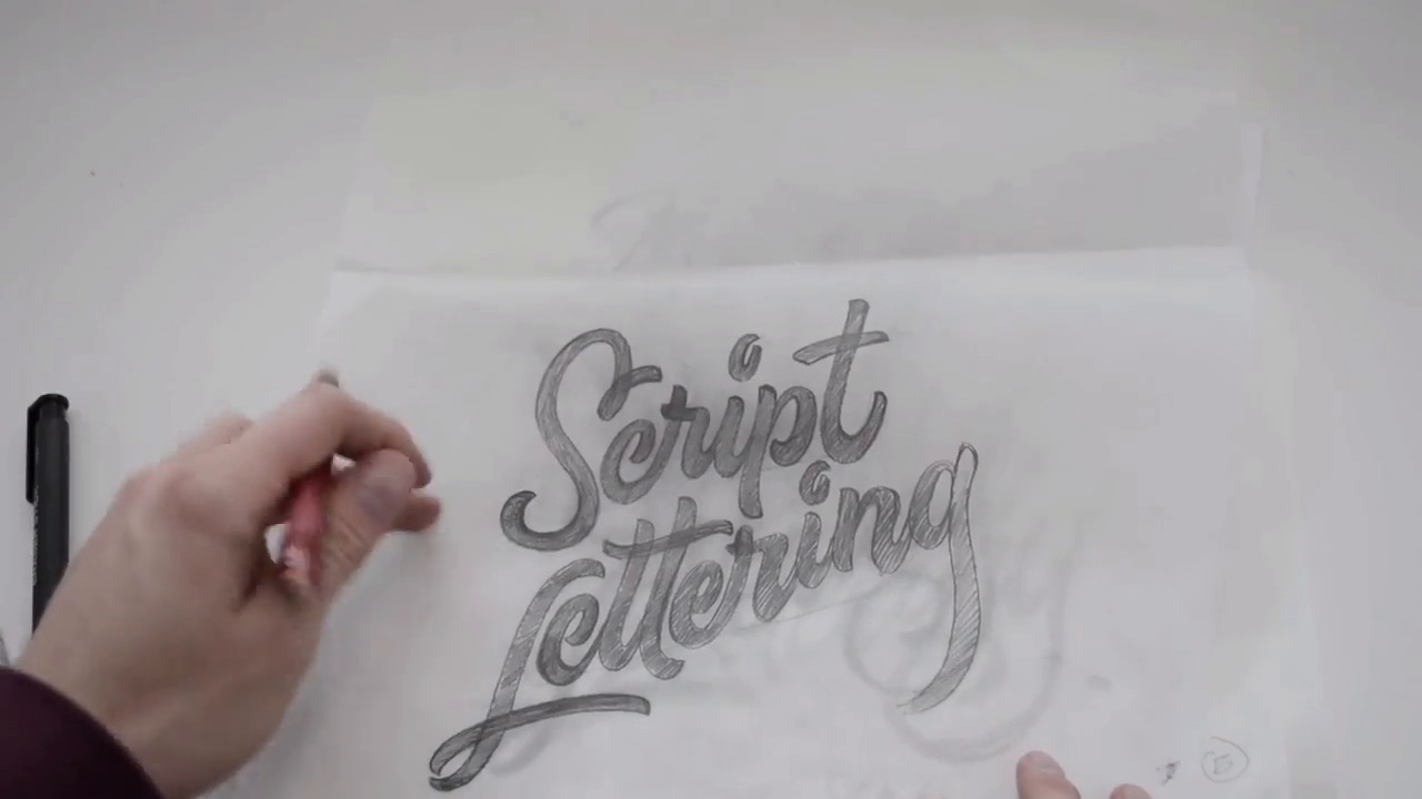
- Overview
- Transcript
3.4 Alternate Letterforms
There are so many ways to draw a letterform. The possibilities are truly endless! Within this video I will show you how altering letterforms within your word/phrase can add a bit of custom flair. We are drawing custom letterforms, after all, so you don't have to repeat the same form twice!
1.Introduction
1.1Introduction01:22
1.2Supplies01:01
1.3What Is Script Lettering?02:33
2.Formal Script Lettering
2.1Breaking Things Down02:10
2.2Understanding the Proper Angle08:02
2.3Smooth Connections02:52
2.4Thicks and Thins03:18
2.5Flourishing04:28
2.6Uppercase01:52
2.7Extremum Vectoring02:49
3.Informal Script Lettering
3.1Utilizing Handwriting05:03
3.2Varying Angles and Rhythm03:26
3.3Stabbing Connections01:45
3.4Alternate Letterforms04:27
3.5Process to Final02:09
3.6Vector Techniques04:42
3.7Further Research01:59
4.Conclusion
4.1Conclusion00:43
3.4 Alternate Letterforms
All right, so now you can see through this editing process that I made things a bit thicker. You can see how I started pretty thin, and then I thickened everything up. And one trick to do that, and I will show you, is to get a piece of tracing paper So get a piece of tracing paper and we're going to draw the left-hand side of our letter form, right? So if we drew the left-hand side of this S and then we nudged it over. You can see where that S was before and then you can connect those two. So, finishing that off, you'd follow that through. Right? And then continue to move it over. Get that sorta loop going on. And then you would continue to do that throughout the rest of your letter form. So draw the left-hand side of the c, nudge it over. We forgot to do this on this side. Nudge it over, and then now you have the thick side of your c, and then you can connect the rest of everything else, too. So hopefully, that makes sense. You just draw the left hand side of your letter form, or the right hand side and you can nudge it to the right, whatever direction you want to go in, and then finish connecting that off. So through the editing process I essentially reached this stage. This very thickened up version of the script lettering, you can see how much progress we've made just from our initial handwriting to where we are now and there is still so much room for improvement. But it's cool to see that our handwriting can end up into something completely unique and completely different from what we started with. But more importantly, within this chapter, I want to discuss a little bit more about drawing various forms of letters. With script lettering there's so many ways that you can draw a letter form. I mean even with sans serif and regular serif letter forms, there's so many ways to draw those as well, right? So for example, if you were to draw the letter r, in this case, I have a very cursive like r. But you could also have something similar to a brush script sort of r that looks something like this, right. I'm sure you've seen something similar along these lines. This is a very brush-like letter form, but I think it would still fit in with the rest of the forms that I have going on. Another thing is, like with an f, if you wanted to, you could draw a cursive f that has some sort of a thicker stroke. It curls into itself and then maybe the top end curls into itself as well. Maybe you have like a wavy horizontal crossbar. Or you could have an f that is just very, very up and down. And then it has just a round terminal. A slosh terminal, something like that. What I'm trying to get across is there's so many ways to draw these letter forms. So don't feel like you're stuck in drawing an e, like this. Maybe it's a capital e. The one that almost looks like a backwards three, right? It can be something like that. Don't feel like you're stuck into drawing one sort of form. You have the ability, this is lettering after all, so you have the ability to do just about anything that you want, really. So throughout this editing process, keep that in mind, so that way your lettering can almost look even more unique and more custom than what you're normally drawn to drawing throughout your process.


