
 Lessons: 18Length: 55 minutes
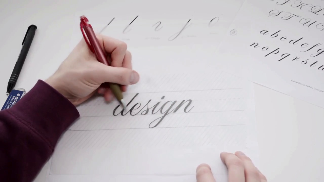
- Overview
- Transcript
2.3 Smooth Connections
This video will show you exactly where to connect your formal script letterforms. Not only will you learn where to connect the letterforms, but you will also understand why the connections appear so graceful. Consistency is key!
1.Introduction
1.1Introduction01:22
1.2Supplies01:01
1.3What Is Script Lettering?02:33
2.Formal Script Lettering
2.1Breaking Things Down02:10
2.2Understanding the Proper Angle08:02
2.3Smooth Connections02:52
2.4Thicks and Thins03:18
2.5Flourishing04:28
2.6Uppercase01:52
2.7Extremum Vectoring02:49
3.Informal Script Lettering
3.1Utilizing Handwriting05:03
3.2Varying Angles and Rhythm03:26
3.3Stabbing Connections01:45
3.4Alternate Letterforms04:27
3.5Process to Final02:09
3.6Vector Techniques04:42
3.7Further Research01:59
4.Conclusion
4.1Conclusion00:43
2.3 Smooth Connections
All right, so within this chapter, we're gonna be discussing the connecting points within our letter forms. One of the characteristics of formal script lettering is how everything is very consistent, everything flows very nicely, everything looks very elegant and beautiful and that is because of the connecting points, as well as the thick to thin ratio with our stroke contrast. So let's discuss our smooth connections between each letter form, as well as our kerning and tracking of the word, as well as maybe even letting to, if we get to that point. So with our letter forms, you can see how each letter has this consistent circular upstroke. You can fit a circle within each of these upstrokes. So everything has this upward connecting point, and all of our exit strokes enter into the next letter very, very high into the letter form. A general mistake is a lot of people will change this angle. If this angle changes, that is okay. For example, the s, it is slightly altered to create space around the letter form. But if the exit stroke, for example, goes straight across, like this, instead of keeping that consistent circular exit stroke, some of the letter forms might appear to stab into another letter form. If we had, for example, a letter b or something. It will look as if it's stabbing into it rather than flowing into it like we have with the d and the e, etc. So definitely pay attention to our connecting points of each letter form, you wanna just make sure they connect fairly high to keep that consistency. And then, when it comes to spacing, spacing is a rather difficult thing as well. But you need to be spacing as you're drawing. You need to just be aware of what letter is before the letter you're drawing and what letter is coming after the letter you're drawing. So that will allow you to understand how much space to put between each letter form. For example, I think there's a bit too much space between this s and the i, so when I throw a piece of tracing paper on top, I would essentially nudge the i, the g and the n over just a hair to close up this space right here.


