
 Lessons: 18Length: 2 hours
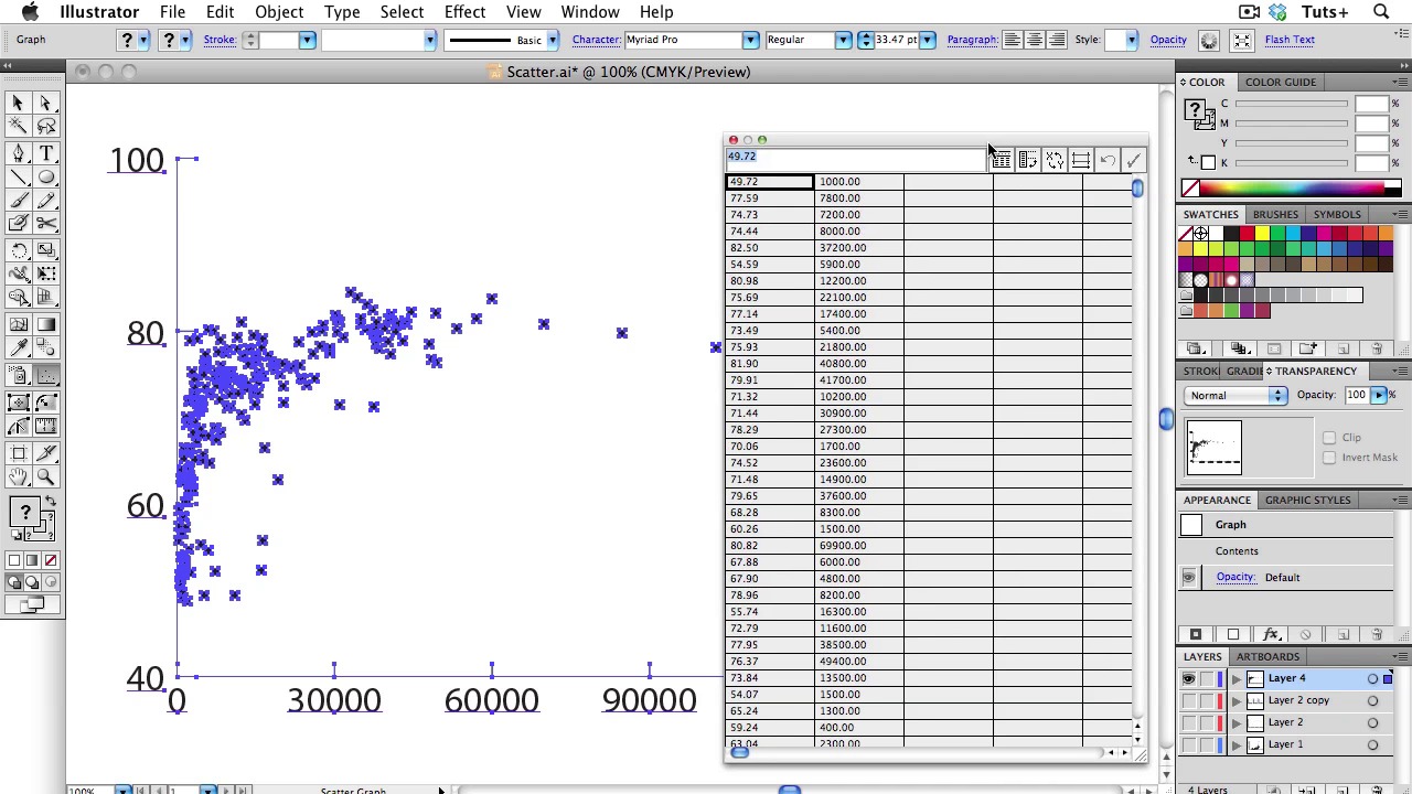
- Overview
- Transcript
2.5 Scatter Graphs
In today’s lesson, I will teach you about Scatter Graphs. Scatter graphs, also known as scatter charts or scatter plots, are used when you want to show correlation between sets of data. Let’s learn to make them effective and meaningful to our readers.
- If you have a dependent variable, put it on the Y axis.
- Check your data: Look for outliers. Is this a mistake or an anomaly?
- If you have many data sets, consider using a matrix.
- Don’t use different symbols for different sets of data: If you have more than one set of data, differentiate the sets by color.
1.Introduction
1.1About the Course03:43
1.1
About the Course
03:43
1.2Data04:18
1.2
Data
04:18
2.Basic Graphs
2.1Line Charts11:18
2.1
Line Charts
11:18
2.2Bar Charts08:26
2.2
Bar Charts
08:26
2.3Pie Charts06:29
2.3
Pie Charts
06:29
2.4Area Graphs06:55
2.4
Area Graphs
06:55
2.5Scatter Graphs06:29
2.5
Scatter Graphs
06:29
2.6Bubble Charts09:31
2.6
Bubble Charts
09:31
2.7Locator Maps08:45
2.7
Locator Maps
08:45
2.8Choropleth Maps06:45
2.8
Choropleth Maps
06:45
2.9Timelines07:42
2.9
Timelines
07:42
3.Design Issues
3.1Variables05:09
3.1
Variables
05:09
3.2Color05:20
3.2
Color
05:20
3.3Typography03:37
3.3
Typography
03:37
3.4Math06:22
3.4
Math
06:22
3.5Big Graphics08:53
3.5
Big Graphics
08:53
4.Conclusion
4.1More Resources02:41
4.1
More Resources
02:41
4.2Top Tips05:04
4.2
Top Tips
05:04

