
 Lessons: 18Length: 2 hours
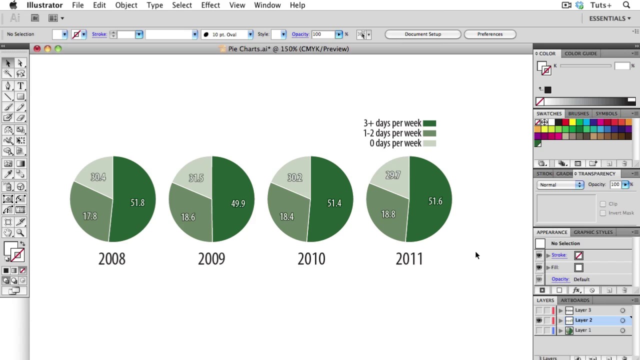
- Overview
- Transcript
2.3 Pie Charts
In today’s lesson, I will be teaching about Pie Charts. Pie charts are one of the most over-used and mis-used types of info graphics. There are some data visualization experts who would tell you to avoid them altogether, but as long as you stick to the rules and use them appropriately, they can be effective. Let’s learn to use the correctly and with valid meaning!
- Know when to use a pie chart: Remember you are dealing with parts of a whole. Don’t use it if you are not dealing with the whole subject!
- The pieces of a pie chart should add up to 100
- Use proper ordering: You should order the slices with the largest one starting at the top right. Since we read from left to right and top to bottom, put the bigest wedge here. Then the next largest should go to left, with the rest going counterclockwise in descending order. An exception or alternative to this rule is when your slices are are pretty similar, then start at the top right and go clockwise.
- Stay away from wacky colors: They can distract and also draw disproportionate attention to some wedges. Try to stick to different tints of one color, and if you want to highlight a particular wedge, use a darker shade.
- Use less then 5 slices: Pie charts with more than about 5 wedges become pretty useless. Too many slices are just too hard to read.
- Don’t use 3D: It adds no information and it distorts the area and angles of the wedges.
- Don’t use donuts: Try to stay away from donuts, or use them judiciously.
- Don’t confuse people or make them work to understand your data: The whole point of information graphics is to illuminate data, not make it harder to understand.
- Know your audience: It’s good to know your audience and if you want to have some fun once in a while, that’s okay.
1.Introduction
1.1About the Course03:43
1.1
About the Course
03:43
1.2Data04:18
1.2
Data
04:18
2.Basic Graphs
2.1Line Charts11:18
2.1
Line Charts
11:18
2.2Bar Charts08:26
2.2
Bar Charts
08:26
2.3Pie Charts06:29
2.3
Pie Charts
06:29
2.4Area Graphs06:55
2.4
Area Graphs
06:55
2.5Scatter Graphs06:29
2.5
Scatter Graphs
06:29
2.6Bubble Charts09:31
2.6
Bubble Charts
09:31
2.7Locator Maps08:45
2.7
Locator Maps
08:45
2.8Choropleth Maps06:45
2.8
Choropleth Maps
06:45
2.9Timelines07:42
2.9
Timelines
07:42
3.Design Issues
3.1Variables05:09
3.1
Variables
05:09
3.2Color05:20
3.2
Color
05:20
3.3Typography03:37
3.3
Typography
03:37
3.4Math06:22
3.4
Math
06:22
3.5Big Graphics08:53
3.5
Big Graphics
08:53
4.Conclusion
4.1More Resources02:41
4.1
More Resources
02:41
4.2Top Tips05:04
4.2
Top Tips
05:04

