- Overview
- Transcript
1.3 Two Voices
In this lesson I’ll be introducing Two Voices, which is the project and brief we’ll be designing alongside throughout the course. I’ll show examples of previous Two Voices designs as well as discussing what makes it an exciting project to work on.
Related Links
1.Introduction3 lessons, 06:36
1.1Introduction00:56
1.2Thinking Creatively02:50
1.3Two Voices02:50
2.The Concept Stage 2 lessons, 24:56
2.1The Stories14:17
2.2Forming Ideas10:39
3.Research 1 lesson, 14:05
3.1Mood Boards14:05
4.Refining Ideas 2 lessons, 15:28
4.1Sketching07:53
4.2Perfecting the Final Sketch07:35
5.Creating the Artwork 6 lessons, 1:08:49
5.1The Basic Shapes09:52
5.2'She Swiped Right'06:08
5.3'He Left'20:41
5.4Applying Colour11:31
5.5Perfecting the Design09:30
5.6Grain Effect11:07
6.Conclusion1 lesson, 00:44
6.1Conclusion00:44
1.3 Two Voices
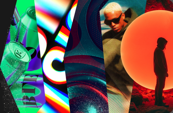
Hi, everyone. Welcome back to the course. In this lesson, I'm going to talk to you briefly about what we're going to be designing throughout and at the end of the course. So it's useful with a project like this to have something to channel your ideas towards. A brief, really, cuz without that, if I just said to you, go and design what you want and go and be crazy, then that could be very overwhelming and you wouldn't know where to begin. Whereas, if you have yourself a brief, then you have some way you can channel your ideas and really kind of narrow down your thinking and actually have a place to head towards. So the thing we're gonna be creating at the end of the course, is a typographically led piece of artwork. Now this artwork is gonna sit alongside a project called Two Voices. Two Voices is a project that a friend of mine, Phil James and I, we set up a few years ago now. The project aims to tell very short stories through beautiful typography. So Phil will write a very short story of about ten words or less, and then he'll give that story to me to then design and create some artwork out of it. The great thing about this project I think is just the words on a black piece of paper would really kind of trouble the viewer to understand the story. But when you bring design into it, you can help fill in the blanks and help people understand the story. And then also, you get to really amplify the emotion within the story. Some of my favorite stories that we've done are, Her Name Was a Bad Choice. I could never be a dad. Dad was her first word. Two voices, our room, I knock. And the rather dark humored, her cat, his car, their end. So hopefully, you agree that these pieces of artwork are intriguing both aesthetically, and then also there's something else about them which challenges you to kind of engage with and try and understand the story. So it's rewarding both mentally and also statically as well. So join me in our next lesson as I'll be reading through a list of stories that Phil has written for us. I'll be reading through them and then choosing one of them to take forward to design.


