
 Lessons: 15Length: 2.2 hours
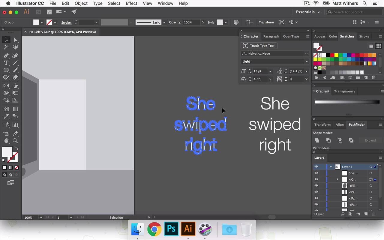

- Overview
- Transcript
5.2 'She Swiped Right'
In this lesson I'll be applying the 'She Swiped Right' text to the design. You'll learn how to apply 3D and perspective to text and shapes.
- Source File: He Left v1.ai
1.Introduction
1.1Introduction00:56
1.2Thinking Creatively02:50
1.3Two Voices02:50
2.The Concept Stage
2.1The Stories14:17
2.2Forming Ideas10:39
3.Research
3.1Mood Boards14:05
4.Refining Ideas
4.1Sketching07:53
4.2Perfecting the Final Sketch07:35
5.Creating the Artwork
5.1The Basic Shapes09:52
5.2'She Swiped Right'06:08
5.3'He Left'20:41
5.4Applying Colour11:31
5.5Perfecting the Design09:30
5.6Grain Effect11:07
6.Conclusion
6.1Conclusion00:44
5.2 'She Swiped Right'
Hi everyone, welcome back to the course. In this lesson we are going to be looking at putting some of the text into our design. In the previous lesson we were looking at building the background. We were just using some basic shapes to make the doorway in the wall of the first floor there and building the phone to try and make it look like the perspective, just if it was correct. And now in this lesson, I'm gonna be putting on the text she swiped right onto the phone. And then I think in the next lesson we'll move onto he left. So in this lesson what I want to try and achieve is make it look like the text of she swiped right is sitting on the phone. And also the font that I choose is appropriate and makes it feel like it's definitely part of the phone and makes people definitely realize that it's a phone we're looking at as well as a door. So in order to achieve that kind of perspective, there's one or two methods of doing that. We may need to try one or two to do that. We might just get away with one. So I'll just begin going through those and let's see how it looks. So to start that, we're going to just write out our text, she swiped right. And we're gonna find our friend Helvetica, and I think we're gonna try it in light cuz that seems to be what phones like iPhones use in their home screens. So to make this phone look as realistic as possible, I'm gonna try that font for now. I'm gonna make it white so you can see it clearly enough on this gray background. And just to reiterate I'm just using very basic gray color palettes at the moment just so I can distinguish each individual shape. And then further down the line we're gonna start choosing colors and talk about how they can relate to the design and the feel of the overall thing. So I'm gonna put these in a center aligned. Here we go. So it's already set up like that, great. And I'm gonna duplicate it. So that was just holding down Alt and clicking to make two versions of it. So I've just kept that one there in case I need to go back in the future if I want to quickly be able to use the text. That one's already set up as text so I can edit it simply. With this one, I'm going to make it some outlines, make it some shapes. So this is just quicker and easier to use for when I'm going to start distorting it now and changing the perspective of it. So let's bring it roughly into place And then what I'm going to do is use the free transform tool. So I click on that and then this extra little tab comes up here. And I'm going to choose the perspective distort selection. And so then you have these different anchor points to choose and click on. And this is just a matter of kind of playing around. And so if you click, hold, and drag, you can see the blue outlines behind it, changing the perspective of it. So as I said in our last lesson, sometimes if you are too kind of clinical and scientific about getting the lines completely perfect, it doesn't always look and feel correct. So this is going to be a matter of having a play around with this really until we feel like it looks correct. So, first, this would go with it. Might make it a little more of a steep angle. Okay, that's beginning to look correct. Might make it a tiny bit steeper again. Yeah, I think that looks good, I think I'm happy with that. And it's roughly in the center of this shape here. Yeah, that looks good. Just to mention the other way, the other method that you could do to edit the perspective of something is in Object. If you had your text or your selection highlighted, then if you go down to Envelope Distort > Make with Mesh. Then a similar box or grid comes up and it appears around your selection. And then you can just choose each anchor point, similarly to how we just did that then, and edit the perspective of it. But yeah, I'm happy with what we've achieved here with this one, so I'm just gonna hit Save on that. Great, so thanks for watching this lesson. In the next one we are gonna start looking at what choices we're gonna make with the text for he left and how we can bring a bit more feeling into the design. So thanks for watching and I'll see you next time.


