
 Lessons: 15Length: 2.2 hours
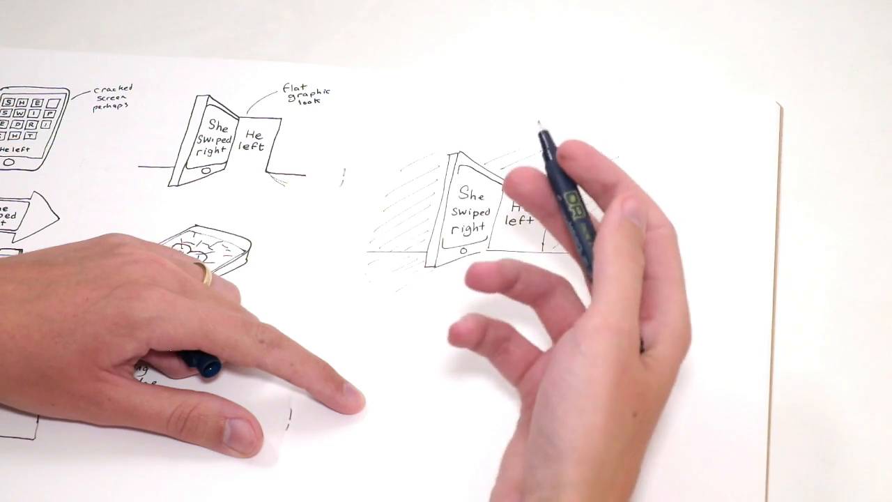
- Overview
- Transcript
4.2 Perfecting the Final Sketch
In this lesson I'll choose my favourite route from the previous lesson. I'll then redraw and perfect this concept, preparing it to be made into final artwork.
1.Introduction
1.1Introduction00:56
1.2Thinking Creatively02:50
1.3Two Voices02:50
2.The Concept Stage
2.1The Stories14:17
2.2Forming Ideas10:39
3.Research
3.1Mood Boards14:05
4.Refining Ideas
4.1Sketching07:53
4.2Perfecting the Final Sketch07:35
5.Creating the Artwork
5.1The Basic Shapes09:52
5.2'She Swiped Right'06:08
5.3'He Left'20:41
5.4Applying Colour11:31
5.5Perfecting the Design09:30
5.6Grain Effect11:07
6.Conclusion
6.1Conclusion00:44
4.2 Perfecting the Final Sketch
Hi everyone, welcome back to the course. In this lesson, we are going to be looking at the ideas I was sketching out in the previous lesson. And I've had a bit of time away. And a bit of time to mull over the ideas and now I've come back and had a look again and that's been some really useful time to kind of refresh and be able to work out which one I think is the strongest. And which one I'd like to take forward more. So with that space away, what I've been thinking is this one is the strongest with the phone as the door. I really like how I think I can do something quite interesting with the lights and the dark's in this one. Making them quite dramatic and which is able to be quite relevant to the theme for story. And I think the fonts, we can use them both. She swiped right and then a different font for he left. I think those could be quite interesting. Juxtaposition between what we do with those as well. So yeah, I think this is the one I'm choosing to take forward. So I'm just gonna sketch it out again and maybe make a few more notes. Start deciding where or what depth you want to take it. Great. So I've just kept it very loose sketch style, still, I'm not going to, really, start sketching out what I'm going to do with the typefaces and the lettering yet. Until I'm ready to get on the computer. I'm just gonna start making some notes about what I'm going to do with that now just so when I get on the computer, I'm not completely frozen and out of ideas. So as I was saying, I would really like to try and bring some a dramatic feeling in the difference between the lights and the dark's in this image. So we could use two different light sources here. The doorway, that could have light shining through it. And also the screen is well, could perhaps be a different light source. So I think If we're going to use both those, this back wall would be nice and dark looking. And probably down here on the floor too and then all this section here would be make best thing in life from both of these two light sources. And I'll keep most of the shapes basic, the style for phone and the door. I don't wanna get too much into detail with that. I think it would, I don't know. It would lose some of what would make it interesting if we went too much into detail, I think when you're trying to make something look like a phone, just having a little circle there. And that like rounded softer rectangle within the harder outline of it. I think that's enough to make someone realize it's a phone. And you just want to kind of hint at these things, as well. You want to just give people enough to intrigue them, I think with these sorts of illustrations and then they can kind of fill in that last bit of the blank. This sort of said that they, it's almost rewarding with your kind of your eyes drawn to something and you think that looked a phone and then you look a bit closer to it and then you realize that's what it is. Then you can, that feels quite nice as well, when your eye is drawn to something then you work it out yourself. I think it's quite a fun thing to deal with to the viewer. So yea, I'll keep illustration style quite simple, I think. And then for the fonts, she's quite right, as this is gonna be on the phone, I'm thinking that should be like a very simple vertical light, something which looks like it would be on a phone. So I think that's what iPhone have them home screens. So I think that would work well or something similar to that would work well, for she swiped right. And then for he left, I think I'm gonna be a bit more playful with that lettering. So I'm thinking about how we can really suit the tone of a story and let's think about, possibly how would the guy feel as he's leaving? He'll probably be feeling angry and betrayed, perhaps there's some way of getting that across in the font. So, yeah, I'm gonna be looking to sum up that feeling in these letters. Perhaps something like, Quite a cold looking Serif font might work, kind of quite business and formal that might work. And also thinking something I'm just gonna start noting these down. Something maybe a Gothic looking font will be quite fashionable to you, though I'm not too sure how relevant it would be. This is something I definitely want to try when I'm working from the computer. Okay, great. Well, I think that's enough to kind of refine at this point. I think the rest of it will come when I'm actually working onscreen. So thanks for watching this lesson. And I will see you all in the next step, what we're gonna be actually designing this up on, using Illustrator and Photoshop. So, see you then.


