
 Lessons: 15Length: 2.2 hours
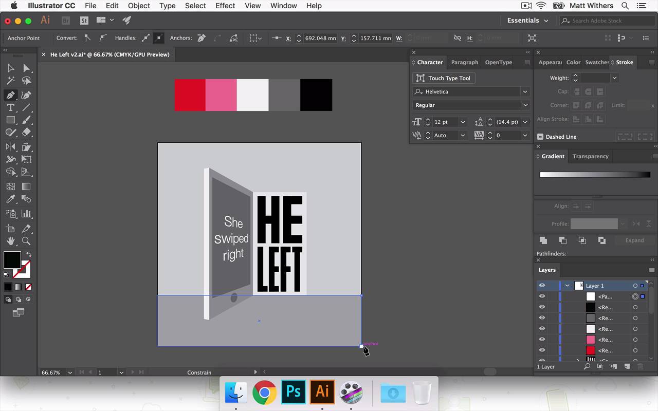

- Overview
- Transcript
5.4 Applying Colour
Now we have all the elements of the design created, it's time to add colour. In this lesson I'll be experimenting with my colour palette. I'll create multiple versions of the design with different colours to compare which is the strongest.
- Source File: He Left v2.ai
1.Introduction
1.1Introduction00:56
1.2Thinking Creatively02:50
1.3Two Voices02:50
2.The Concept Stage
2.1The Stories14:17
2.2Forming Ideas10:39
3.Research
3.1Mood Boards14:05
4.Refining Ideas
4.1Sketching07:53
4.2Perfecting the Final Sketch07:35
5.Creating the Artwork
5.1The Basic Shapes09:52
5.2'She Swiped Right'06:08
5.3'He Left'20:41
5.4Applying Colour11:31
5.5Perfecting the Design09:30
5.6Grain Effect11:07
6.Conclusion
6.1Conclusion00:44
5.4 Applying Colour
Hey everyone, welcome back to the course. In this lesson we are going to be continuing to build our final piece of artwork. In last few lessons we've been building our design, we've got the background in, She swiped right and in the previous lesson we were looking at how, different choices for that HE LEFT text, At the end of a video, I was a little unsure of which one I was gonna choose in the end. So now, I've just had a bit of time away and a bit of a break. Been able to step away from my screen, come back with some fresh eyes. I think the one I'm going to take forward is this one here. This one was a bit too light, this feels a bit too like it's digital font, even though its got some nice like sharp edges as quite boxy, and it feels like kind of, just like masculine, and angry. So it works in that way, but just the digital look of it doesn't sit right with me. So I'm counting that one out. This one I quite like. The condensed look of the font. I like that's it's quite narrow as well. It's not very bold I think that's that kind of slightly interesting too. It fells kind of quite I don't know I'm not sure how to really describe it. It feels quite like, back still got a huge amount of identity, it feels slightly cold, which is what I think works with the theme of the story. But the thing I really like about this one, is I think it's similar about what I just said about that one, about the kind of coldness of it. This feels, it also has like an urgency to it is in She's swiped right, the reaction being or the outcome being HE LEFT. I think that works quite nicely. So I'm gonna push that one forward. So I'm going to save a new version of this Version 2. And I'm going to get rid of these other art boards, just so they don't confuse me. Save that again, okay. Now we are going to look at bringing in some color into the design. And then that will help us build this and help us to kind of really refine the tone. And we'll probably refine some of the lettering. And we bring some textures in there next lesson. In this one we're just going to start choosing some colors to really help bring it to life. So I've already been thinking about colors and what we can work with and as this is a story of, it's love and heartbreak, most appropriate colors that comes to mind, like reds, maybe some pinks in there. But then if you mix those with black and white as well, that's a nice strong contrast between them. And I think those colors mixed together can really create an urgency to a design as well as get across the romance side of the story too. So what I'm going to do is draw boxes across the top here and then we are going to use these. Probably going to choose about four or five different colors, and I'm going to do that because I wan this to be quite a flat, graphic looking design, and we're going to have different tones for the back wall and also the floor there. How the light starts spilling out from the doorway into the room as well so I'm gonna draw on some different sections in a moment as well just to get some different lights, different tones in there. But I don't want to go crazy with a bunch of different custom colors for each individual part of the design. I want to just try and keep it to four or five colors. And use each panel each section keep them all within those designs, I think that can look really strong and bold. And also still vibrant and also it kind of plays in nicely as well with keeping things quite simple and helping you to kind of really look into the design, and try and intrigue you and make you work out, draw your attention to the fact that it is a phone. So let's start looking at these colors. So, we're going to choose a nice, bright red. And then the next one I want a lighter version of that. Maybe like into a thermal pink color. Then we have a white, there's kind of a gray in there. A dark gray. We may need another, another grade, a different step in that, so we're gonna go with those for now, and I'm just gonna draw on the light parts. Different sections of light coming through the door. So that's going to line up with the bottom of that doorway there. Okay, I'm going to send this block to the back. So to do that, that was Shift+Cmd and the minus button, but I don't want it to go to the very back. I'm just gonna bring it forward a few times. So now let's start building the colors up, so. And as I do this I may bring in new colors into the design. In fact I'm gonna do that immediately I think. I should, let's try that one. No pink isn't right. We're gonna need another grey in there. Okay. Okay, try pink for that, actually. And then, this part of the door frame as it's coming around the corner, we're going to say that, in reality, this would be the same color as this shadowed part of it. It's going to be a deep color. So we're going to choose the red for that section of it. Same for that bit. And then text inside it, actually let's try that with red, might feel unrealistic if it is red. How's that look if it's black? And then black works quite nice. Okay, I'm not so keen on this pink. I think it's a bit too marshmallow-y. Maybe if we go, yeah that's a bit better. Okay, now this section down here. I don't want this whole section to be black. I want to distinguish between the floor and the wall. So to do that, this can be Maybe that gray there is in service. Say this is color A and then A has two different, that's the shadowed version of A and that's a lighter version of A. So that's shadowed version of it and that's the lighter version of it. So that's beginning to come together. Okay, I'm happy with how that's looking. I think I'm just going to try another version of it using roughly the same colors. That I'm just wanting to see how it can look if we maybe change this part of the door frame to black maybe. Let's give that a go, I'm gonna duplicate it just so we can have them side by side so we can compare which one we like the best. Yeah, maybe we don't need the pink at all. I quite like having a different tone. The pink in there, but at the same time, this one, I feel like it's getting that urgency across quite nicely and the emotion as well, that comes across quite well in the bright red without the pink in. So I'm gonna save that again. And I'm gonna keep pushing this one forward and on the next lesson. So on the next lesson I'm going to be refining the design and probably going to play around with HE LEFT a bit more. And then perhaps we look what it looks like if we have HE LEFT centered in the image and the phone kind of to the left slightly more maybe look at zooming in slightly. And then eventually, we'll bring in some textures as well. But yeah, we are getting close to our final thing now. Thank very much for watching, and I'll see you in the next lesson.


