
 Lessons: 15Length: 2.2 hours
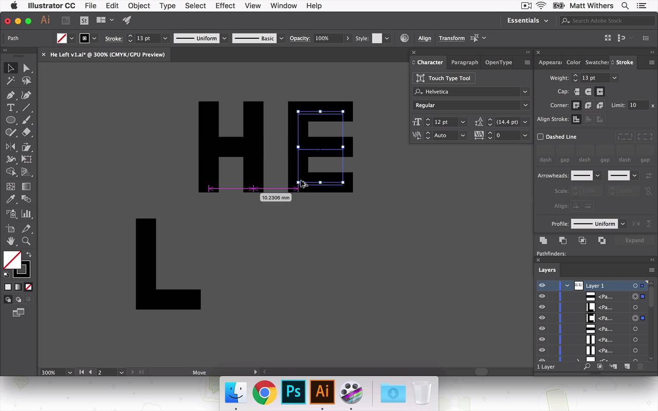

- Overview
- Transcript
5.3 'He Left'
In this lesson I'll be experimenting with different lettering styles for the 'He Left' text. You'll learn how you can draw your own letters using Adobe Illustrator's Shape Tool.
- Source File: He Left v1.ai
1.Introduction
1.1Introduction00:56
1.2Thinking Creatively02:50
1.3Two Voices02:50
2.The Concept Stage
2.1The Stories14:17
2.2Forming Ideas10:39
3.Research
3.1Mood Boards14:05
4.Refining Ideas
4.1Sketching07:53
4.2Perfecting the Final Sketch07:35
5.Creating the Artwork
5.1The Basic Shapes09:52
5.2'She Swiped Right'06:08
5.3'He Left'20:41
5.4Applying Colour11:31
5.5Perfecting the Design09:30
5.6Grain Effect11:07
6.Conclusion
6.1Conclusion00:44
5.3 'He Left'
Hi, everyone. Welcome back to the course. Now in this lesson, we are going to be looking at continuing to build our final piece of artwork for our story. So far, we have our background designed. We have, she swiped right. And we've been looking at getting the perspective of that text and the phone looking correct. Now in this lesson, we are going to be introducing the text he left in the doorway here. Now this is gonna be where we're going to start to really inject some of the feeling and the theme of the story. We're gonna try to get across some of the betrayal or anger that the man will be feeling in the story. And we're gonna try and bring that through in the style of lettering that we choose. So I've just been thinking about how I would like to do that. And I think I've got three different ways in mind that I'm gonna try. And they are all just gonna be drawing the letters myself, because I think this is kind of, for what I've got in mind, I think this is gonna be quicker to do rather than cycling through in these fonts. And then choosing one which is kind of right, but not exactly what I've got in mind. I think it is quicker to cut to the chase and use my friend, Pentel, to draw out exactly what I've got in my mind. So we're gonna try three different versions. One is gonna be quite a condensed-looking font. And then the next one is gonna be a bit more boxey. I would like some sharper edges. And then the third one, I think I'm gonna try filling the doorway with the text, he left, in quite bold letters. I'm really interested to see how that will work. It might feel a bit too shouty, but it'll be interesting to look at. And all of them, I think I'm gonna try them all in caps. Because, again, that's hopefully it won't look too shouty, but it will get across some of the anger hopefully. So the texts he left like condense fonts, and sharper edges, and things, and also [INAUDIBLE] quite masculine as well. So I'm gonna try, yeah, try using those things. So yeah, let's see how it goes. So the first one I'm going to try is the condensed looking text, so I put my friend, the Pentel here. I'm just gonna start drawing some very basic shapes. I'm gonna start drawing at the H, and see about just drawing one line there. Gonna duplicate that over here just by holding down alt, and they aren't that fillet mode, so we can't see them. I'm just gonna switch phase to stroke, and let's give them roughly eight point. So there are our two lines for the H, there's the cross bar there. And then I'm gonna duplicate this across to start building the E, and I've duplicated that one because I want them to be all the same height. Then, In stroke, Show the options. When you have this projecting, caps selected, so I'm gonna put that onto these. When you draw another line away from it, now, the top of that line is the same height as this. Whereas, before, if you take it up to here, it's slightly shorter, but I want them all to be the exact same height. So we're gonna add on that little cap just to make sure they're all the same size. And also, I want them all to be roughly the same width. So I'm just gonna drag that out there, there we go. Okay, so I'm gonna come back to these in a moment, and make them probably slightly bolder. I'm just gonna write out all the lettering quickly. And the nice thing about these letters is there's a lot of kind of common shapes and lines between them. So, for instance, with the F here, I'm just gonna delete this bottom line and we're already flying through our words. Just got the T to do now. Gonna duplicate that, just so we have the same line length again, the same height. I want it to be the same width so, Just gonna make it the same as this one. Okay, good. So looking good. Let's make this slightly bolder. Make it feel a little bit more angry somehow. We're gonna need to move these apart a bit. I'm going to just group all of the lines that make up the letters together. So to do that quickly, I'm just hitting Cmd+G which groups the letters. Great, so that's nice, bold, chunky lettering. May bring the stroke weights down slightly just to make it feel slightly less aggressive. I'll put it into our design in our doorway in a moment, and that might help me choose what is better. And I think I want as everything's the same shape and size. I think I'm gonna align these up too so that E and the F are gonna be on top of each other. And the H and the E gonna be the same. Make sure that these are the same, [INAUDIBLE] they have the same baseline. To do that, I'm gonna hit a line, and this one here should do it, then we get. Okay, so now zooming out, this line of the L feels a bit too long for me. It feels like the L in particular is really hanging out by itself out there. The T feels like it's a little more involved, I think probably because of how the the cap that comes across comes closer to the F, whereas, with the L, you've got a huge gap here. So I'm gonna move that in slightly. I'll probably move the T in a bit more too, and actually just move everything a little bit closer together. I'm probably gonna make this line length slightly shorter too, just so I can bring this line a little bit closer. And the T is hanging out by itself a bit too much, we can bring that in. Okay, that for now looks good, let's just drop it into our design over here. And now, it's gonna be huge because I've just made it smaller, and the stroke size stayed the same. So I'm gonna have to make the stroke size slightly smaller again. Okay, that's looking good, and I think what I would like to do is align it to the So it's the same height as she swiped right. So I'm gonna just do this group them all together, And then make it the same height. Not sure if that's working as the same height actually, I might make it the same, align it to the bottom of the T there, top of the E. Feels a bit too large in comparison. Okay, cool, feeling happy with that one for now. I'm gonna move onto the next style that I was just talking about. I'm just gonna save that quickly. And then I'm gonna duplicate that art board. So I've just hit Document Setup, come into Edit Art Boards. This new art board will create a new one, but I don't think I actually wanna create a new one. What I would like to do is duplicate this one. So I'm gonna hold down Alt again, and then click and drag. And then we have the same art board, just duplicated, so it's real handy to have. I'll get rid of that text for now, cuz we're gonna drop something new into there. Now with this one I'm going to do something similar to what we've got here. But instead of it being quite so tall, it's going to be slightly shorter. But probably I'm gonna try a bit fatter, a bit bolder. So let's just write that out again quickly. Just going to align the top of the T with horizontal bar of it. Okay, so that is too long. I'm gonna make that a bit shorter. Great, group all of the lines together again. So nothing gets missed. The H probably isn't quite as wide of the rest of the letters, so I'm just gonna make that slightly wider, great. Now, with this one, I think I make the spacing a little bit tighter between everything by making it feel slightly more uncomfortable, maybe, when the textures are quite really bunched up together. Let's see how that looks. So, I just wanna make sure these things are lined up. And, this one we're gonna have to make the H slightly, not quite as wide. And that's okay. Okay, that looks good for now. Let's drop it in to our design. I might play around with this one a bit more, make it slightly. Slightly more extended and less condensed. And that's the good thing about, as you're working with just the Path tool and just with strokes, if you were to expand this letter. And then if you were to make it taller or make it more extended than the thickness of these horizontal lines will then be effected as well. And it can make letters look really distorted and not what I'm going for here, but if you just gotten Selective strokes, the thickness of the letter stays the same. So that's why I'm still working with them as strokes at the moment, because that's just handy to be able to play around with, and it doesn't lose the integral shape. Now, this one, it almost looks a bit like a digital looking font. I'm not entirely happy with that. Kind of looks like it's from a computer just because of the sharpness of the edges, I think. It looks like it could be made up of a simple pixels. Still useful to see. Yeah, looking at this one again, I like how it kind of feels a bit cold, which I think suits the feeling of it quite nicely. Someone walking away from a relationship cause his been betrayed. I think it works well with that. So, looking this one again, I can't help but feel like cause it's looks like a digital, something you might see on that, or the LCD screen or something like that. It's not really working for me, that one. So the last one I wanted to try was filling this whole doorway, the whole space with HE LEFT. I think that would be interesting to take a look at. So we're gonna duplicate the art board again. Get rid of this version of text within it. And we're gonna use the Rectangle Tool this time. Find S of S for half ways booked. That I'm gonna use films instead of like stretch the outline. And to make sure I want the The width of each fill lines get to be the same. So just copied this shape here. You're going to paste it in place, so that again was shift alt command v. So now we have two versions of that on top of each other. And I'm gonna drag that and reshape it so now it's for crossbar. And again, just to make that shape there and that one, that was just holding down Alt, clicking to duplicate it, I want that to sit at the bottom align bottom for that, that looks good. Now, so he that is looking good. Let's start doing left. I'm gonna have to probably make It's slightly less bold to fit it in, so let's- Copy paste in place again. Cool, so I'm gonna- Group all of these shapes together to form each. We're gonna have to make this- Slightly narrower, so let's do that one. What we're going to do is group them all, and if you double-click it then, just to let you go into this section to work on it, just on the individual letters itself. So when you try to select for anything else you can't click on any of those other things, it's really handy just to edit some lettering like this. But I've just noticed that this part of the L isn't in the group, so I'm just gonna add that in. All right, here we go. So this is a slightly tedious way of doing this perhaps, but this is just the way I found that works for me when I'm editing something like this. So I've just highlighted all of the anchor points except this line in this one here, and I'm going to just nudge it three spaces to the left, and then same with this. So then these lines and these lines are all the same thickness, I'm just making the letters slightly narrower without editing the thickness of each of the strokes. So we squeezed a bit more, I just wanna get this T inside. Okay, are we getting there? Okay. Yeah, that is quite cool actually, and actually I should have mentioned that when you placing in place. So as I was copying these lines here and I was placing them in place, it does that to every outboard. So we just need to go here and make sure we get rid of them from the rest of our outworks cuz I've always had this interface for everything. Okay, so that's quite literally almost this one, but I don't know I quite like it. It looks, it definitely kind of gets across, I think like anger and the reaction of the story. Nice, that one looks understated, but I think it's working quite well. The one in the middle, I think, I'm gonna count that one out completely. I don't know, it doesn't really say much to me other than it just keeps reminding me of a digital-looking typeface that's not relevant for what we're going for. So I'm gonna leave it here for now. I'm gonna go have a little bit of a break and then come back. And then I will decide on which of these two I wanna carry on forward. And so in the next lesson, we're gonna start looking at using colors and eventually looking at some textures and then refining the design just to make it just perfect in the end. So, thanks very much for watching, and I'll see you all in the next lesson.


