
 Lessons: 15Length: 2.2 hours
- Overview
- Transcript
5.5 Perfecting the Design
In this lesson I'll be paying close attention to detail and the alignment of individual elements within the design. You'll learn techniques you can use to help bring balance to your design.
- Source File: He Left v3.ai
1.Introduction
1.1Introduction00:56
1.2Thinking Creatively02:50
1.3Two Voices02:50
2.The Concept Stage
2.1The Stories14:17
2.2Forming Ideas10:39
3.Research
3.1Mood Boards14:05
4.Refining Ideas
4.1Sketching07:53
4.2Perfecting the Final Sketch07:35
5.Creating the Artwork
5.1The Basic Shapes09:52
5.2'She Swiped Right'06:08
5.3'He Left'20:41
5.4Applying Colour11:31
5.5Perfecting the Design09:30
5.6Grain Effect11:07
6.Conclusion
6.1Conclusion00:44
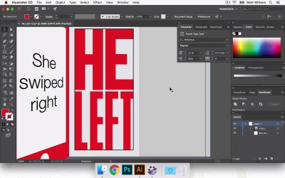
5.5 Perfecting the Design
Hi, everyone, welcome back to the course. In our last lesson, we were looking at bring in color to our design. And now, in this lesson, I am just going to be finalizing the design and the layout in Illustrator. And then in the next lesson, we're gonna take it into Photoshop. Maybe bring in some different textures and really try and amplify some of the emotion that's in the story. But just in this lesson, we're gonna look at things like making sure everything's accented in the center of the page and just some things like that. So I'm gonna show you one or two very quite basic tricks which will help you to get those sorts of things down as quickly and as effectively as possible. And I'm also gonna just tweak some of the lettering here just to make sure I'm entirely happy with everything like that before I take it into Photoshop and start finalizing everything. Great, so at the end of the last lesson we had both these different color versions of it. And I'm definitely gonna keep moving forward with just the red one and I'm take away this pink root here. So I'm gonna just select all of those things, get rid of that, delete that artboard. Then I'm going to save this as v3. So now what I'm going to do, is group all of that together. And what I think I'm going to do now is, I want the door, the phone and the doorway to be centered within the design. So to make sure that's happening, I'm gonna draw a rectangle, a square, even. Just make it an outline. So we can see it and then I'm gonna line it to the artboard. So it's completely in the center of the page. How do we make it more of a rectangle shape and then just by eye I'm going to move the design. So it's the center of what we have here, of the rectangle. So that's done it there. And I'm just gonna move these shapes out so they go right to the edge of the artboard. It doesn't matter if it bleeds over slightly because when we take it into Photoshop that shouldn't matter cuz we'll just place the artboard and we won't place the entire file in. Great, so I like how that's nice and centered now. I'm just gonna go and refine the HE LEFT. So I want HE LEFT to be in the center of the doorway. So to do that, again, I'm going to copy this shape and paste it in the same place and then I'm gonna make a smaller version of it. And I'm going to make the heights of it the same height as this corner of the phone screen there. And I'll make that into an outline, make it black so I can see it. And then we're going to group these things together again and move them into place. Now it would be nice, the H lines up to the bottom of the E nicely. So what I think I'm gonna do is do the same with the E, and this side of the F that looks quite cool. And then I'm gonna move this in slightly, just to make some of text look slightly more interesting, I think. And if I move that e it might make it slightly less legible. So I'm gonna keep that the same length as for top and the bottom. Now, I'm wondering if that is a bit too close together, so I might, what I'm going to do is, Draw that shape back in. Go into this group, bring that shape into there and then I'm gonna make these all slightly smaller. So then I can bring them out to the edges again, just to make sure everything can breathe a little better it doesn't feel quite so busy in there. In fact what I might do is, in the earlier lesson we made these letters a bit narrower. Now we can afford to make them slightly, extend them slightly, which will just help with legibility. Not gonna do it massively, just a little bit, should do the trick. Now having made that too far apart, Maybe it'd be nice if actually the angle of this is sort of pointing to the top of that corner of the H. I might move the LEFT up so we have the same effect coming from this angle pointing to the bottom of the L. I quite like how this distance here is roughly the same as the distance between HE and LEFT, I think that works quite nicely. I wonder if it looks slightly odd, as it's not all in the center, although I do quite like how this points to each of those corners. I think I'm gonna go back in to make it slightly larger. I mean it hold back together slightly. Cool, I like how it's closer together now. I think that makes it feel a little easier on the eye as these angles lead into the top and bottom of it. Okay, great, I'm going to leave the Illustrator side of things there. And join me in the next lesson where we will be refining and bringing in some different textures, maybe some kind of glows to help the light, the glow of the doorway come through. And yes, try and really amplify the kinda gritty emotion of this story. So thanks very much for watching, and see you on our next lesson.


