- Overview
- Transcript
3.1 Mood Boards
In this lesson I’ll show you to how to search for and bring together visual references. I’ll also show you a few useful resources and websites for image searching as well as a few inspirational letterers.
Related Links
1.Introduction3 lessons, 06:36
1.1Introduction00:56
1.2Thinking Creatively02:50
1.3Two Voices02:50
2.The Concept Stage 2 lessons, 24:56
2.1The Stories14:17
2.2Forming Ideas10:39
3.Research 1 lesson, 14:05
3.1Mood Boards14:05
4.Refining Ideas 2 lessons, 15:28
4.1Sketching07:53
4.2Perfecting the Final Sketch07:35
5.Creating the Artwork 6 lessons, 1:08:49
5.1The Basic Shapes09:52
5.2'She Swiped Right'06:08
5.3'He Left'20:41
5.4Applying Colour11:31
5.5Perfecting the Design09:30
5.6Grain Effect11:07
6.Conclusion1 lesson, 00:44
6.1Conclusion00:44
3.1 Mood Boards
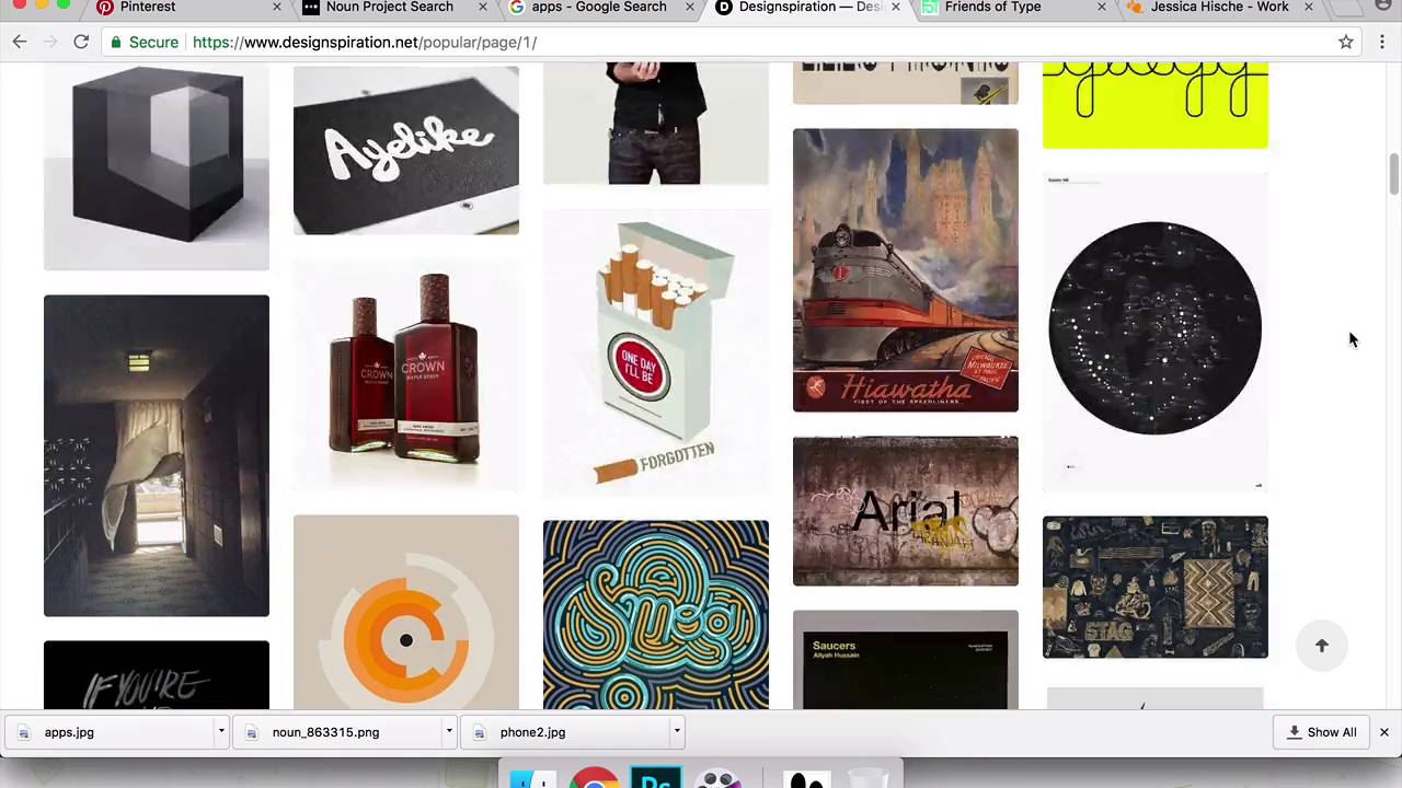
Hi everyone, welcome back to the course. In this lesson, we are going to be looking at pulling together some reference images and putting together a little mood board to help inspire our next stage of design. So as you can see here, I'm just in Photoshop. And we have a few images that I've already just been looking at and starting to pull together. So I'm gonna just complete this mood board and go on to the Internet and find some other images which I hope to find helpful. And then, I'll show you a few websites and a few designers who I think are some of the best and the most famous letterers and typographers in the contemporary lettering game at the moment. So hopefully that will be useful for you to see as well, and then we'll come back into the mood board, finish this off, and I'll talk through what I'm most keen on about these image. And how we might be able to use those going into our next lesson. So I'm just gonna come onto Chrome here and this is Pinterest. If you're not already familiar with Pinterest, it's a very useful website that allows you to save your own images and kind of create mood boards online. It's very, very useful, and it's got a really extensive pool of images to help you. So I have already just typed in phone illustration because I just wanted to show how the phone just as like a tool within illustration is quite versatile and it's very fun to use. You can use it in lots of different ways, hopefully, there'll be an image somewhere in here which we can use in our mood boards. So I'll just start scrolling down here. So images like this, where the screen can kinda become a pool or something like that. I really love how some illustrators and designers have used it in that way. And you see this one here, it's like a entire mirror. This one, this is quite relevant for what we're doing. It's a phone and it's someone cheating. That's quite cool. I might just go ahead and save that image. Then this image here, that's kinda cool, too. Maybe not so relevant for what we're doing, but interesting to see how something coming from the phone can be used as a part of your illustration as well. Okay, cool, well that's useful, that we got something from that page. And the next little website that I wanted to show you is called Noun Project. This is a website which has loads of icons. And you just come on here and search for anything and it will pretty much always churn back a useful icon relevant to what you've just searched. And I find it really useful because it often shows you what you're looking for in the most basic visual representation of it. So one of the things which we were looking at in our last lesson was, in that big list I had written down footsteps and people and the idea of leaving. So if you type in footsteps it gives you all these different huge choice of footprints and footsteps to choose from. Which is, I quite like these two, just gonna save that image, think. And then also, what I wanted to show you is how, also, when I'm looking for visual references, one thing I find really useful is just going on good old Google images. And typing in what I'm looking for, or the theme of what I'm looking for in there. And it doesn't, it's not, you shouldn't really be using it for finding, or you shouldn't really hope to find any, necessarily beautiful imagery on there. But it's good for basic reference things, and to kind of give you a broad idea of a theme. Google images is really good, so we're looking at apps in our last lesson. So I'll just type in apps here and it gives you a very good overview of things to do with apps, which is really useful to be able to see all in one place like this. So I'm just gonna grab one of these images. Which one should I go with? Yeah, probably this one. And then, these last few websites that I want to talk to you about are just really useful for looking for design references for modern and contemporary design. So I think these are all just pulled from are reputable and good blog. And they bring more here and it's got a really good search function as well if you want to try and look at have or something in particular. But It's just a really good overview of what contemporary in design right now. And I think it's like a never ending scroll thing too. So you could definitely spend a long time on here. Having a really good look at what's current. And then these next two are, this one Friends of Type is a group of letterers and designers. One of them is a guy called Eric Marinovich, who is one of the most famous letterers for the last few years, he's just got insane skills. And this is a blog that he and a few friends have put together. I think it's been going for quite a few years now and they just post some really cool just design posters. And I think they got commissioned to do big advertising things occasionally but they definitely seem to be doing stuff for themselves and design the things they think it would be fun to do. So yeah, definitely suggest having a look on Friends of Type, they've got some really, really amazing work on here and it's really diverse as well. It's amazing how they can be so strong in so many different areas of lettering, it's not just fine calligraphy. They can do brush things all by, stuff by hand, and then also stuff digitally as well. Yeah, definitely give these guys a look at, and then this lady is called Jessica Hische. She is an amazing letterer and type designer. She does lots of amazing design work as well as, lots of speaking events and talking about lettering and design. She's a great person to check out what she says. And she got lots of practical tips as well as being a designer and how to deal with clients and how much to charge and things like that. So she's great in math but then also her work is very inspirational too, so I suggest checking her out as well, she has a very extensive portfolio. And similar to Friends of Type, it's not just one lettering style that she can do, she can pretty much cover everything, and it's, yeah, all awesome. So yeah, give those guys a check out, Jessica Hische and Friends of Type. So we'll go back into our little mood board now and just finish that off. Okay, so this is just useful to bring together a few images just to see them all in one place. So you can see here. I've been looking at Tinder and how it looks on screen like how the app looks just to check if there's anything useful there we can use. And after looking at it now, I'm not so sure if there's anything that recognizable or exciting to use within that. But still, good to know, it's good to get to look at these things just in case there was something there. We also in our last lesson, we were looking at smashed phone screens, and so these two images here are like a smashed screen with the image behind it. And I've really, in particular, love this one here with the kind of refracting of the image through different sections of a smashed glass. And that really, the fact that it's smashed feels, will work I think really well with the betrayal heartbreak aspect of this story but then also the images kinda like chunks out into different sections like this. That makes it feel odd and disjointed as well. And I think that also, will work quite nicely with the theme of the story. So maybe that's something to use as well. And also, I think I mentioned in our last lesson too, how suitcases, like I said and the idea of leaving, similar shapes to a phone, maybe there's something in there we can use, and also a flat battery. And then someone leaving through a door, like doorways and phones again similar shapes maybe there's some way of looking at those two together. And then looking at swiping and the action of swiping. So this mood board over here is just, we're looking at kind of big picture still. We're not going down too much into detail of looking for specific references and type styles. Because at the moment, we're still looking at the idea, and making sure the concept of our design is coming through in a strong way. And I don't wanna get bogged down and lost in the detail of the aesthetics of the lettering yet. Enjoy looking at things like design inspiration, Friends of Type and I would suggest at this point of the process to be careful with looking at those kinds of websites. As I've often does this in the past is that you go onto those websites. And you see something that you really like the look of. And you think, wow, that's amazing. I really wanna just do something like that. But then actually, it was further down the line, you realize, it's not actually that relevant to the idea of what I'm really going for here. So definitely check those things out at this point, but just kind of use it to broadly inspire you. Try to not get too influenced by anything too specific at this point, I would suggest at least. And just kind of keep looking around the basic themes of what you're going for. Cool, so thanks for watching. And in our next lesson, we will be looking at starting to sketch and to kind of actually bring some ideas together and really kind of honing down what our final design is gonna look like. So thank's very much for watching and see you all next time.


