
 Lessons: 12Length: 1.2 hours
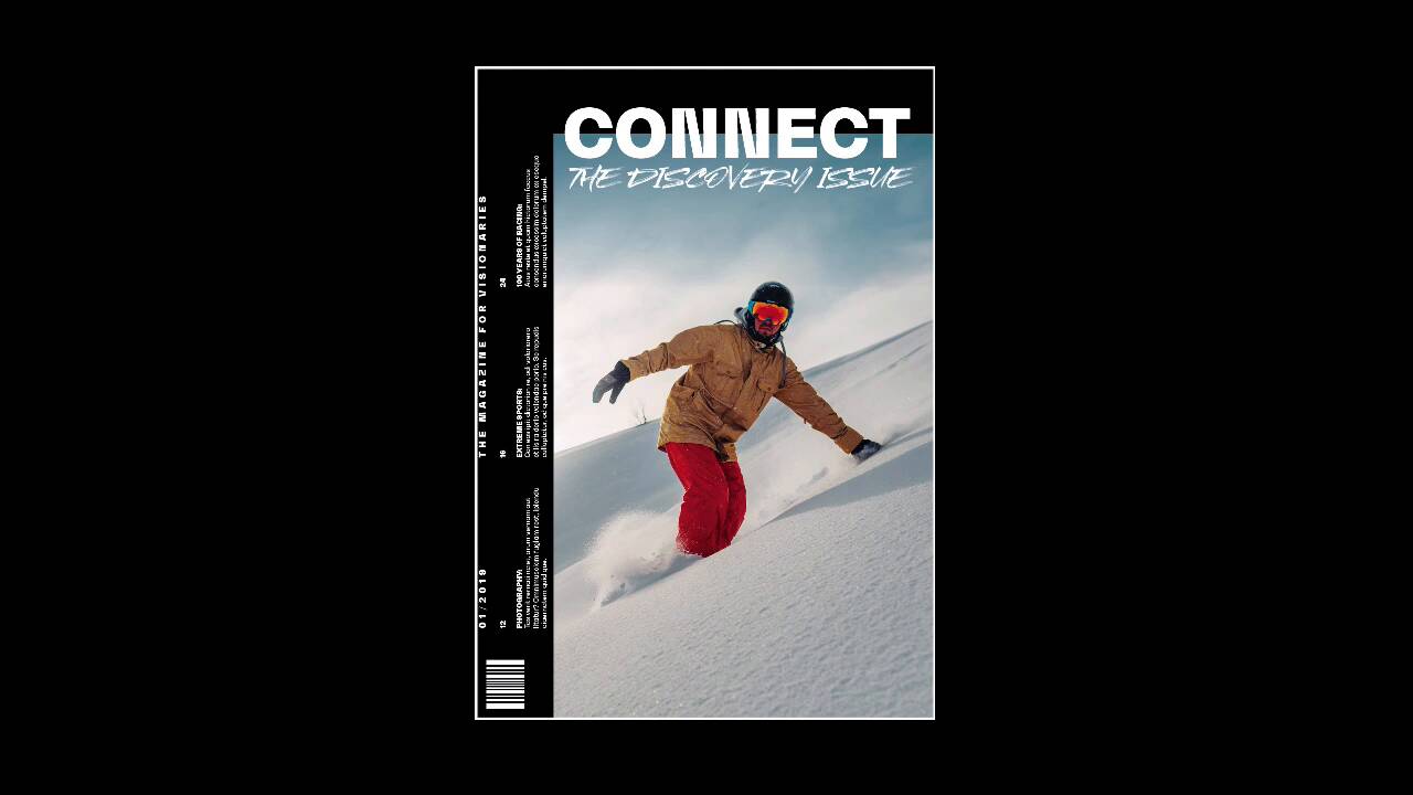
- Overview
- Transcript
3.4 5 Ways to Create Impact in Your Design
Time to get out of the box! Now that you understand the basic rules of print design, it’s time to break the mold. In this lesson, we’ll take a look at five ways you can turn your design from simple to impactful.
If you want to go even further, check out our course on Creative Magazine Layout Design.
Related Links
1.Introduction
1.1Introduction01:20
1.2InDesign vs. Affinity Publisher04:41
2.Getting Started
2.1The Essentials07:09
2.23 Ways to Create an Effective Workspace08:23
2.3The Structure of Your Document05:55
3.Design Elements
3.13 Foolproof Ways to Choose a Color Palette03:42
3.24 Typography Tips14:35
3.33 Essential Steps for Importing Images05:14
3.45 Ways to Create Impact in Your Design07:36
4.Printing
4.14 Steps to Get Your File Ready for Print04:26
4.2Exporting Files for Print05:01
5.Conclusion
5.1Conclusion01:59
3.4 5 Ways to Create Impact in Your Design
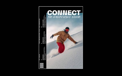
Hi there and welcome back to this course, Basics of Print Design. Now that we've covered all of the elements that you need in order to create a good print design project, it is time to get out of the box and explore a little bit. In this lesson, we'll take a look at a few ways to create impact in your design that will keep your readers engaged and interested. So first up is keeping it simple. So, in the 1950s and 60s the International Typographic Style or the Swiss Style came into full force in the graphic design world. And this style really made strong use of For which allowed hem to create really clean and organised designs. not only that but they were really impactful and they gave us a really good visual break from olden ways that we would see around. So, for instance, this 50th anniversary of the Moon landing poster design heavily uses a grid to organize information and to place information. So, that's the one good thing about using a grid structure. At the very top, we have the headline. And then at the very bottom, we have all of the information that we need. So, for example, here is an exhibition. So, on the last line we have a description of the exhibition. In the second last line we have all the information that people would need in order to attend it. In this poster I used only one font, Sans Serif to keep everything classic and clean. And then I left the middle part for the actual graphic. And that's what I wanted the reader to look at first. I wanted them to be able to know what this poster was all about, which is the anniversary of the landing on the moon. And then head over to the headline and then they could read the rest of the information at the bottom. So, keeping it simple is not always just keeping it basic, because it will give us a good break from all of the other designs that we see around in the world. And this is something classic, traditional and to the point. The second way to create impact in your design is by using full-bleed images. If you're designing a business card, or a brochure, or a magazine, using full-bleed images are a large size is a luxury. It causes so much impact, especially to a reader, if they're going through a magazine and they come across a beautiful big image like this one that we have here of coffee grounds. You can use a full-bleed image on a spread. Here I'm using it on one page. The image is also crossing the gutter towards the second page. That gives us the opportunity to not only use an image either vertically or horizontally but also give it a different dimension, here would be a square. An image like this takes a lot of real estate when it comes to your magazine, but it also creates a bigger impact to the reader. So, if you happen to be working with a great photographer who can supply great images. Or if you are using and Envato Elements, take advantage of that and blow them out on your spread. Next step is layering elements. And now we're moving away a little bit from the classic design that we saw on the first example. When I was a beginner designer, I used to design everything very flat. And quickly I learned that there are many ways in order to create depth. Creating depth in your design will help it stand out more. So, for instance, you can use drop shadows, highly textural images, but I still like the flat look, and I prefer to layer elements. By layering elements you also are allowing the elements to interact with each other and create a different kind of harmony, a different kind of texture that can really benefit your design. In this particular magazine cover, I use the name of the magazine to overlap the cover image. And then I chose to use white to contrast not only the background, but also the image that I'm using. I'm also using a Sans Serif which makes it even easier to read, rather than using the style where it says The Discovery Issue, then handwritten style, or a Serif. So, you have to weigh their pros and cons and what kind of fonts you can use, what kind of colors you can use in order for it to still work. On the left side, I chose to rotate the text, and I chose to keep it simple as well, but give it a little bit of an edge. This is a great segue to go into the next tip which is, change type direction. So, changing the type direction in your design can make it more dynamic and add more movement. Not only that, but you can also use type directions in order to direct the reader's eyes somewhere else. On this spread I was using photos of people climbing, and when you climb, you climb vertically. So, that was the inspiration behind using The vertical text. I used it on the left side as sort of a title for the spread, and then I used it on the second page too. Also, I tried to mimic columns by creating two different text boxes. This particular spread was created for an experimental editorial design course. So, we wanted to go all out. And even if it was created for a course, you have to keep that reader in mind. And last we have go all out experimenting. So, once you've learned all the rules of graphic design, it's good to get out of the box a little bit and experiment and try to develop your own style. There are so many ways that you can experiment by using Photoshop or using a simple image and just applying a ton of different effects to it. You can use analog materials, where you can actually cut and paste things with your hands in collage and scanning them. David Carson was a big fan of doing this, of working with his hands. Chris Ashworth is another designer that not only works with grids, but also likes to experiment outside of that, or experiment with the grid. For this particular poster, I used a front from Envato Elements that includes wider characters. So, that was a great way for me to experiment with that and use something a little bit different than your usual normal width characters. For the background, I used the brush to create different colored diagonals. And this image is actually a statue, where I turned it into black and white and then I close-cropped it, and moved different square shapes just slightly off. So it looks like there is a digital glitch on top of that. And then I added a little bit of noise on the background between the background and the actual image to create depth. You will notice that the layout of the information is quite basic. I have the title at the top, the location and the different stages at the bottom, but I tried to spice it up a little bit by changing the direction of the type. Not only on the stages, but also on the very right where I have the date, the website, and the address. So, you can experiment as much as you like. You don't have to go all out crazy. But just pushing a little bit with the boundaries every time you design something, it will allow you to grow as a designer. Now, that we've covered all of the elements of design, it's time to jump into the printing section. So, in the next lesson, we'll talk about the essential steps that you need to take in order to get your file ready for print. I'll see you there.


