
 Lessons: 12Length: 1.2 hours
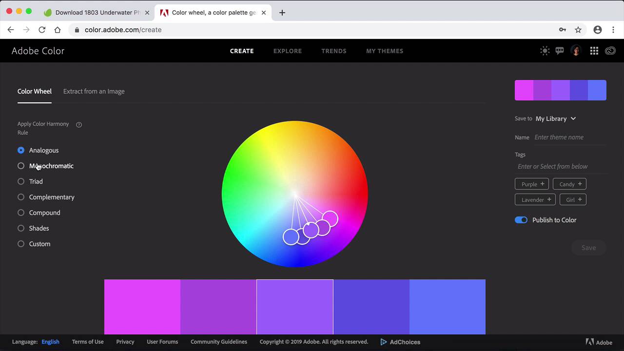
- Overview
- Transcript
3.1 3 Foolproof Ways to Choose a Color Palette
Deciding on a color palette can be surprisingly time-consuming! In this lesson, we'll look at a few tools and tips that can help make the process quicker and easier.
1.Introduction
1.1Introduction01:20
1.2InDesign vs. Affinity Publisher04:41
2.Getting Started
2.1The Essentials07:09
2.23 Ways to Create an Effective Workspace08:23
2.3The Structure of Your Document05:55
3.Design Elements
3.13 Foolproof Ways to Choose a Color Palette03:42
3.24 Typography Tips14:35
3.33 Essential Steps for Importing Images05:14
3.45 Ways to Create Impact in Your Design07:36
4.Printing
4.14 Steps to Get Your File Ready for Print04:26
4.2Exporting Files for Print05:01
5.Conclusion
5.1Conclusion01:59
3.1 3 Foolproof Ways to Choose a Color Palette
Hi there and welcome back to this basics of pre design course. In this lesson will show you three foolproof ways of choosing a color palette. Choosing a color palette can take some time, but there are a number of tools that we can use to make this step a lot easier. So let's start with the first one, is the color theme tool. This is a tool that InDesign added. Not too long ago, which is super, super useful. I've already downloaded an image from Envato elements, you can just do so by going to photos and selecting an image and downloading it. They have a great library that is always expanding. So for sure you'll find something there that you need. So let's grab the file please sit into InDesign. And the color theme tool is under the eyedropper tool. So hold a click there to open the other options. So color theme tool. Then click on image and that's the easiest way to select colors. So you can already see how you have to choose a successful color palette. Ideally you would need something that's very subtle, that can work as a background. Two medium light colors, one medium and one dark. We have a button here to add these theme to Swatches. I'll head over here to the Swatches panel. In here I have Colorful _Theme. The second way is the Adobe Color Wheel. So this works the same way as this was called before cooler. And basically, you have all the different color harmony rules, you select the main color, so the rest of the colors are based on that specific one. And then you can move the colors swatches around. Then, of course, you have to custom one where you can mix and match as you like. You can say this to my library you have Adobe Color one, save, and it's ready to be used. Another option here they also have is extract from an image. So we'll drop the image here. And the neat part of this is that you can actually move the five colors that we have here so we can either select a mood, and it will show you where exactly is grabbing it from. Or you can select None and move things around. And if we just quickly go back to InDesign. The color theme tool, if we click here on the arrow, it'll give us the same options as well, but not the one where it's custom, where you can move each color around. Next we have the Explore page. And of course, here you can type a theme and you'll get a result for the different colors. So this is how you choose a color palette, you'll notice that three colors should be really the minimum that you need to have. Because that will give you a range that goes from light to medium and dark. Five, I would say is the most that you need because then you're going to be struggling as to where you can use. Let's say the lightest shade or the medium shade, so I will say between three and five, and something that takes all the boxes meaning like medium and dark. Now that we've covered how to create a color palette. In the next lesson we'll cover everything from type hierarchy to paragraph styles, basics of type settings and the do's and don'ts of composing a text


