
 Lessons: 12Length: 1.2 hours
- Overview
- Transcript
3.2 4 Typography Tips
Let’s be real: type knowledge is so vast that we could talk about it for days. In this lesson, we’ll cover four key tips you can use to make better typographic choices. You'll learn how to pair fonts, how to create typographic hierarchy, and a few essential tips for typesetting.
Related Links
1.Introduction
1.1Introduction01:20
1.2InDesign vs. Affinity Publisher04:41
2.Getting Started
2.1The Essentials07:09
2.23 Ways to Create an Effective Workspace08:23
2.3The Structure of Your Document05:55
3.Design Elements
3.13 Foolproof Ways to Choose a Color Palette03:42
3.24 Typography Tips14:35
3.33 Essential Steps for Importing Images05:14
3.45 Ways to Create Impact in Your Design07:36
4.Printing
4.14 Steps to Get Your File Ready for Print04:26
4.2Exporting Files for Print05:01
5.Conclusion
5.1Conclusion01:59
3.2 4 Typography Tips
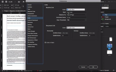
Hi there and welcome back to this course, Basics of Print Design. Let's be real, technology is so vast that we can talk about it for ages. And in this lesson, we'll cover four tips that you can use to make better typographic choices, and to also have an easier workflow. We'll cover type hierarchy, how to pair fonts that make sense. I'll show you how to use paragraph styles which can save you time and you'll work more efficiently. Let's take a look. Let's start with font pairings. Font pairings is one of those things that you have to train your eye in order to find something that works. And if you know the type categories, then that will make it a lot easier. We have some great articles at Envato that can help you learn more about the font categories. In essence, there are four to five groups of fonts. And if you head over to Envato Elements, they already have these categories on the left side when you're looking for a font. So it's Serif, Sans Serif, Script and Handwritten, and Decorative. So if you're looking for something specific, you can check one of the categories and Envato Elements will filter that for you. You can also choose depending on the size that you're intending to use it. So the more you'll learn about typography, you'll know that display fonts are not meant to be used as body text because that will make it a lot harder to read. I've already chosen a few fonts here from each category, so I can better explain how to pair fonts. Addington is a Serif font which is better used for long forms of copy. Next, we have Sans which is a Sans Serif. This font can also be used for text or for display. Next, we have Bouchers Layer Duo. And this is more of a decorative font so that it's right. It is a Sans Serif but at the same time it can be decorative because it has different layers that add shadow to it. So display fonts, like I said, they are better used as a title or if you're working on a restaurant menu, the name of the restaurant can go on this type of font. Because you're not using it in a long text, you're just using it for a few words. And the same goes for Bouchers Script, so you could pair this with Bouchers Layer. Of course, these two fonts are created by the same designer so they do match. And it's great to have something supportive either if you're using Bouchers Layer Duo or Bouchers Script. Addington and RNS Sanz are a great pair because Addington is a very basic Serif, very elegant and very readable, and RNS Sanz is neutral. You can use RNS Sanz as a headline and Addington as a body copy. Another great way to find great pairings is by going to Envato Elements and search for font duo. So some designers have already paired two fonts together. For instance, we have Jacksons Font Duo which is a handwritten font paired with a Sans Serif, it looks very elegant, a little bit old school. And then we have Ripon, which is more feminine, it will look great as a magazine opener. So the trick here is to not use two fonts of the same category. So don't pair a Serif with a Serif, try to pair a Serif with a Sans Serif or a Sans Serif with a Script or Handwritten. Next, let's take a look at Type Hierarchy. So typographical hierarchy is very important if you want the reader to know what to read first, what to read next. And it will also help you divide the information, how you want it displayed and what you want the reader to read first. Here I have an example of type hierarchy on a magazine spread. So at the very top we have the headline and the headline should be the larger font size they're using on a spread. The headline should be catchy, something with just a few words, not a full sentence. So that way the reader, if they're glancing over the magazine, they can just pick it up really quickly. Under the headline we have the deck, the deck can be used to add a small introduction to the story. You can use a Sans Serif or a Serif, here the deck is set at 30 points and the headline at 60. Under the deck, we have a credit line and credit lines are great for giving credits to the author of the article and the pictures. And only if we can use two fonts on the article, we can still create something different that can stand out from the rest. So for example, on my credit lines, I prefer to use all caps because it's a way for it to stand out. But I'm also using it at 14 points which is smaller than a deck but bigger than the copy. Next, we have the actual body copy. And the body copy I've set it to Addington at 9 points, I would say between 9 and 10, sometimes 8 depending on the font, 11 tends to be too big usually. On the second column, I have a Pull Quote. Pull Quotes are great to break some of the text, I've set this one at 24 points and extra bold. It is smaller than a deck but still bigger than the copy and width-wise it still gives me a few words for it to be able to be readable. Because I don't want only one word on each line, I want a good amount of words that people can still read it comfortably. The purple frame on the second page can house a picture and under it I have a caption. I use RNS Sanz for the caption at 8 points, Sans Serifs are very readable at smaller points, that's why I'm using it. And 8 point is not too small but it's still a good size to house some information. So now that we have all of our type hierarchy on the spread, we can start setting up paragraph styles. Paragraph styles are a great way to work efficiently especially if you're working with a long publication like a magazine. Once you learn how to work with paragraph styles, it will really help you get the job done quickly. So for instance I have the spread here that I talked about in our type hierarchy, and I need to have my paradox styles open. So I'll head over to Window > Styles > Paragraph Styles, and since we have our type hierarchy already set, we can start working on the smaller details. For example, I want the headline to be set to Title Case, the deck I want it to be on Sentence Case. I know I wanted credits to be all caps, and I'll start setting up colors here. I want the copy to have the first line indented, here I'll add some space before each line so you can see how it works with the baseline grid. So let's head over to InDesign CC > Preferences > General, let's make sure here that we can see the baseline grid. And here on the Preferences, I can change the start of the baseline grid to 0 at the top of the page, click OK. And if we zoom in here, you will see all these little lines through the document and that is called a baseline grid. Baseline grids are grade to align the text especially if you're working with different columns. So that way, the lines of text are going to be the same across all columns. So let's select everything here, let's head over to a paragraphs panel and at the bottom, select align to baseline grid button. You will notice that every line of text will be aligned to a baseline grid. If you head over here to the top and change the space of the first line, you'll notice it doesn't move. The reason it doesn't move is because we chose that every line to be aligned to a baseline grid. So the algorithm of the program is going to ignore that change and only use the baseline grid option. But if you put it to 0, then now it's going to move. So you can see now every line on both columns is aligned. So now to continue setting the paragraph styles panel, I want to add a drop cap right here. A drop cap is used for the reader to know where the article actually starts. There's no rule as to what kind of style you need to have a drop cap, you can choose any style you want, you can get super creative. Okay, so we have everything set now. Open the character styles panel, and I want to set this character style before setting the paragraph styles. So select the Drop Cap, click on Add New Character style, double click, change the style name to Drop Cap. Here you can double check for the options in the settings. I'll click OK. And now let's head over to paragraph styles. The easiest way to do this is by selecting with the text tools, select the text that you want to convert into a style. Add a new paragraph style. So the name, it's always good to go through the options and check that you have the right settings. And since this is a Drop Cap style, head over to Drop Caps and Nested Styles, select the character style to Drop Cap, We want it to take four lines and only one character. Click OK, and here let's just try it out really quickly. So click on this first line here, select Drop Cap, and it'll instantly apply the style, perfect. Now, I need to set a regular copy. So I'll click here, add a new style, copy, And you can continue to do the same for all the other elements. This is the fastest way to apply type hierarchy to all of the other articles that you will be working on. For example, here I'll add some text and I can apply any of the paragraph styles to it. Another benefit to using paragraph styles is that if you want to change the style of the font or the size of the font, you can open the Style and change the settings as you like. This change will only apply to the copy that you used the style in. And the last tip is basic typesetting, this tip becomes even more and more important the longer the publication that you're working on. If you're working with a brochure, you won't apply this as much. But if you're working on a magazine, newspaper, type setting is really important because then it defines how much text you can actually fit into one page. So for me, something useful to open is the info panel so head over to Window > Info, here we can measure the number of characters that it's in the line. So usually, you would have between 70 and 80 characters in a line for it to be comfortable to read. Let's measure here a couple and we have, 70, 75 so the column width here is okay, it's not bad at all. The info panel can also give you the number of words, lines and paragraphs if you select all of the text in this text box. When I'm typesetting texts, I like to use the Adobe single line composer. So what happens here is, if you're using the Adobe paragraph composer, the software is going to use an algorithm to move the lines and to break the syllables in each words. For me, I prefer using Adobe single line composer because it doesn't use algorithms at all, so it gives me more freedom to typeset the text. So for example here, I'll select a few lines and start tightening the tracking so I can fit more words or to get rid of some of the hyphenated words. Rule of thumb is not to have two hyphenated words back to back so line to line. And also the goal is to not have a weird shape on the right side of the column, because that can distract the reader and also it's not visually pleasing. A lot of designers prefer using the justify settings when typesetting a text. If you're using this, you need to pay attention to the h and j violations which is the hyphenation and justification. And if you remember, you can set this up in your preferences panel. So if you have this option activated, it will highlight the lines that are violating the minimum and maximum space value. You'll notice that there's some yellow that is very faint and some of it that is really strong. So the ones that are really strong are the ones that are really stretching the values. So for me, those will be the ones that I need to fix right away. And a way to fix it is by either tightening the tracking, but you will notice that in some lines if you tighten it, then the word space is even tighter. So there are way too many characters in that one line. And when you get into even more detailed stuff, you'll come across other problems like rivers, which is the wide gaps in between the words. You'll come across orphans and widows and then you'll have to start fixing those things. Orphans are lines that begin at the end of a column or a page. And widows are the last line that appears at the beginning of the next column or page. So the longer your text is, the more important typesetting becomes. Because you want your text to look visually harmonious and you want the reader to have a good experience and enjoy reading the text that you typeset. In the next lesson, I will show you the essential steps you need to know with importing images, I'll see you there.


