- Overview
- Transcript
1.4 Tips and Tricks
What should I include on a restaurant menu? How can I create a hierarchy? What paper should I use? Helvetica?
In this lesson, we'll cover some tips and tricks for creating effective menu designs and look at lots of great restaurant menu ideas. If you're stuck for menu design ideas, this video will help!
1.Introduction4 lessons, 20:32
1.1Welcome to "Restaurant Menu Design in Adobe InDesign"01:01
1.2Restaurant Menu Design Assets and Software02:04
1.3How to Edit a Restaurant Menu Template12:26
1.4Tips and Tricks05:01
2.How to Create a Menu Card5 lessons, 38:27
2.1Setting Up a Menu Card File03:39
2.2Color Swatches and Styles13:12
2.3Using Tables in InDesign05:50
2.4How to Design a Restaurant Menu Card11:44
2.5Preparing the File for Print04:02
3.How to Create a Trifold Menu4 lessons, 24:53
3.1Setting Up a Trifold Menu Design File05:42
3.2Color Swatches, Paragraph Styles, and Tables08:05
3.3Completing Your Trifold Menu Design07:56
3.4Preparing the Trifold Menu File for Print03:10
4.Conclusion1 lesson, 02:02
4.1Conclusion02:02
1.4 Tips and Tricks
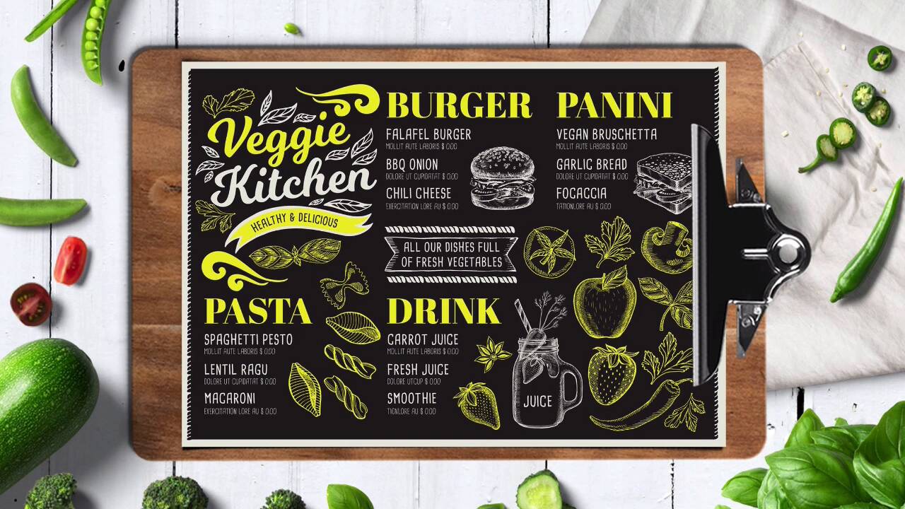
Hi there, welcome back. Before we start with this course, there are a few tips and tricks we think you could take in consideration before designing your menu template. There are a few key elements you must have in your menu template or design, name of the restaurant, location, and phone number. These are important if people are taking menus or tri-fold menus home, especially if you're designing for a takeaway restaurant. Make sure that the menu contents are divided into sections and with prices, this will ensure that everything is nicely laid out and separated into categories. Optional elements are opening hours. This is helpful for takeaway restaurants as well as social media handles. Social media is a great tool for marketing and sharing. It is becoming increasingly popular to attract other customers, so this is a big plus as a template. These are the more important elements that you need to have, especially the top three. This is just basic information that will help customers get in touch with the restaurant and be able to order. Let's take a look at a few tips and tricks when designing a menu layout. Use grids for the layout. Designing a menu requires order and organization. So long blocks of text can be hard to read and digest, so it is a great idea to divide a content in sections. Try to see if you can split up the text into different categories. It will also help if you have clear demarcation lines, or a gap to make clear where the category starts and ends. For example, in this first menu, there are eight categories and each section is divided by the title of the next category and a stroke at the top and the bottom. On this second example, if you're playing with colors or if you have a theme, you can play with different borders, colors, and style. This tri-fold is dividing sections into the different panels, and the two outside panels have two different categories, as well. This also comes in handy if you have special dishes of the day or special drinks. So any suggestions that you have for your restaurant and something that will help the customer decide what they'll like to eat. Next step is enhance the menu with visuals. So use illustrations and use photography, but make sure that these are really good quality. Depending on your restaurant, illustrations can evoke a certain mood. Line illustrations can add a playfulness and an easygoing vibe, like this first menu. And because these illustrations are on a black background, it makes it look like it's drawn on a chalkboard. So instantly, it just gives you that rustic feel. So always keep in mind that you're using really good quality illustrations that fit your restaurant. Photographs are another great way to apply visuals to your menu layout. Invest in good quality photos of items on your menu, and this will help let customers know what to expect. If there is a dish the restaurant is known for, maybe that will be a smart idea to put a picture of that dish. And it is a way to tell the customers look, this is our tastiest dish here, the most delicious, the most ordered, and that's a smart way to bring them in. Next step is use funky fonts, spice up your layout with different fonts. If you're going for something classic and elegant, it's okay to tone this down. But if you have a theme in your restaurant, why not go all out? This retro diner is using typical fonts from the 50s that just help enhance the mood. That can be just enough to make every piece in the restaurant just work together nicely. This tri-fold menu is using a font that adds depth to the design. You can go crazy with a style, like on the diner menu. But for this one, just something small, like adding a shadow will add a depth of field and just something special to the tri-fold. And last, we have use different backgrounds. Backgrounds and paper choices are often overlooked in menu layouts. So by applying a background, you can add another dimension and evoke even more feelings through the design. You have two options here, you can either use an image as a background or you can use an actual paper. So, for example, this watercolor background helps enhance a romantic feel on the menu. So for this, you can either add a watercolor image or you can also customize white paper with your own watercolor design, and then you can print on it. So every copy of the menu that you have will have a very different watercolor design as a background. This tri-fold brochure is a great example of mimicking a vintage scratch paper. If you want a rustic or a grunge-like feel, a scratch old paper texture can help you achieve that. And, again, you can use a textured image or perhaps you can head to the art store, and you'll find different papers that you can print your menu design on. Now that we've walked you through the essential elements on a menu card and a few tips and tricks, it's time for us to get started on the design. So I'll see you in the next lesson.


