- Overview
- Transcript
3.3 Completing Your Trifold Menu Design
Story-telling is important when creating a trifold menu design. In this lesson, you'll learn how to design a cohesive pacing to tell a story that will make sense to the reader. We’ll add supporting images, menu items, and finally create a compelling and elegant cover.
1.Introduction4 lessons, 20:32
1.1Welcome to "Restaurant Menu Design in Adobe InDesign"01:01
1.2Restaurant Menu Design Assets and Software02:04
1.3How to Edit a Restaurant Menu Template12:26
1.4Tips and Tricks05:01
2.How to Create a Menu Card5 lessons, 38:27
2.1Setting Up a Menu Card File03:39
2.2Color Swatches and Styles13:12
2.3Using Tables in InDesign05:50
2.4How to Design a Restaurant Menu Card11:44
2.5Preparing the File for Print04:02
3.How to Create a Trifold Menu4 lessons, 24:53
3.1Setting Up a Trifold Menu Design File05:42
3.2Color Swatches, Paragraph Styles, and Tables08:05
3.3Completing Your Trifold Menu Design07:56
3.4Preparing the Trifold Menu File for Print03:10
4.Conclusion1 lesson, 02:02
4.1Conclusion02:02
3.3 Completing Your Trifold Menu Design
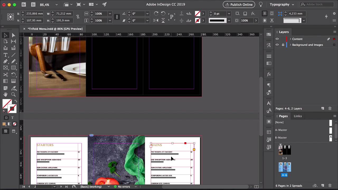
Hi there and welcome back to this course. In the last lesson we added color swatches paragraph styles and tables for a trifold menu and in this lesson we'll finish designing it with the help of storytelling. Let's take a look. So here on our table, I've added a few more menu items and descriptions using the placeholder text. Let's add a new section down here leaving a cell in between the content and style it with Paragraph Styles panel. I'll just copy and paste information that we have at the top. And here, it would be nice to have a little break from the content. So maybe we can add a photo. Navigate to the assets of the trifold brochure and select the tomato soup image. You can drag this from the window and drop it into InDesign. And here I'll just click to place it. Resize the image to meet the bleeds at the top and the bottom and then to fit the second panel, the width of the second panel. Using the Direct Selection tool, click on this circle and you can move the image around Perfect. So this gives us a break in between the text that we have for the menu. It's a great way to display maybe something that's on the menu to present it to people visually. Now let's set the third panel in here. I'll just press option and drag the text box towards the third panel. Since this panel is smaller, we have to resize the column, double-click on the stroke in-between the two columns, and drag towards the center, so we can resize it. Here I'll add different sections. Note every restaurant has only six things on the menu or, you know, you want it to look a little bit different compared to the first panel at least for looks and then people can edit it as they need. So add a couple more here, a new section, for desserts. And that said, that's our inside panel. So we have plenty of space here to display the dishes. We have an image, which is a nice break in between the two panels. It also works to entice people to ordering just reinforces that this is a restaurant menu and not just a marketing brochure, let's say. So let's head over to now the first spread, panels one through three. The first panel is the panel that folds in, the second panel is the back, and the third panel is the cover of the menu. Here is where storytelling comes in handy because we can play with the images and the placement of the rest of the information. Navigate to the trifold brochure folder where you have the images and here I'll pick up the server with the two wine glasses. Drop it into InDesign, resize this to fit the one panel, the first panel. Use the direct selection tool A on your keyboard and let's place this image a little bit better so we can take full advantage of it. Since the inside of the panel is white, maybe a black color on the outside will be good. Black is very versatile, it's elegant and this is the kind of vibe that we're going for with this trifold. Using the rectangle tool draw a rectangle to fit the second and third panel. Make sure that you're touching the bleeds. Select these two elements head over to the Layers panel and move them to the background and images layer so we can work on the top for the content. The same for the inside panel and let's lock the layer. Now let's work on the content. Copy one of the tables from the inside brochure and paste it on the outside Command C and command V. Place the table on the second panel. Zoom in here and change this to DRINKS, and this to COCKTAILS. So since we used black for the menu items, we'll have to change these to white. We can do so manually, by selecting every single item, for the prize since everything is black, and we have to change it to why you can select the whole column. Press J on your keyboard to activate the color, for the type I select Paper. We can also create a new paragraph style, now that we've changed the color to white here. So select part of the text of the menu item, head over to the paragraph styles panel and add a new style. Here we can change the style name to menu item white and click okay. Head back to the table on the second panel here, re-style everything to the menu item white. Let's copy and paste, so all of this content down here, and let's extend the table, as well. Perfect. Since we created a new style for the white text, we can change the price column as well. Now lets work on the front cover. Head over to the folder with the images for this trifold brochure and select the table set image. Drag and drop it into InDesign. And here I just want it to fit in between the margins, I want to extend this image a little bit more but focus on the key elements. Using the selection tool make the image longer, and then press A to use the direct selection tool and with this tool make the image bigger. Hold on shift to resize it evenly. Here I just want to move it a little bit to find a good crop. And now we can add some text. Using the text, we'll create a text box over the image, the name of the Bar or Restaurant will be 3030. Use a paragraph styles to style the name with the restaurant name style. On the second line, I will add kitchen and bar and I'll use the restaurant tag or description style for this. The last line looks a little bit too tight so maybe we can add some tracking to let it breathe. Double click on restaurant tag or description. Head over to the basic character formats. I'll move the window here so you can see the changes. Let's set the tracking to 200. That looks better. Click OK. Add a new text box under the image and here we can have party room reservations and a phone number. Style this with a telephone in address style and we can center the image. Make sure that you have this Smart Guides activated so you can help you center things evenly. You can see the green arrows, that is a lot of help when you're trying to align things in InDesign. Perfect. So we have designed the inside and outside of the trifold menu. Using the tables we kept everything very organized and neat. Everything has the same distance, so it looks very consistent throughout all six panels. We use black on the outside and white on the inside and that's a nice contrast to have when people open the menu. Now that we're done with the design of this restaurant menu template, I'll show you how to export the file for professional printing and how you can package this as a template. I'll see you in the next lesson.


