- Overview
- Transcript
2.4 How to Design a Restaurant Menu Card
In this lesson, you’ll learn how to create a menu by adding your own content to the restaurant menu template and creating an effective layout. You'll use everything you learned in the previous lessons to successfully format the food menu design. Finally, you’ll see you how easy it is to edit colours and fonts to personalise the template.
1.Introduction4 lessons, 20:32
1.1Welcome to "Restaurant Menu Design in Adobe InDesign"01:01
1.2Restaurant Menu Design Assets and Software02:04
1.3How to Edit a Restaurant Menu Template12:26
1.4Tips and Tricks05:01
2.How to Create a Menu Card5 lessons, 38:27
2.1Setting Up a Menu Card File03:39
2.2Color Swatches and Styles13:12
2.3Using Tables in InDesign05:50
2.4How to Design a Restaurant Menu Card11:44
2.5Preparing the File for Print04:02
3.How to Create a Trifold Menu4 lessons, 24:53
3.1Setting Up a Trifold Menu Design File05:42
3.2Color Swatches, Paragraph Styles, and Tables08:05
3.3Completing Your Trifold Menu Design07:56
3.4Preparing the Trifold Menu File for Print03:10
4.Conclusion1 lesson, 02:02
4.1Conclusion02:02
2.4 How to Design a Restaurant Menu Card
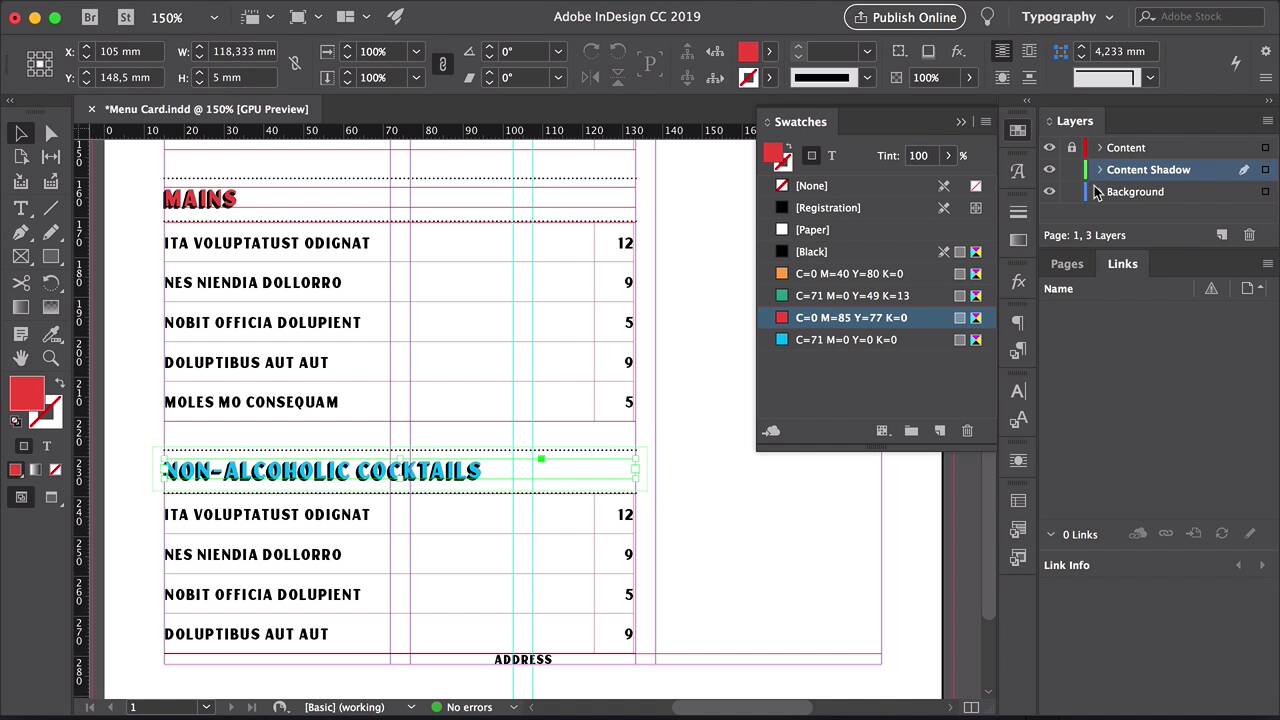
Hi there and welcome back to this course. In this lesson, we will be adding the rest of the content to the menu template. You will learn how to create an effective layout, and we will put them to practice the lessons that we learned at the beginning of this course. Let's take a look. So here I'll just copy and paste different parts of the place holder text so that way it looks like it's a little bit more real. Select the line tool from the tool bar. Then we'll draw a line on the first two columns. I want to set the stroke color to black. And change the style to dotted. Set the stroke size to 1pt, and I just want to lower this a little bit so that way there is a real contrast between the name of the restaurant and the rest of the menu. If you're looking to align things or have the same distance between elements, using the Smart Guides is a good choice. If you don't have them activated, head over to view written guides, Smart Guides or Command U, and that will give you the green lines you are seeing. Duplicate this stroke by pressing Option, and move it towards the right. I just want to resize this so if it's the one column on the right. Select the name of the section both text boxes and press command B. Check the Ignored Text Wrap option. Let's open a Text Wrap, head up to Windows Text Wrap. Select the wrap around bonding box here. And set the box to be 3 millimeters all round. And here, just to make sure that the line or the stroke at the top has the same distances that second stroke that we will be creating. So press option, select the stroke and drag down. And let's place this at the bottom of the text wrap. So you can see that visually, it's a little bit off. I just want to move this up a notch. That's because of the shadow. This shadow is sitting lower than the regular style of this font. So that's why we need to maybe take it up a notch. Move the table so the top of the table is touching the bottom stroke on the name of the section. Let's zoom out, move the drinks to the bottom since the drinks are always the last things on the menu. Select all the elements on the menu on the left side. Press Option and drag down. I just want to place this at the bottom, right at the bottom of the table, now press Shift and the down arrow that will move. What this will do is it will increase the amount in moves down instead of just pressing the down arrow without shift that moves all the elements just a few pixels at a time. Lock the content shadow layer. Change the name here to Solids. On the swatches panel I'll change the color, and then I'll do the same for the shadow, Keeping it black. Duplicate this again, select everything, I'll move the drinks down. Select everything again, press Option, drag down so it duplicates. Remember to place it right at the bottom of the table. Press Shift Down Arrow and you will be your move it down. Now, let's just do one for items in each section of the menu. So let's say we want to delete one row of the salads. Select the row. I'm getting rid of all the text, right click. Head over to delete, select row and that will delete one row. If you want to make the text box smaller, double click on the center point of the text box and that will automatically shrink it to the size of the table. So again, let's move this up press shift. Down arrow, perfect. Let's change this to five. And using the place holder text, we'll just copy and paste items. Change the name of the section, change the color and make sure that you're also changing the content shadow. Let's delete the drinks here and duplicate all the elements from this last table. Delete the last row, Lock the content shadow, we'll change here drinks here to non alcoholic cocktails. Unlock content shadow to the same. Here is where the two column is going to come in handy that we created at the beginning of this course. The bottom part of this menu template will be dedicated to drinks. But since we have two columns, we can create two subdivisions for the drinks. Select all the items, press SHIFT and click on the table so that way it deselects it. And resize this to take only the first column of the two columns we created. Double-click on the stroke in between the two columns and drag in, so that we fix the first column. Let's double-click here on the text box, so that way it shrinks, and that's it. Now we can duplicate this to the other side, the second column. So select everything, press Option and drag towards the right. Here, I'll just have cocktails. I'll change it on both the content and the content shadow layers. So that's looking pretty good. Maybe let's move this up a little bit so we can bring everything up and try to make everything fit. So we can have some room at the bottom for the address. Duplicate this stroke. A clear delineation from the end of the menu in the address. So pressed option drag down and resize this to fit the whole page. So please hold the text for the address. Select everything. Head over to the paragraph styles panel and select the restaurant address style. See the size of the font is a little bit smaller here, it will be good to add some space in between the letters. So set the tracking to 50. And that will give it a little bit more area in between, and it will be easier to read. Let's move down just a little bit more, and it's good to zoom and out, and see what is working, and what's not. So you can look at the spaces, if they're tight, or if they're too airy, if there is too much breathing room, you just tighten things up. Duplicate the stroke on the third column, press option and drop down. We can add the stroke to have a clear delineation to between the menu and we can either have some quotes or specials here on the other side. Extend this down, and here is just a matter of moving things just a few pixels here and there. Duplicate this vertical stroke by pressing Option and drag, resize it to fit the drinks. And I just want to resize this stroke to hit the top of the letters. Let's see maybe just having maybe just having one stroke at the very top will be enough to also judge this visually. Not only mathematically when it comes to spaces, but see what works best. Maybe there are too many elements and just having one stroke here for the drinks will be just enough. So that looks much better. Okay, now we can work on this column here on the side. So select the text and duplicate it dragging down, press option. Make the text box a little bit bigger. Let's see, let's have here, You can have gluten free and vegetarian options available. To lock that layer, bring up the content shadow layer and let's do, let's write the same thing. Duplicate this stroke so that the top is separated here from the bottom, otherwise it will be too much of a wide gap in between. Let's change the color here to yellow. And then we can change also the contents on the top here. We can have asks your server for daily specials. Let's do the same for the content shadow. Move this a little bit lower. So, like both text boxes and try to align them and the last thing that I want to add is a background. So lock both of the content and content shadow layers, select the background, and navigate to where the paper textures are on your computer. Select textures, I want to select something almost like craft paper, but not too dark. So 129 is looking good. Let's see, maybe this is a little bit too dark. To work with our colors 129, select 129, drop it on the menu template. Now we'll just draw here where I would like the background to go. Press R on your keyboard and rotate this vertically. In here, just make sure that the image is touching the bleeds. Maybe it is too strong. It could be this could be a bit too strong, so let's play with the opacity. And there you have it. This is our final restaurant menu template. We cover how to lay out the menu in a nice way so it doesn't look too busy or too empty and how to subdivide the drinks section. In the next lesson, I will show you how you can export files for printing and how you can package files as a template. So you can distribute it to clients or if you want to for example, sell assets that is also possible. I'll see you in the next lesson.


