
 Lessons: 21Length: 1.7 hours
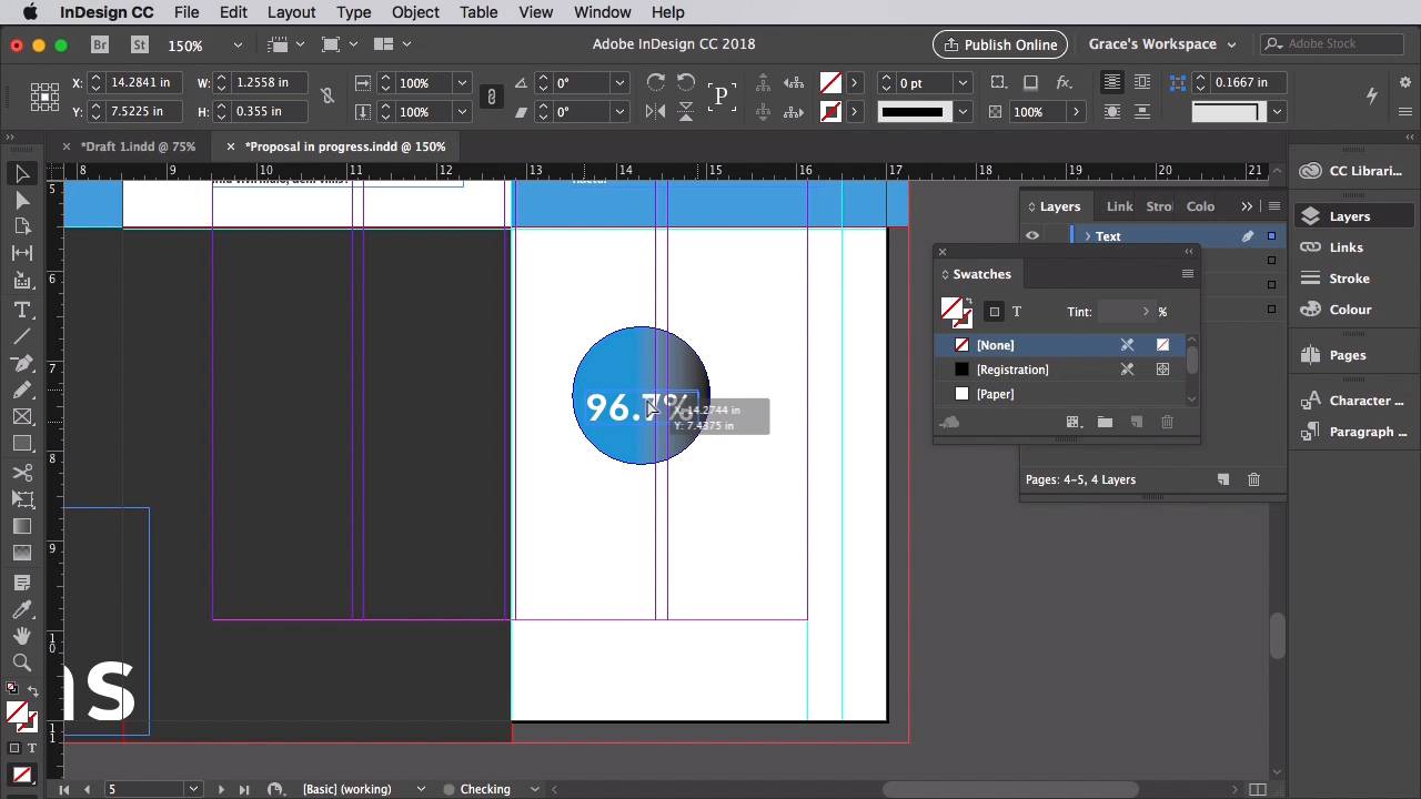
- Overview
- Transcript
3.8 Styling Your Proposal: Shapes and Stats
Proposals often contain lots of facts and figures, but these don't have to be dull for your reader. Presenting these as interesting graphics can help draw attention to key pieces of information and make them easier to read.
1.Introduction
1.1Introduction01:53
1.2What Is a Project Proposal?04:03
1.3What You'll Need to Create Proposal Documents01:41
2.How to Adapt a Proposal Template
2.1How to Choose a Suitable Proposal Template04:03
2.2Getting to Know Your Template06:23
2.3How to Adapt Your Template (The Easy Way)03:21
2.4How to Redefine Styles in Your Template05:44
2.5How to Format Color in Your Template03:07
2.6How to Edit Master Pages in Your Template03:33
3.How to Create and Design Your Own Proposal Layouts
3.1Setting Up Your Proposal: Part One03:14
3.2Setting Up Your Proposal: Part Two05:41
3.3Styling Your Proposal: How to Find Inspiration08:07
3.4How to Create an Effective Cover for Your Proposal08:01
3.5Styling Your Proposal: How to Create Type Styles06:25
3.6How to Create a Contents Page for Your Proposal07:03
3.7How to 'Map Out' Your Proposal09:42
3.8Styling Your Proposal: Shapes and Stats02:31
3.9Styling Your Proposal: Images07:26
3.10Preparing Your Proposal for Print: Preflight04:00
3.11Preparing Your Proposal for Print: Exporting03:45
4.Conclusion
4.1Conclusion03:08
3.8 Styling Your Proposal: Shapes and Stats
Proposals can at times be a bit dry. You've got to present financial breakdowns as well as stats about your business. Sure, you could pop these into your body text, but it's much better if you can pull out key facts and figures in a more interesting, engaging way for your readers. Now that we/ve created a sort of brand look for our proposal, we can lift elements of this to help build our graphics. So in our proposal and progress document, we're going to keep working on this chapter three spread. Unlock the shapes layer and scroll up to the chapter one's spread for a moment. Select the blue circle, and edit and copy it. Then move back down to page five and edit and paste it. Hold shift while you scale this down to about a one and a half inches diameter. On the text file, let's create a text frame over the top of this, and set the font to Medellica Bold 29 point font size, and up the tracking to 40. Let's change the font color to paper. So we can type in a number such as 96.7% and create a new text frame to the right of this explaining that statistic. So, for example, of visitors to our apps would recommend them to a friend. Let's set the font of this to Glen Sans, size nine points. Leading to 15, tracking to 20, and the font color to 90% black. Okay, so this is a little ready made graphic you can use for other stats. Let's select the circle and the text frames and copy and paste them and move it below. We can create a little title above this reading Our Stats and set the font to Metallic Extra Bold size 24 points and set the tracking to 20. So It's a really simple idea, but basically you can use this formula of circles with text to create statistics that look a bit more interesting. And it's also a really good visual technique for drawing attention to stats that might be particularly enticing or interesting for the reader. In the next lesson, we're going to use this technique again, but this time to create a stylish way of presenting some of the images in our design. So save your document, and we'll take a look at how to use images in your proposal in the next video.


