
 Lessons: 12Length: 2.5 hours
- Overview
- Transcript
3.2 Texturing Foliage
Using a bit of photography, we can now give our foliage a more realistic look using photographic textures and custom brush work.
1.Introduction
1.1Introduction00:57
2.Creating an Environment
2.1Line Art / Composition14:13
2.2Blocking In Colors14:46
2.3Adding Form and Lighting12:38
2.4Refining Edges15:16
2.5Refining Edges Continued15:00
2.6Refining Foliage14:52
3.Adding Texture and Foliage
3.1Adding Texture14:47
3.2Texturing Foliage14:57
4.Finishing Up
4.1Adding Finishing Touches14:55
4.2Adding Character13:43
5.Conclusion
5.1Overview03:34
3.2 Texturing Foliage
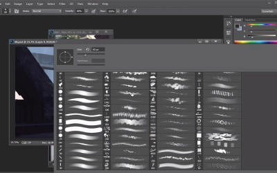
Okay, so I turned the foliage back on and we're gonna get the foliage figured out here right now and get that done as quickly as possible so we can start doing a little bit more atmosphere, that kind of stuff. But we're close to the end here because you got pretty much everything that we need. So before we start on the foliage let's actually add a little bit more detail in here in terms of adding just a little, some lines in terms of small little details, cut lines, all that kind of stuff. All these kind of things will help add to the livability of this guy here a little bit, so you're gonna see me move some things around and put in some lights here and there. Little bits of value and stuff. And that's kinda gonna help break up the edges and it's gonna kinda help sell this idea of this little piece. This light is kinda hitting it and stuff like that and you know we're gonna kinda put a little bit more here. If at all possible, so just some small details, nothing too crazy here guys. I don't want to kind of overcomplicate things. So it's just kind of important here, that I get this to look right. All right, so I think we're good, honestly, on all this kind of stuff. I could like sit here and probably with loaded time you can probably sit here and render it out but for anything this is just showing you guys an idea of where you can take this when you have the time to go for it which is pretty straight forward. I definitely think this is looking pretty solid from where we were. If we start from right here, turn that liner on and group everything else, it's definitely not bad. Let's actually make a white layer underneath it so you can really understand what's happening there. That's definitely not bad from where we were, to go from that to that, it's definitely a pretty good spot. Overall I'm pretty happy, let's keep it going. I think we gotta change a little bit of the color. Luckily the color is kind of matching what I want here. Why not just use it in the painting, you know what I mean? Because those questions are being answered, and then I don't have to worry about the lighting, stuff like that. And I'm just using the gradient tool right here to get some of these lighting options here. Just a tad bit, and see, look at that, already solving my problems. So that's kinda where I wanna go with this if at all possible, so let's see if we can maybe use some of that to to our advantage, so I'm gonna grab maybe this kind of brush here, and just layer it if at all possible. And I'm gonna look at these values right here, and I'm gonna try to keep them I'm going to try to retain some of that information, but all I really want here is texture and repetition so that's kind of the texturing phase here. And I just kind of want these little bits and pieces of light and value. So right here we see that nice little light value, that's kind of what I want. And so right there a photo kind of helped answer our question there. And so that's where the fact that I painted this from my head in terms of color, I might get some things wrong a little bit, so why not have a photo help you? So you take your own photos, it's your own reference. Now you don't have to necessarily worry about anything, you can just go for it. So this is where taking your own photos can help. And so you kind of notice when I teach and stuff like that I'm about using all of my tools at hand. I don't really neglect anything. If I think it's gonna help me, then I'll use it. That's pretty much what you should always do especially when we're kind of thinking about the stuff in terms of production. So, a lot of this stuff isn't necessarily meant to be hanged up on a wall, it's mostly to answer a question, and in that we'll kind of again move through production and people will then model this thing out or it'll be a kind of an idea for a gameplay, for a movie or a shot in a film. So, when you start working with production the things kinda change and so it's all about kinda communicating our ideas and so does this look like foliage? Does this look like, does this look like what I'm trying to paint? If it doesn't then that's where we need to kind of start asking ourselves questions as to why. Why is this not working? Why doesn't this read right? Why is what I'm drawing not being perceived well? And so, that's kind of what this is all about. And the more you practice, the more you're going to kind of get that down. So I was going to maybe go like maybe, 80% here, just so I can get a little bit more and actually, that's gonna transfer back on. I feel like we need a little bit more of a softer tone here. We just want some of those values just to kind of come show through a little bit. So, I might even be able to kind of take some of the values from the tree itself and just kind of throw it in there. We could actually even do that. Let's see what happens. So if you grab some of this guy and there you go. Problem solved. You can kind of erase from there. I would probably go in and just throw in a blur or a smart blur. Let's go in to filter gallery here and I think we could probably throw in a little bit of a cut out filter in here. Just hit OK so maybe not too much of that. Let's do a smart blur. I think a smart blur is a pretty good place to start. Kind of helps kind of get those edits a little bit more kind of that painterly feel. So there you go. So kind of blend that out. And these things can help us answer some of those questions in terms of value, and then we blend it out with the blending brush, and then we just keep painting over it. You know what I mean? And then, problem solved. So let's keep adding to it with some of our brushes here, and we play that game of mixing and matching that idea with foliage with photo texture. And that I didn't plan to do. I was planning on using it as just a piece but when something works, something works you can't really argue with that. So why not use it if its going to kind of speed up the process here. And why not use it if it's your photo too. It's not like I took this photo from somebody and didn't ask for permission or something like that. It's literally my own photo, it's outside my house. So yeah, so then at that point, let's just kind of keep doing that if at all possible. Yeah, it looks good to me. Let's take a color of this this guy right here, and let's merge all this down, by the way, too. So I think that's a pretty good think where, when you like something just, and you think it's gonna work, just merge it down. Save some space. So we definitely need to add some darkness here. Some of the branches. So these you probably want to be able to see them only in certain areas. So you definitely want those to kind of, you don't want them to stick out too much here. And so every once in a while you're going to throw in a little bit of that warm color in here, right there, just go to like bam. Just throw in a little bit of that warm color. And all of a sudden it's, like, snap. It kind of, the light is catching it in these kind of randomness of places. And that's, like kind of what you want if at all possible. So every once in a while, you get a little bit of those, like, random pieces of light. And that's why you keep things separated, for that very reason. So then you just don't have to worry about those kind of things. So, let's keep rendering this out and then I think after this, we're pretty close to start maybe. To start adding some more finishing details, adding some of those light solid kind of stuff, if you need to any color dodging, any of that kind of stuff, we can begin to answer that question. So I'm gonna add this last little piece right here. And I'm gonna shift it a little bit, and so hopefully that makes it very very easy. We'll hit Ctrl+F cuz that will repeat the last filter that I did. And so we kind of essentially used the brushes to get the shape. And now for texture we kinda use photos a little bit so again, it's just whatever, whatever works. So usually, not at this point, because I used a photo there, I may or may not have to use a photo somewhere else, like using it in the texture and stuff like that, in like the rocks. But I think that because it's foliage and it's kind of random, I don't think we have to do that. So you kinda have to kinda play with that a little bit cuz sometimes where things can kinda look weird is when people use photos but they don't blend it correctly. And so then all of the sudden everything's painterly, painterly, painterly, and then you have this photo-real brick, then everything's painterly, painterly, painterly, and then it defeats the purpose and it suspends the disbelief. So you've got to be careful about that when you're kinda using photos. So if you are gonna do it, you kinda wanna make sure that you blend things to the same level of quality that you have everything else at. So we're almost done here, I think, for the most part. So I'm gonna just kinda turn this to the side and I'm actually gonna just use it verbatim. And see if I can kind of get a little bit of erasing kind of edge to it, because I kinda wanna have this, I really want this to feel like it's, you know what I mean? Like the nature has really reclaimed this guy. So we'll put this guy on there. We'll put that blur back on there, bring that down. Now, essentially, it's kind of helped me figure out some of the shape problems that I was having in the beginning as well, because of the photo. There is some good things to be had from that. Now I'm just adjusting the lighting a little bit here and kind of saying, these areas are gonna be very, very dark, while these areas are gonna be very, very light. So I'm just using the blending brush right there to kind of get that, and eventually I'll kind of zoom in a little bit, and kind of just make sure that things are reading as best as they can. So like right here it gets kind of weird so I would probably have to go in there a little bit and add some more detail you know what I mean? So that can and will happen so. Didn't solve all your problems. That's kinda the biggest I can tell you is that some people look at photos and go It's gonna solve all my problems, I don't have to think anymore. No, you very much do have to think. It just will, it will help guide you a little bit. But if you don't think, then your stuff will kind of look like all you do is use photos and it doesn't look like you know what you're doing, and so you don't want that. You want to be able to use the photos in confidence. And hopefully in the future we'll do a video, I'll do a course. Where we talk about how did we make a thing starting from pure photos and how did we blend that into a painting? But in the meantime, I think as you're learning, this stuff is very important, just being able to design with bare bones and kind of just using the basic stuff here. So, hopefully we'll get to that at some point in time, but for now we'll just kind of focus on kind of like the basics here. So all right, I think we're almost done here for the most part, we're just gonna kind of get some of the light in here. Let's add a little bit of some jungle kind of vines and stuff. So it kinda just helps kind of, that kind of stuff that you kind of see, and that reference by the way, just kind of comes from all the stuff that we saw in the reference folder and that's kind of where I want to go with that. So that's where having good, really good reference can come in there. So you're gonna see me kind of build that up a little bit. I want to nicely kinda frame this guy here. And so that's where I'm kind of my and I'm trying to keep my hand as steady and as regular as possible. I'm trying to have a very very light hand. So I want to feel like my stylus is kind of gliding across, gliding across the tablet. You don't want to be this heavy hand, so I'm kind of like, all right, it's like fog floating across the ground. You want this to be very, very light. So if I can kind of get that to kind of happen, then I feel like that's a good spot. Let's add a little more foliage here to really separate this guy here and have some of that foliage hanging there. So it really helps with this idea that this thing is, not really messed up, but nature is really kinda getting in here, and that's kinda the fun stuff, so, cool. So let's add a little bit more here, and then I think we're gonna get to probably the finishing details, kind of evaluate it. We'll take a little bit of time, evaluate where we came from here. And see if we have to add kind of finishing touches, maybe fix up some of the clouds. And then I think we'll go from there, okay? So, cool. So let's add a little bit more here, cuz I wanna keep these videos under 15. So let's just kind of Kind of right here, add some of these little pieces. All right, cool. Okay, so I will see you the next part and after this we're gonna talk about, just some basic rendering and some finishing touches. We're gonna look at it and see what we can kind of add to it and take away from it, okay? All right, guys, see you then.


