
 Lessons: 12Length: 2.5 hours
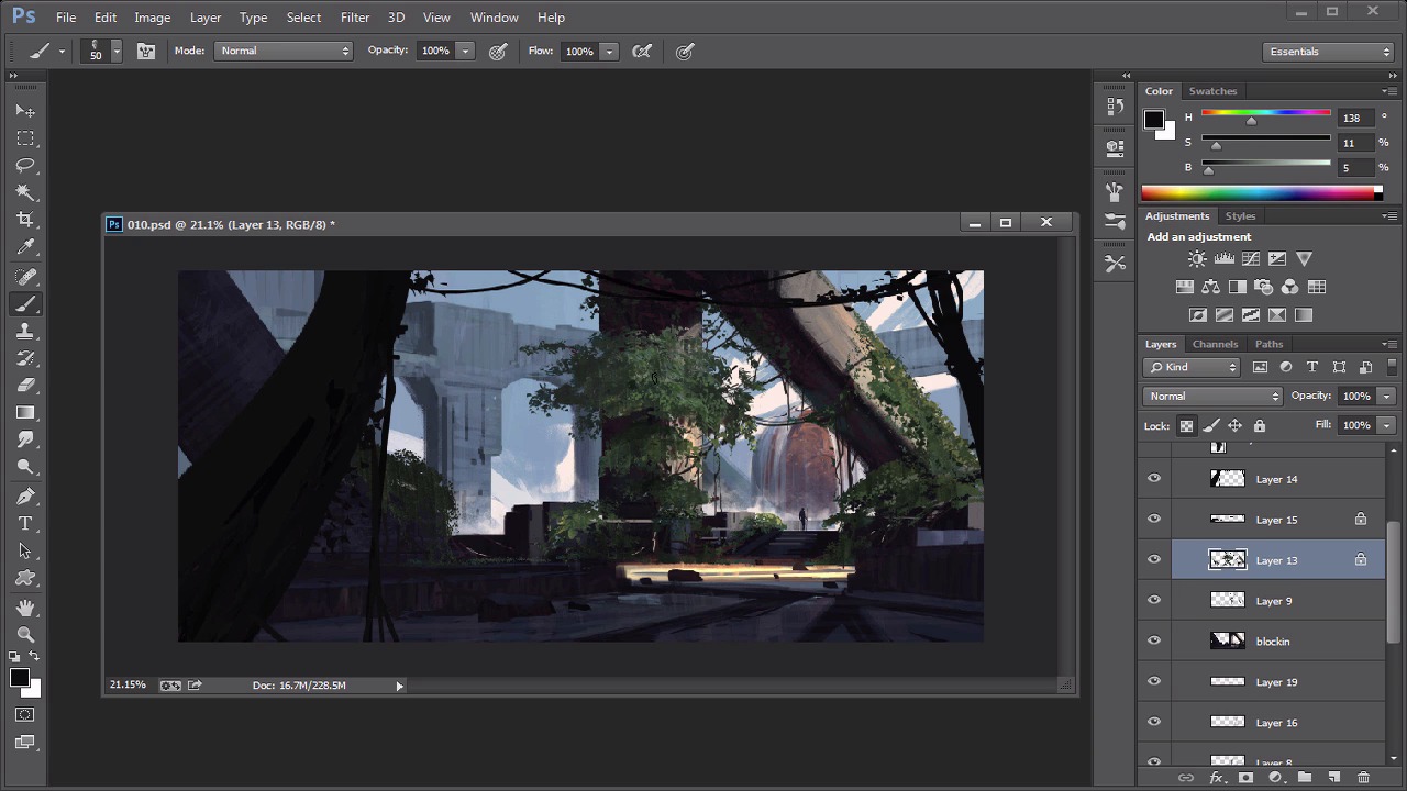
- Overview
- Transcript
4.2 Adding Character
For the final touch we will add a character into our environment. This is important as it will give our environment a sense of depth and distance.
1.Introduction
1.1Introduction00:57
2.Creating an Environment
2.1Line Art / Composition14:13
2.2Blocking In Colors14:46
2.3Adding Form and Lighting12:38
2.4Refining Edges15:16
2.5Refining Edges Continued15:00
2.6Refining Foliage14:52
3.Adding Texture and Foliage
3.1Adding Texture14:47
3.2Texturing Foliage14:57
4.Finishing Up
4.1Adding Finishing Touches14:55
4.2Adding Character13:43
5.Conclusion
5.1Overview03:34
4.2 Adding Character
Okay, so we're back. So I think the one last thing I want to do before I even get into some of the lighting is I want to add a character. I don't think we added a character in our last one and I thought that'd be kind of cool so let's just try to figure out, you know, what the heck is that even going to look like, you know, so let's do that. Before we move on, let's actually save this out so I'd like to save alliterations here. So, let's go to zero one, there we go and that way we don't get lost here. Okay, so let's add a little character. I don't want him to be too big, so I'm trying to think of the height that I want him to be at. I think I said that's a pretty good height. So this thing is gonna feel like it's pretty massive. I'm not the best character guy in world, but you know, I do a lot of life draw and that kind of stuff so my, my goal is to kind of just use that kind of knowledge to kind of, you know, just block in, like the torso. All that kind of stuff. And, you know, hopefully it's readable. I think that's probably the biggest thing here. Is that it, it feels like a character, so let me see here. Let me move this around. Let me zoom out here. So let's see if we can kind of push this guy a little bit. So, I kind of want him to I'm not sure if I want him to be kinda like he's walking. If he's walking, you kinda wanna bend the legs a little bit and that's usually kind of a good way to start. But, you know, we'll see. So I think all I gotta do is just get the shoulder and the head correct. So you have that. And I'll put a little stick on him. That's like one of my trademarks. [LAUGH] If people have ever watched me paint, I always give a guy a stick. It's just funny to me. So I always call it the adventures of staff man. So maybe this guy is like, you know, he's like a guy that searches for lost treasure and stuff. And now he's finally found it. And there he is. So now you can see that. That's really cool cause now it kinda gives us a sense of scale that we didn't have before. So in terms of kind of rendering it, I like to put some dark values in there just to kind of mix it around. So, you know, I'll go in here and I'll put a backpack on him or something like that, and give him a belt, give him a gun, that kind of stuff. I don't want him to go above this little horizon line, this ground line so we're gonna kind of save that out. Which means I kind of have to kind of change this a little bit too here. Cause I don't want that to be, I want that ground plan to be pretty straightforward which means this, whatever this is, it's gotta change. So, and there you go. And while I'm here let's actually kind of fix this, let's add a little bit more of a painterly effect if at all possible. So that's a simple matter of kind of going from left to right. You know just like that. And we can probably even Just add some of that there and that's kind of nice so it'll help blend out some of that stuff so it gives it more of that painterly feel that we're looking for so I'm just gonna. Add all that in there. And actually now that I think about it, I think it'd be nicer if there wasn't any kind of amazing lighting source here. I think we should probably save that for like right right here, so we wanna get the brightest value right here and just kind of keep that and that line super bright so that way the character stands out a little bit more. And then for the character's lighting what I like to do. Just throw a little bit of, all you really gotta do to kind of make him feel like a character, is throw a little bit of light on the shoulder, right there, bam. And a little bit of light on his head. That's usually where things catch light the quickest, usually on a person, when you look at people and there might be some small lighting things right there, but then you take like a lighter value, something that's not as bright and then you can kind of work your way. You might get some rim light possibly too, but for the most part that's kinda, that's all you gotta do. And so from there, that looks like a fully rendered character and they didn't even do anything. So there you go. So let's think about lighting here real quickly as well. So I think we need to add a little bit more kind of, you know, little more of a rendering to the fog and stuff behind the water. So, I think it's gotta make a new layer here. And just try to get some realistic, something realistic, not realistic, but something that just looks a little bit more detailed. And that's just a matter of kind of getting the right brush and kind of just slapping it in there. So You know what I mean? Something like that. Then we can put that in front of everything so now it just kind of helps kind of created that mist that we're kind of looking for and that's always nice. You kind of want something like that so we can get that warm mist too, that it's creating, and that's exactly what we want here. And we can put this upward as well. And there you go. Mist. And that mist will definitely help create a lot of value, a lot of different changes here. I think overall we could could definitely get some darker tones here on some of these foliage pieces so, I'm not sure of the best way to do that, I'm just gonna grab a brush right here. I'm just gonna grab a darker tone which is this color right here, and I'm gonna go a couple shades darker like that. And I'm just going to lock the transparency and kind of just keep that simple because we don't want that to steal the show. So that's where we have to kinda make some changes here, just some small ones. So we'll put the lighting makes sense. So some little things, you know here and there and that will kind of help show some of the form as well. So again if I ever get lost I can always just kinda go back to my, I can always go back to my photo and kind of look at that and see what's happening, but I don't think I have to. I think for now, it's looking pretty good. And can definitely maybe add some more pieces here in terms of the lighting. So maybe to kind of counteract that, I might actually add another kind of piece here, kinda going across. So maybe it's like a piece like that, and And maybe, you know, maybe it was kind of, Add something right there and that can kind of help out. So this kind of stuff, like this will definitely kind of come and go, like as you change. Cause you might look at this be like dude, that doesn't look right. And then you have to go back and kinda fix it. So that's why I definitely keep this on its own layer, but I think for now it's cool. Actually, no I do not like that, so I'm gonna keep it as is. But I could probably have a lot more kind of pieces. Kind of like right here and then I can kind of lead our eye to some of these little things that are happening here. So we can definitely do that, you know? That could work. And then what we could do is we can take that same shape, but we'll make it a little bit bigger and then that will actually help us to kind of show how big this forest is. You know what I mean? Or this jungle. Like this jungle in the sky. I don't know what we're doing here but, it's cool. Like that's, like, the cool part about it, is this could literally be anything, and that's kind of what I want to do. I don't want to, I want to think of cool stuff then eventually you can figure out was to add story and make it believable and stuff like that. But in the meantime just think of cool things first. And then we can work our way. And sometimes having a story is an easier way to think of cool stuff. So just so you know. All right, so that to me looks cool. That looks fun, it looks like a fun piece. And that's exactly what I wanna go for. All right, so let's see what we can do here. So I think the time of kind of no return here. Let's just kinda double the sky up or merge it down. So now we have a layer by itself and I think we can now kind of just, you know, make some finishing touches, you know, whatever we think we need. You know, I just wanna do that just kinda add it in there. I'm just gonna blend out stuff if I think I need it, you know, like this stuff, for example. You could probably blend out some of this background, this background noise, a little bit. All that kind of fun stuff. Right? Anything goes now, right. Cause we've merged it all down. So, like, definitely kind of just make sure that if you're gonna do this that you're pretty set on your idea, cause if you're not, then it's gonna be kind of weird. So I think what we can do right now is we'll probably grab a little bit of some color dodgeness, and we're gonna drag this guy up a little bit. I think it's gonna add some really cool lighting here. By going like that you know what I mean. So I'm going to kind of put this brush, I'm going to change the brush to kind of this little oil brush I like to use. And let's add a little bit of color dodge here. I think this is going to be really cool as we begin to kind of get this orange color that we have right there and we're just going to kind of drag that up a little bit. And so all that kind of stuff we're gonna use that and kind of let that hit there so it kind of just stands out a little bit. We can even go as far as maybe add a little bit of that color dodge, that God lighting right there, so you get kind of that overcast, that bloom. So that way it just feels more interesting. And that's kinda what I wanna go for here. And that's gonna feel super, super cool. Yeah. That's cool. I like that. I like that a lot actually. So, yeah, and there we go. Now we could probably add a little bit of color dodge to the background but I think I kinda want to push the background a little bit more, probably push it really far back actually, so I'm just going to use the lighten layer here, and kind of just add a little more. And you know what? I'm gonna add a little more purplish kinda color to it, a little purple tone to it. So that, that way this doesn't feel so stagnant. But that's kinda what I'm hoping for is the purple tones will kinda just push that guy back. So that way the overall just detail and stuff, we're just not going to see it. I think it was kinda stealing the show a little bit there. And we don't want that. You know, we wanna kinda just push that guy back, so. Kinda stay zoomed out here a little bit. It's all we're looking for. We don't need to go in there and detail the heck out of it. We just gotta add a little bit more wash to it. So we can kinda push this guy back so that this guy kinda stands forward a little bit as well. And there we go. No, sorry, I keep messing up there, cause I don't wanna go too far down. But you can kinda do it to your own liking there. And that's pretty much it for the finishing touches. I don't think we need to add anything else. I think it's all pretty straightforward in terms of the detail and stuff, and you know, that's me doing a fun image right there. And hopefully you guys enjoyed that one. You guys will want to go and try it too. Let's wrap this guy up a little bit and then what we'll do in the next one, just kind of do a little overview, what we did, how we went about it, all that kind of fun stuff. And I'll let you guys out. All right guys. I'll talk to you guys later. See you in the next video.


