
 Lessons: 12Length: 2.5 hours
- Overview
- Transcript
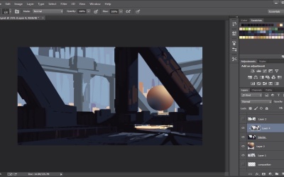
2.4 Refining Edges
One way to give your paintings that traditional feel is by defining hard and sharp edges. Here we will discuss ways to do that in order to achieve a more painterly look.
1.Introduction
1.1Introduction00:57
2.Creating an Environment
2.1Line Art / Composition14:13
2.2Blocking In Colors14:46
2.3Adding Form and Lighting12:38
2.4Refining Edges15:16
2.5Refining Edges Continued15:00
2.6Refining Foliage14:52
3.Adding Texture and Foliage
3.1Adding Texture14:47
3.2Texturing Foliage14:57
4.Finishing Up
4.1Adding Finishing Touches14:55
4.2Adding Character13:43
5.Conclusion
5.1Overview03:34
2.4 Refining Edges
So now that we have this nice little block out. The problem that we're having now is that it feels a little bit too sharp and there's not all that edge variety here, and we want to fix it up. We want to add some more some overall more interesting kind of shapes and lines. So what we're going to do is we're going to switch our brush up here, and we're not going to use kind of a square brush. Instead we're going to use kind of a chalky brush, and so you can pick any brush that you have from the brush set. I'm going to pick this one right here, I think it's like 394, and what we're going to do is we're going to kind of take this brush and you're going to see what happens now is it feels a little bit more like a texture. So it's gonna help us blend in some of these values in a much more cohesive way, and it's gonna make things feel a little bit more interesting, and so what we can do is, with that, what's gonna happen is. Some of these edges now are gonna be a little bit softer, and so that's kinda what you want. You don't want all the edges to be the same kind of roundness and hardness. You kinda wanna have some things a little bit softer in certain areas. So I'm gonna turn off this guy right here, just so we can kind of see that happening here, and so notice what happens when we kind of break up a little bit here, some of the texture, and we kind of make some of the edges a little bit harder, a little bit softer in certain areas. So I might even go in here, I might say you know what, this guy needs to be really soft because it's a piece that kind of turns a little bit, and so you can see now stuff is starting to really kind of get some form here. With that, what I want to do as well is let's add a little bit color variation in this guy as well. So let's go back to my little brush here and I'm going to take some of these warm values, these kind of cool values in here and I'm just going to kind of, you know Drag it down a little bit in the darks. So this will kind of help us a little bit, get a little more variety, and so now it doesn't feel as flat, if you see what I'm saying. So you can kinda see this, and now that the brush has a little bit of like opacity to it, I can kind of sample certain parts of it, and that way I'm not getting just the full color. I get a little bit of variety in there, and that's kinda what I want, if at all possible. So you can kind of see that going. So now, we're gonna be able to kind of add some shadows and stuff like that as well, but now with this, It's gonna have a lot more of a nicer variety to it that we're missing a little bit as well so we're gonna do that. What I want to do too as I want to probably take some shape tools here and throw it in there a little bit to add a little bit of kind of texture and grit. So if I go here and go to my shape tools and these are the ones that I've made, you can kinda just pick any one that you want. There really is no right or wrong here. You know, you can do something like that and again I'm gonna change my eraser brush as well to that same brush so that way again we're just getting a little bit of that grit, that texture, and now the piece is really starting to come into its own because we're changing up some of these values here. So this is really, really important that we kind of establish this so So I'm just going to kind of keep painting here and again, I'm just going to erase. Again, that's exactly what I want. I want the good stuff right there and that kind of helps kind of simulate that painterly feel which I'm kind of a fan of just because That's kind of the way I was taught in the things that I like to paint. So I kind of like it when I can make things look like kind of a traditional painting if at all possible, and it's easier said than done obviously, but that's kinda what I'm into, so, but, you know, the way you wanna approach it, that's totally up to you guys. I'm not here to tell you that this is the only way, but just wanna show you some of the ways you can handle this. So, again, you can see How I'm handling some of these. These forms, even though this form and this form are connected, just by adding a little bit of a different value to it, it will help break it up, and that's exactly what I'm looking for here, so, So I'm getting really in there. Notice that I dont zoom in a lot, that's kind of an important thing. I mentioned that in the previews course and it kinda still brings true here that you don't wanna zoom in if you don't have to. Just cuz it's really easy to kinda get lost in the details and next thing you know, you have all this detail, you have all this stuffing going, and it's just not working out. You want to be able Be able to, you don't want to get. You want to kind of see the bigger pictures, it's like forest for the trees. So you want to just be able to see everything that you're seeing and then make changes as you go. Notice here I'm going to kind of erase from the original block out and I'm going to add Some more kind of, you know, values and stuff here, and this is kind of important because now as I'm looking and as I'm adding form and shape to things, this is where, you know, your design kind of sense comes in and your instincts come in. So, you know, certain things aren't working, then you have to kind of fix it. You don't want to kind of leave it alone. Otherwise, that's usually kind of a bad way to kinda start your painting out, and that's gonna lead to bigger problems later on. So if you see things you have to change, go ahead and change it. There's not anything wrong with that. There's paintings nowadays can get so complex That it's really unrealistic to kind of look at something and be like, yeah, I'm gonna paint that [LAUGH]. I'm gonna have no mistakes, and I'm gonna kill it every time, and I'm not gonna have to make any adjustments. Like conceptual art, especially in you know this kind of field is all about adjustments. You always have to be able kind of make adjustments and kind of as we say in the industry, kind of design and edit, design and edit. So you make a choice. You kind of evaluate it. You think hey was that the best choice, and if not, you move on. If it is, you fix it, but if not, you keep going. You're gonna notice that sometimes I make some of these choices and some are kind of wrong, and I have to be able to kind of have that eye to evaluate it, in terms of the composition and see if that's working put for me. Looking out for me, so you'll kind of see me go, spend a lot of time in certain areas for whatever reason. Maybe I see something and I just have to kind of fix it. So that's just kind of a personal thing, so don't worry too much about it. All right so looks like It looks like we're slowly getting somewhere and it's looking kinda cool. So I definitely want this area right here to kind of Have a little bit more of a warmer tone, especially in the shadows. So I'm going to see what I can do about that, see if I can add something here to it that will make it sing a little bit more, and so you'll see me give these a little bit of a sketchy quality here with that, and that's just me trying to, again trying to simulate that painterly feel. So you see me make these kind of marks, and stuff like that. That's very much on purpose. I don't want it to feel too digital. So you kind of have to make those mistakes a little bit. You're just moving a brush around. All right, so you can see that. I'm actually gonna go in here. I'm gonna take this value and I'm gonna see see if I can kind of just get some of that reflective light here, we need some of that warm colors in the cool colors, and that's kind of a color theory thing, whenever you can put warm and cool, and cool to warm, usually good things can happen. I'm going to grab some of this green here, too, and kind of throw that in the mix as well. Just to kind of add, and all these things will just help Building that realistic rendering. Because I would imagine that some of those colors will definitely be hidden and stuff like that. So you can see me kind of work that in. So in this area, we are definitely going to have some of the screens, some of that stuff, and it's all in the shadows, but the cool part, the shadows are all blocked off. So I don't have to really worry. About all of that noise. So now I can go in here. If I wanna add a little bit more texture or something to the ground. Little bit ore of a warmer tone especially in this area. I have that. You know what I mean? So. Yeah so you can kinda see like this bits of paint. It's where I wanna go with that. All right. So now this is the part where personally I get kind of excited cuz I'm like, aw sweet. We're getting some of this lighting stuff figured out. We're figuring out some of the texture, all that fun stuff. That's kinda where I wanna be, and then after if you want to add some more lighting you know we can but we'll have to kind of just take that as we come. You know maybe -- so maybe here in the block in you know we can kind of Add some little values here. Maybe just maybe we can add a little bit here. Right so we kinda just wanted to simulate that. That warmth which would come from the edges so, no. So now we just kind of get some of that color in there, all that kind of fun stuff. So now, now we're rocking, now we're really starting to make some bold choices here, and that's kind of where I wanna to go with it if at all possible, and if at any point in time, I can always kind of take. I call it a value there. You can kind of just have that go over it, but I think for now. This is, this is fine I think so, and then I can always again kind of switch back to the shadows and I can kind of you know add some of these shadow colors in here and stuff like that and I don't have to necessarily worry, and I can kind of erase from it, and you kind of just go back and forth. It's that back and forth, that design and edit that we're going for here. So you can kind of see me kinda wanna get some of those hard edges in there, stuff like that. Don't wanna make it too dirty. So I'll probably switch some brushes up here a little bit and kind of mess with those things, and you know, so it's actually I picked the eraser [LAUGH] that's my bad. So we'll go back here and see if we can kind of make some of these choices. You're gonna notice that I don't kind of noodle a lot I try to make a conscious decision. On what color I'm choosing or what I'm trying to achieve and that comes from practice. So don't sit there and be like, just make strokes until happens. That's definitely a good way to get a happy accident, but more times than not, you want to be able to be kinda purposeful in your designs. So that's kinda why I try my best to make correct choices, or at least in my head, correct choices in terms of kinda choosing what value to pick. So here I'm choosing what this value, probably something like that would be a little bit nicer. So not everything has to have that warmth. So I may wanna kinda just Kind of loosen that guy up just a tad bit here, and maybe, I definitely want to add some of that block in here. So maybe actually what I'm going to do I'm going to take some of this value here and I'm going to add a little bit more like form to it. So just like so. Yeah. So these little shapes will kind of help add to it so it's kind of what I'm looking for here and yeah, we'll go from there. So, I'll just keep going. Yeah. See, you just have to get, you just have to kind of see things here as you're working and then you're like yeah, that's what I want, and then you just kinda keep going here. I definitely need to kind of fix these stairs if at all possible. So I'm trying to kind of get a little bit more of a So I think it should go from left to right here. So that would kind of help with the. So I think the stairs need to be like a lot more, in terms of, like, how many. So I think that's probably the first problem. And then I kind of wanna do something like that. So I think actually for this I'm gonna use just the flat brush here, the flat square brush for this kind of thing. I'm gonna zoom in just a little bit here. We get some of those streaks and I don't think we want that if at all possible. So we're just gonna, I kind of want to simulate that it's going across, so there's a shadow being casted across, and then we have this kind of thing where it's The light is hitting the dark, so it's kinda like it's slowly kind of going across the area. So that's what I'm thinking, so I don't know if it's gonna work or if that's even reading, but hopefully that idea kinda comes across to some degree. So I'm just kind of dragging that over. Almost like little piano stripes or something. Piano keys. So we'll go back, and then we'll kind of fix this guy over, okay, and let's see if we can start to add a little bit more detail here, add some more to the trees and we'll keep going with this, okay? All right guys, I'll see you in the next piece.


