- Overview
- Transcript
2.3 Adding Form and Lighting
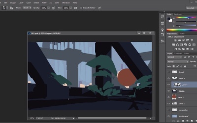
With the rough colors blocked in, we can now add form and lighting to our environment by adding highlights and shadows to our diffuse color.
1.Introduction1 lesson, 00:57
1.1Introduction00:57
2.Creating an Environment6 lessons, 1:26:45
2.1Line Art / Composition14:13
2.2Blocking In Colors14:46
2.3Adding Form and Lighting12:38
2.4Refining Edges15:16
2.5Refining Edges Continued15:00
2.6Refining Foliage14:52
3.Adding Texture and Foliage2 lessons, 29:44
3.1Adding Texture14:47
3.2Texturing Foliage14:57
4.Finishing Up2 lessons, 28:38
4.1Adding Finishing Touches14:55
4.2Adding Character13:43
5.Conclusion1 lesson, 03:34
5.1Overview03:34
2.3 Adding Form and Lighting
Okay, so now what we can do is let's see how we can do about adding light and adding value, adding all that kind of fun stuff. So let's see what we can do with that. Now for this guy right here, what I'm probably gonna do is I'm probably just gonna add a little bit of variety to some of the edges here. I know I said we'd do that a little bit later, but just for now. Just wanna add a little bit of variety to some of the edges here. And this will kinda help me visualize a little bit more in terms of where we're gonna go with some of the shadows and stuff like that, okay? So now that I got that, and we won't do too much here, we're just gonna just going to answer a little bit of questions. What I'm gonna do is I'm gonna make a new layer, I'm gonna link it to that layer. And I'm gonna pick the darkest value that I can think of and it should probably be. So actually what I should do, this should probably be the dark value and the light value should be something like that. So actually what I'm gonna do is I'm gonna switch this out, so this is gonna be my light value and that's gonna be my dark value as you can see now. So there we go. So now, I'm gonna kind of paint in the darkness. Or actually, I think what I may want to do is, I may wanna keep this somewhat relatively dark. You know what, I changed my mind. That's kind of the fun part about this. At any point in time, you can change your mind. You can say hey, you know what, yeah, it's not working out. So we'll go to this guy, and I'm just going to go a shade bit darker here and go with kind of a warmer tone. And hopefully that will kind of show through. Which it does, so there you go. So the cool part about this is that at any point in time, if I don't like something in terms of the shadow, any of that stuff I can just take it out. So it's kind of what I'm trying to do here. And as we get further back, there's definitely gonna be a little bit of shadows here and there. So most of this stuff will be in shadow anyway, so we don't have to worry about it. But I still want to kinda have an interesting, a cool read, you know what I mean? So, you kinda see me put this in here. And so I'm just trying to follow the contours as well. So the contours are going to play a big part in this if at all possible. So we'll keep going. And this is kinda the fun part, because if you kinda take your time here, it'll make it a lot easier to paint the form in. So that's kinda what we're doing right here. All right, so, and on the original layer, we'll probably just paint in the light directly on the layer. This is gonna be on the shadow, the dark, all that kind of fun stuff. For the meantime, I'll put this on multiply, just so we can kind of see through it a little bit and then we'll kind of lower the opacity. We don't want to interrupt this too much. We don't want to distract us. And sometimes that stuff can get a little distracting. So, we're kinda painting in the shadows as we see fit. And that's kind of all she wrote here. I'm gonna move this guy over here. We don't think we would need this that much. I'll look at it occasionally from time to time if I feel like I need it. But, for the most part, I'm kinda in the zone right now And now I just wanna get some of those, some of those values in. This is kind of important here. At any point in time, I'm just gonna erase. That's kind of the cool part about it, is at any point in time if I'm not feeling something, it's just now working, I can say, you know what? Not today. And just erase and keep going. So it's kinda what I'm planning on doing here. So, I'm just gonna keep kind of painting this in. So you're gonna see me switch back to the brushes, back to eraser and the paintbrush tool, that's very much on purpose because I need to understand what I'm seeing here. Here, we'll definitely, lay in some values here, that kind of fun stuff, as we go. And so painting with the shadows first kind of helps you, in a sense, figure out some of the values. That's kind of why I do this. Bam. And again at any point in time I can, that will serve as a light by just kind of erasing from it and then painting the cache all that kind of stuff back in. So to kinda get a better feel for this, let's actually kind of turn this guy a little bit darker just so we can really understand what's happening here. And so I'm going to go to here Ctrl+M. For some reason it's not working so let's just go to levels I guess. Levels will do fine. We'll just kind of turn that a little bit down just so we can kind of see that. So you see that. Now we can really see how this stuff is being effected. And we'll paint a little bit without the line art. And just so we can kind of get a real good taste for that and kinda see what's happening. So again this is gonna be, all these little lines that I'm putting are gonna kinda serve as shadows. There gonna kinda serve as bits and pieces of terms of things sticking out, the unevenness of the ground. Because we are looking at that kind of ruin stuff ,and we are like okay that's cool. That's a cool idea. The ground's uneven, it's very manmade, it feels very ancient. How do we carry that into the environment? That's kinda what I'm thinking about here, right now. At any point in time, if I feel like I need to add more to it then I will. So I'll go in here and I'll say, you know what? I need some more little blocky stuff here. A little more detail so that way it's not being blocked off. And if we need to add stuff, we can, and we can go back here. And that's kind of the cool part about this is that at any point of time, I can make a decision and it's fine. It's not gonna affect sit there and noodle and paint things out back and forth, back and forth, back and forth. That doesn't seem very fun to me, so I would rather not do that, if I have a choice. So I'll just, yeah. So this will help us get some of these guys figured out here, and I'm just trying to get that line variation. A little bit of paints, you're gonna see how these lines taper a little bit. That's kinda a big thing too, having a little bit of a tapering if at all possible can be really good to kind of help break things up and kinda make things a little bit more interesting. And that comes from kinda like a line weight thing, getting that kinda line weight in your work. It's definitely kinda imperative here. And if I want to kind of add a little bit of line stuff like that, maybe that can kind of be structural stuff, we can definitely do that, okay? So look at that, so now all of a sudden, turn that off it's flat. Now we've got form, that's exactly what I'm looking for. So let's see if we can maybe take some of the colors here and let's see if we can kind of add it here as well. So I'm just going to go here. And let's see if we can kinda take some of the sky and we're just gonna add a little bit of a value shift, we don't want too much but just enough. We can kinda mix that it in there. And if any point in time I want to mix some of these colors I can use the blending brush here. And I switch to that and then go back and kinda get that happy medium and that's what you got. So we'll do something like that. I'm gonna paint directly over this layer. I'm not gonna use a different layer for this because it is a background piece. So I believe, to me, there's not going to be much of an edit there. But, it's the foreground stuff where that can get a little bit dangerous because that's what you're seeing first. That kind of has to be on point. You don't want to ruin that, if at all possible. That's why I can sample and paint as I go as opposed to separating the layers. Cuz sometimes when you separate the layers, what's gonna happen, it's hard for your mind to kind of switch between both. Between painting and technical side of switching layers and stuff like that. And that can be not fun sometimes. So you're gonna have to make that choice for yourself a little bit, about how many layers do you wanna use. So you'll see me use a lot of layers. That isn't by any means saying that you have to do that. It's just more so, it's a little bit more of a safer bet for me because I know I'll probably make mistakes if I'm not perfect. And then that will allow me to kind of fix those mistakes as I go on one layer. I'm not here to tell you what to do, it's kinda showing you guys where you can take this, and then. It's up to you guys to kind of show me what you got. So there really is no right or wrong answer, I think as long as the result looks good. Personally, no one really cares. As long as the piece looks good, it's on time, that's what it's about. For me, efficiency is a big part of this here. Transparency again and we're gonna keep going, just kinda put this in here and, all right. So, it's looking pretty good. Let's see if we can get a little bit of light or something here. Let me look at these colors here. I think maybe we just gotta grab like a little bit of a warmer color, and let's see if we can kind of put some stuff in here as well. So. So we're just gonna put a little bit of like a warm tone. And that's the cool part, right? If you have it separated, now we don't have to really worry about the shapes. Right, we don't have to worry about what we're painting because the shadows are still in place, it's not going to matter. And that's like the really fun part about this, that now like I don't have to worry. I can paint something and if I want to make a change then I have that. I don't have to worry about whether it's gonna make sense or all that kind of stuff, so all right. I don't have to go back and paint and doodle and go back and forth and back and forth, I hate that. So that's why this method works for me in that way because now, it's not affecting anything. Let's grab a little bit of a warm color here. Some of these warm tones will serve really nicely, I think. So let's grab, think you are the warm tone that I want. Yeah, so that cool and warm right there is imperative here to kinda make this read. And by usually warmth, on the edges they'll have a little bit of that redness to it, and that will help kinda sell that realism a little bit. So even though you kinda zoom out, it still looks right. So here with the ball, I think what I'll just do is I'll just kinda drag the gradient tool on it. And then I wanna have a little bit of that blue kind of come underneath it a little bit, and that will kind of solve that problem. Something like that, and then underneath that I did have this little piece right here, so we'll edit that guy. So let's hit the backslash button so we can kind of unlock the layer. We'll take a little bit of the sky. Something like that, and then we'll kind of mess with that a little bit as we go, so nothing too crazy. So all right. So I think we got enough of the colors that I wanted, I feel like personally. So I think now what we're gonna do is we're gonna spend the rest of the time, the next part of the video. We're going to take some time and kind of just kind of refine the edges so we can get more kind of the painterly feel. We'll use some of my custom shapes as well. And all these things will kind of help us kind of speed up the process and get something that's a little more interesting, okay? So all right guys, I will see you at the next part. Peace out.


