
 Lessons: 14Length: 1.7 hours
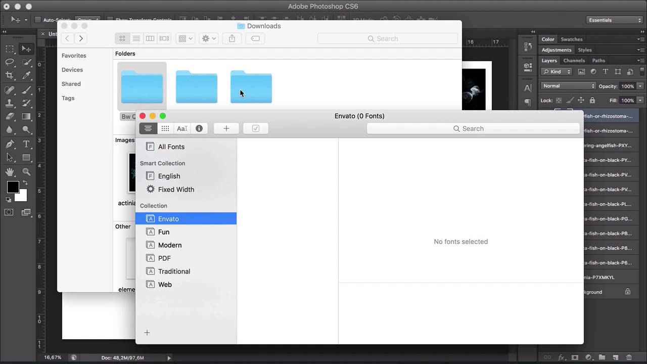
- Overview
- Transcript
1.3 Choosing Fonts and Images
In this lesson, we'll narrow down the images and fonts we’ve collected in the creative process. We will analyse the elements and see how they can work together for our typographic poster.
1.Introduction
1.1Introduction00:54
1.2The Creative Process07:53
1.3Choosing Fonts and Images05:04
1.4What You’ll Need to Get Started01:37
2.Creating a Typography Poster Design in Adobe Photoshop
2.1How to Create a Ready-to-Print Photoshop File06:43
2.2Preparing Images for Printing04:09
2.3How to Use Layer Masks12:24
2.4Typography, Character, and Paragraph Panels11:32
2.5How to Create a Composition15:13
3.Refining the Design
3.1Refining the Design13:13
3.2Further Refinements06:17
4.Preparing Files for Printing and Web
4.1Preparing a File for Print08:55
4.2Preparing a File for Sharing Online05:30
5.Conclusion
5.1Conclusion00:48
1.3 Choosing Fonts and Images
Hi there. Welcome back. Choosing the right images and fonts for our poster can be a daunting task. In this lesson, I will show you how to go through the process of elimination by analyzing the elements that we collected. Let's dive in. I have opened the images from the previous lesson and put them into Photoshop, so we can take a look at them. You will notice that the group on the left side has a lot more movement, busy backgrounds. There are some see-through pictures. We have a few close up shots, and it's a lot more dynamic compared to the shots on the right side. But some of these images have a very extreme depth of field. So for example, something like this would make it difficult for us to cut out because the front of the fish is in focus but the back is blurred, and it has a lot of small details. So that will make the image very tedious to work on. And the light source is very different on each of the images. Let's take a look at the group on the right side, and these are very colorful in comparison to the images on the left side. They still have a sense of movement. It's not a lot, but it is still there. The images were sourced from two different photographers, but they are similarly shot. And the isolated background will make it easier to work with. Since we're creating a type of graphic poster, we want the font we choose to shine, so we need to choose images that will complement the font instead of overpowering it. So for this course we will be using the images on the right side. Now, you have to keep in mind that we won't be using all of the images, but for now we need options, especially when it comes to color combinations and the direction the fish are moving to and the placement that they will have in the composition that we will create later. So now that we've chosen our images, let's look at the fonts. In order to install the fonts, we need to decompress the ZIP files. So we can do this by double-clicking on each of the files, and this will open three folders. Head over to the font book, and I will be creating a new collection named Envato. And this is because the fonts are not licensed yet, and when I license them that's when I'll move them into my regular collection. So grab the three folders and drop them into the font book, into the Envato collection. And now we have our three fonts installed, and lets head over to Photoshop to see what they look like. In the previous lesson, we mentioned that we could use one of two headlines, Aquatic Life in Motion or Aquatic Life in Color. So I will type Aquatic Life in Motion. And let's choose the first typeface. So that would be Morton, there is one. The second is BW Quinta Pro. And the third one is, BW Stretch. And we know that BW Stretch has alternates in it, so let's bring our Character panel and select Alternate. Let's take a look at the first typeface, Morton. And this is a very classic, neutral font. It is on the narrow side, and it could really go with any theme that we choose to go with. And then we have BW Quinta Pro, which is wider and softer with round edges, and that's what makes it come across a little bit friendlier than other fonts. And last we have BW Stretch, and this the opposite of Quinta. It is tall and narrow, but it contains alternates, and this can make it a lot of fun to play with because it has different widths. If we look at the images we've chosen, we can use BW Stretch and try to, maybe, weave some of these forms through the characters, and I think we will create something interesting with that. Since we're designing a typographic poster, we need to choose a font that will stand out, but won't clash with the colorful images. And I think BW Stretch is a great option because it is legible and it still has personality and it can add something interesting to the composition. So now we have our elements, and in the next lesson I will show you what are the final assets in the software that we will be using for this course. I will see you there.


