
 Lessons: 9Length: 39 minutes
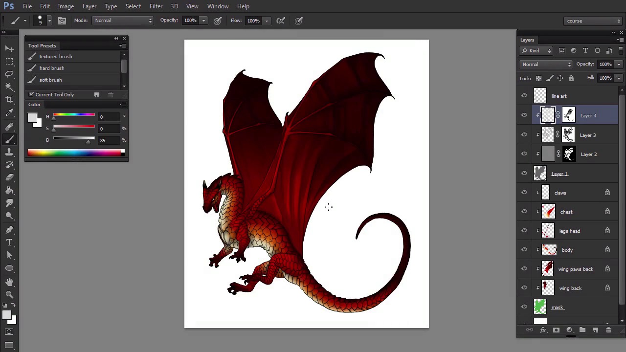
- Overview
- Transcript
3.3 Main Light
Here we'll introduce a main light source to the scene. This will be a chance for us to create form-sculpting shadows—they work miracles when it comes to tricking our eyes!
1.Introduction
1.1Introduction02:15
1.2Tools and Resources04:32
2.Theory of Shading
2.1Light, Shadow, and Color04:20
3.Coloring and Shading
3.1Simple Coloring05:48
3.2Base Light04:44
3.3Main Light03:26
3.4Additional Lights05:44
3.5Additional Tweaks06:18
4.Conclusion
4.1Conclusion01:47
3.3 Main Light
Hi. Welcome back to simple coloring and shading a line art in Adobe Photoshop. My name is Monika Zagrobelna, and in this part we're going to work on the primary light. Let's create another layer clipped to the shadow. This time we're going to make it even brighter, so use 85% gray, which is very close to white. Use the same method as before to constrain our strokes with the selection. Then paint the parts illuminated by our imaginary light source. The primary light source, in contrast to ambient light, has a clear direction. It illuminates only the parts it can reach, so if it hits an obstacle, a shadow will occur behind it. You easily add that through picture, just by not painting light in some places, creating a gap shaped like the obstacle it's covered by. In fact, we're painting light only. The first layer of the lighting was a shadow, and it's following on the rebuilt parts of it, step by step. You can create a nice effect just by bending this light with our secondary light in the middle of the body. It will create a clear difference between the strongly illuminated front, slightly illuminated sides, and dark back. When you're done, you can hide the line art for a moment to see how sculpted the dragon. This is how you can check if you're going in the right direction. This isn't the end. The primary lights should be much brighter than the others so let's create a new layer And bring 100% white into play. Use it to shade the scales that's right in front of the light source. Do not cross the area we illuminated before with 85% grey and try not to cover it all with white. All the power of this shade comes from how rare it is. A nice trick is to draw thin, white lines on the edges of some scales, which makes them look thicker. Also, if you paint white next to a sharp shadow, it will look darker and stronger. However be careful when you're applying both these effects. You need to stay in the directly illuminated area. Otherwise your regular lighting will define so far. Just like before, use a soft brush to make the effect less aggressive. Be careful not to remove smaller details when doing it. When you're done, you can hide the line art once again to see the difference. Now it's so clean, it barely needs the lines. Good job. Let's go straight to the next part to add some less known but very important types of lighting.


