
 Lessons: 11Length: 1.2 hours
- Overview
- Transcript
2.4 Digital Painting Using Photoshop Brushes
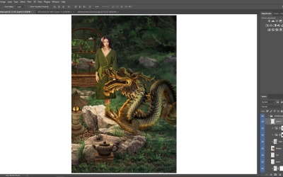
Easily integrate digital painting skills into your digital art by following these simple steps. This lesson will show you how to master digital painting using simple Photoshop brushes and lots of patience.
1.Introduction
1.1Welcome to the Course00:44
1.2How to Set Up Your Photoshop Workspace04:06
1.3Essential Photoshop Tools05:46
1.4Finding Inspiration03:01
1.5Choosing Your Format04:00
2.How to Create Mixed Media Art in Adobe Photoshop
2.1Using Adjustment Layers06:20
2.2Building the Composition07:46
2.3Photoshop Lighting Effects10:36
2.4Digital Painting Using Photoshop Brushes13:07
2.5Finalizing the Details14:26
3.Conclusion
3.1Conclusion01:15
2.4 Digital Painting Using Photoshop Brushes
If you notice after a while, it almost feels like. Art starts to tell us what to do like what the next step needs to be. Because at first, we got all of the positions down right. Then we color corrected it. Give it some moody lighting and some really cool coordination. But, now is the time for the real magic. Can you tell I am excited because digital painting techniques will always be my favourite. And in order to approach the rest of this piece, I just need to be grateful for the fact that these resources allowed me to get this far without physically painting any of it myself. So yeah, wipe the sweat off your brow and roll up your sleeves because now it's time to paint. Now naturally if you want to save on file space, you don't have to keep these masks they do get a little heavy after a while. So right click to apply them or feel free to merge some layers together to free up space when you can. Now just like with adjustment layers, the gradient tool is another quick cheat artists can use to simulate realistic lighting conditions. Let's use the rectangular marquee tool to isolate the model on a new layer, clip to her. Then I'll create a black linear gradient, that fades out as it moves up the model. Change the layer Blend Mode to Soft Light, lower the opacity and move on to the next detail. So the background looks a little closer to us than I would like at the moment. So I'll add a new layer above the base, and use the linear gradient tool again to make a hunter green gradient that fades out as it goes up towards the middle. Set it to multiply, and lower the opacity until the effect blends with the background in a nice subtle way. [MUSIC] It also helps to match the lighting of the shelf, since we have made it darker in the back. [MUSIC] Continue these steps all around this piece, on each important detail in our environment. First clip new layers to each. Then use the gradient tool to add shading. Now this step is supposed to create more volume on each object and show you that there is a relationship between the lamp as the light source. An entire rest of this piece. So in some areas you can play on depth of field, by making sure that the heaviest parts of that gradient, is in the complete opposite direction away, from the light. This works especially for the dragon where we get to kind of like hide a little bit of its tail and make it really sit in this grass by adding more shadow underneath the body and key areas. When you are ready for some light. Add a new layer towards the top of the panel and use a circular gradient to create a gold burst of light coming out from the lamp. Set the layer to overlay, adjust the opacity, and add a quick layer mask to take away some bits of light that you don't want on the model or the environment. Then we could do the same for the candle. Shading at first, adjusting the blend mode and removing some of the color from the top where the flame is. Now it's time for a special magic trick. Remember, the lamp is our main light source, so everything around it gets affected. To show this better. Select the layer mask from the Hue and Saturation Adjustment we did earlier on the dragon. With a large soft round brush, paint black onto the layer mask, and slowly start to reveal the original golden sculpture color from the beginning. [MUSIC] I, freaking love this step. Because, we are totally cheating with the Adjustment layer. Instead of wasting so much time painting yellow light, we can allude to the same thing and show that the lamp is lighting up the dragon just by playing with the layer mask. Now do this all around the dragon, determining how much light should shine across it, detail by detail. [MUSIC] Okay, looking great so far, and knowledge change the row pattern I've already merged those layers into their own embroidery layer. Now I'll switch the Blend Mode to difference, to match the gold color we're starting to reveal in this dragon. You can match the stitching to make it even more realistic by adding a layer mask and using a soft round brush, to create shadows and movement along the fabric. And going for, like a nice satiny, silky but mostly satiny, maybe a little shiny fabric. So that's something to keep in mind. And the crazy thing is that when you start to back out of this shot, it almost feels like it was always meant to look like this. Now, let's see what we can do with her hair by glamming things up a bit with a custom hairstyle. Even without digital painting, look how far we have already gotten. So imagine what a little painting can do to pull off this fantasy. Adding a little glamour and style in this instance, isn't just about making the picture pretty. We're still really locked into the story, right? So we've got these two friends, a woman and her dragon bestie. And while she is a mere human. She still deserves her shine, she still deserves, to feel like the main character in her life. So, we're gonna restyle her with a voluminous, windy hair by painting it ourselves. Now this step requires me to look at this entire piece differently. I have to keep in mind that this process is purely experimental. So I do have to surrender to really studying how all of these different elements and lighting conditions affect one another. For the hair. I'll start with a hard round brush. Using the eyedropper tool to pick up a nice medium brown, from her hair. I'll paint with this color first, slowly building the style over time. Here's the basic setup. Now clip another layer to the dragon and set it to color. Let's try to use this layer to paint, better color on the dragon. First. I'll start with white, to gray out some of these details. [MUSIC] Then I'll paint the tongue and the hair red, to remind myself where I'm trying to go with this realism. Clip more layers to the dragon, using the multiply Blend Mode to get a deep sense of the shading. Now if things are starting to get a little bit dark, you can add in light. Add a new layer above the golden light and set it to overlay. Use this layer to establish the light all across the scene. I'll start with the lamp, then moving out in a clockwise direction. So, I see the bottom of the rope and her socks are pretty close to the lamp so we'll keep some of the brighter spots there. Then as we move up the robe, I want to also play with all these different crevices of the fabric so I can get a nice realistic sheen. If the dragon is distracting you too much, just hide it away for a while. You can also do the same for the teacup set, making sure that the light mostly hits the left side of the objects first, before diffusing the mouth towards the right. Now of course the stone wall could also use some love and by concentrating some of the light on those sharp stone ridges. We start to highlight parts of the scene that make it feel so much more magical. Realistically speaking, some of these surfaces are definitely not gonna be shining this intensely, but we are going for magical not realistic. So feel free to push the light to a level you are comfortable with. Now let's light up the dragon. On the same layer, begin painting soft white light on the dragon, favoring the side that's closest to the source. I'm also gonna clip an overlay layer to the dragon, continuing to push the light, to almost, an obnoxious level, because, I really need to take that dragon out of all of this darkness. This is pretty much when my painters eye is going crazy like can you please add some light, because this is way too dark right now, as you bounce around this piece we are constantly adjusting the light to reflect all these different components. Clip a new layer sets a multiply above the background gradient. Use this layer to balance out the light by showing how strong the shadows will appear on the ground and stones. Use a larger brush to cover more ground with shadow and a smaller detailing brush to detail those shadows, really adding some personality to this guarded environment. Keep this technique up for the rest of the composition, clipping new multiplied layers to each object. And the key here is to keep recycling these techniques for the rest of the composition. Clipping new multiplied layers to each object, so you can drape them in this moody, dramatic shadow. I am officially at the stage where I wanna just keep painting, right? And I know I have a long ways to go. So I'm either just gonna keep adding new layers at the top of the Layers panel or I'm gonna keep clipping on to each detail to continue painting more onto the scene. I'll continue this with a teapot. Clipping a new multiplied layer for more shadow, and using a dark brown color to paint sharp, Angular shadows, just like the ones we see on the grass. Once we're done with that, it is now time to go around this piece, to clean up some of the fuzzy edges and unblended areas. To do this, I'll clip new layers to each item where I'm just basically painting directly on top of that detail. So the dragon is definitely going to need a lot of work. So lets help land some of this skills. The Eye dropper tool helps me pick up a nearby color to paint with so I won't have to just guess this step, I can grab directly from whatever's nearby. Now set a color lookup Adjustment layer as a clipping mask to the dragon. Change the 3D LUT filter to this Fuji codec setting. Then use the mask, to take away anything that throws off the balance of the lighting. We are almost at the stage where I wanna focus purely on painting. So feel free to merge layers again, and free up any additional file space where you can. If you look closely, I'm already on my fourth file. So, we'll keep needing to make more space by merging these layers, as we go. This is gonna prepare us for all the painting that we have to do. Clip a new layer to the dragon and set the Blend Mode to Overlay. Now let's use this gorgeous lime green color, to add some beautiful green details. We can even add a little baby blue in. And what I like about this, is that it starts to kind of make that sculpture feel more real and reptilian even. Almost like some of the nearby colors from the grass are bouncing onto the scales. By the way, if at any time you paint something and it feels like the wrong color, just go to Image Adjustments, Hue and Saturation. To change that color to the one you prefer on the same exact layer. Environmental light means everything, and It's gonna mean that colors from every object in this scene bounce off of one another. So feel free to add more paint layers to the model. Painting golden light, onto her hair and robe, and focus the light around the edges of her to really make her pop. Merge more layers together as you work on refining the environmental light. For the shelf in particular, I'll just grab nearby green colors to diffuse the edges of the shelf. If you notice. I have left a little of a light spot open towards the top, where the candle is sitting at the moment to show that there is more light coming from that side due to the candle. Do the same for the lamp and teapot, adding some green to the edges to show that everything's surrounded by grass too. You can even go back to some layers and keep adding shadow to the ground. This time a golden one, to balance out all of the dark grayish shadows we've been working with so far, when you're ready to move on. We'll shake up this design with some really exciting colors.


