
 Lessons: 15Length: 31 minutes
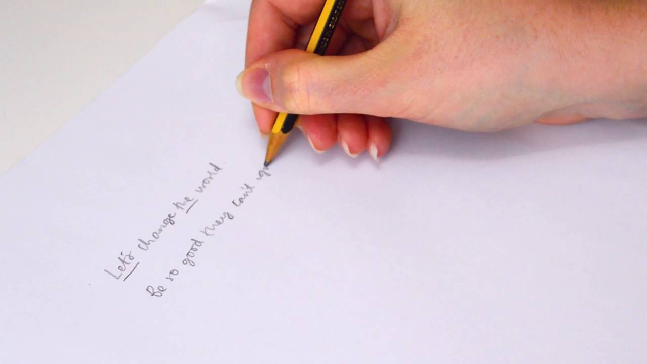
- Overview
- Transcript
5.1 Plan the Composition
In this lesson, you'll choose your phrase and learn how to lay out the text in a composition that is balanced and eye-catching.
1.Introduction
1.1Introduction01:18
1.2What's the Difference Between Hand Lettering and Calligraphy?00:58
2.Getting Started
2.1The Tools You'll Need02:47
3.The Basics
3.1Practising Your Lines and Strokes04:30
3.2Turning Lines Into Letterforms02:09
4.Hand Lettering Your Own Alphabet
4.1Letter Your Alphabet01:15
4.2Joining Letters and Extra Flourishes04:41
4.3Learn About the Baseline03:08
5.First Project
5.1Plan the Composition02:03
5.2Sketching and Refinement01:31
5.3Inking01:39
6.Second Project
6.1Mixing Lettering Styles01:38
6.2Using Different Materials01:39
6.3Creating a Cohesive Piece01:29
7.Conclusion
7.1Conclusion00:22
5.1 Plan the Composition
Hello, welcome back. In this lesson, we're going to learn how to apply all the previous lessons into a piece of lettering. You'll need to choose a quote to letter, i recommend starting with a short quote between four and eight words long. You can find lots of ideas online, or use song lyrics or your favorite sayings. Once you've made your choice, it's time to apply out the layout and composition of your lettering piece. We want to create a piece that flows nicely, where the words sit together well and the result will be a beautiful piece of artwork. The easiest way to do this is to work out the word hierarchy. I'll go through this with you with some examples. Any pronouns, prepositions, and conjunctions have less importance and so can take up less space. In this example, there's a let's and the. Here, there are quite a few words that can take up less space, while the you is a pronoun is an important element of the quote. So I wouldn't group this in with the others and would make this large to emphasize the importance. It's often helps to say the phrase out loud and see where you would emphasize when you speak to help you decide. Now, to start planning the composition of your lettering piece, we'll create some thumbnails. Start by sketching out some basic rectangles or whichever shape you'd like the final piece to be. Using the hierarchy we established earlier, lightly sketch out the words. These do not have to be lettered, we're just mapping out size and location here. Create several thumbnails for your piece with different compositions. You can try layering all on top of each other, adding in curve base lines or playing with the angles. Once you've got one you like, or have a favorite out of the ones you've tried, it's time to refine the sketch further. Join me in the next lesson, where it's time to add some creativity and practice your quote.


