
 Lessons: 17Length: 2.6 hours
- Overview
- Transcript
4.2 PROJECT: Create Your Brand ‘Extras’
In this lesson you’ll learn how to create an easy-to-use and easy-to-share ASE color palette, suitable for print and online. I’ll also show you how you can build brand shapes into your identity and create low-effort, high-impact graphics for all sorts of purposes, such as stationery, websites, social media, and exhibition materials.
1.Introduction
1.1Introduction01:32
1.2What Is a Brand?07:45
1.3Your Essential Checklist04:55
1.4What You’ll Need to Take This Course02:34
2.Logos and Icons
2.1What Are Logos and Icons?10:48
2.2PROJECT: Design a Logo and Icon19:51
2.3PROJECT: Finishing Up the Logo and Icon08:07
3.Brand Typefaces
3.1What Do Fonts Say About Your Brand?11:40
3.2Choosing Your B-Font06:30
3.3PROJECT: Choose and Format Brand Type18:08
4.Branding ‘Extras’: Color, Shape, and Graphics
4.1Building Visual Extras Into Your Brand Identity09:17
4.2PROJECT: Create Your Brand ‘Extras’08:23
4.3PROJECT: Create Your Brand ‘Extras’, Continued11:54
5.Brand Guidelines (Style Guides)
5.1PROJECT: Create a Brand Guidelines Template11:16
5.2PROJECT: Finishing Up Our Brand Guidelines Template08:38
5.3PROJECT: Going Digital: Creating a Brand Toolbox11:02
6.Conclusion
6.1Evolving Your Brand (and Knowing When to Rebrand!)02:20
4.2 PROJECT: Create Your Brand ‘Extras’
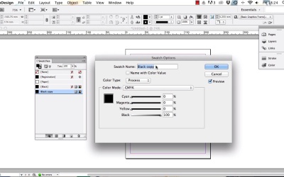
Welcome back, guys. So in the last lesson I talked to you a bit about how brands flesh out their visual identities with brand extras such as brand colors, brand shapes, and also by setting out rules about how graphics, including photos and illustrations, are created or selected. In this lesson I want us to work on creating two of those brand extras. Firstly, we'll put together our own set of brand colors and create a color palette that we can use easily across all sorts of media, both in print and online. Secondly, we'll take a quick look at how you can develop brand shapes and how you can use them in practice. Okay, so let's get started. The first task I would like us to tackle is how we can create a color palette for the Buzz brand. As with all the previous project lessons, you can do as I do and choose the color swatches that I do for the Buzz Studio brand, or you can choose different colors for your own brand identity. Either/or is absolutely fine with me. To get started, I'd like you to open up Adobe InDesign. We'll use the software to create a full color palette. Okay, so pause the video and get InDesign opened up, and once it's opened, head on back over here, so I'll see you just in a moment. Great, so here we are with InDesign opened up. You might have this window open by default, and you can create a new document from here. But if you can't see this, that's no problem. Just head up to File > New and select Document. Make sure that the Intent is set to Print. Leave everything else as it is. We're just going to use InDesign to create a color palette, but we don't need to be too fussed about what the document itself looks like. So click OK, great. So what I would like you to do is to expand the Swatches panel, which is docked over here on the right of the screen. So drag it out and then click on the arrows to expand it. Okay, so what we've got here is InDesign's default list of swatches. One thing to be aware of is that when you set the intent of your InDesign document to print, InDesign will list the swatches as CMYK swatches. So these are swatches that are made up of a mix of cyan, magenta, yellow, and key, which is black. And these are going to be suitable for printing. But one thing that we need to get to grips with for creating our brand color palette is that we will need to have a set of swatches that are compatible with other media. So that's going to include not just print but digital or online. And also, you might even want these colors to be usable for things like exhibition materials and industrial finishes. So for something like that we may well need a Pantone version of each brand color. So you might already be aware of what a Pantone color is. But if you're not, Pantone is a company that has developed a color matching system. It's a way in which companies all over the world can make sure that colors much each other exactly. So say a company has a royal blue for their main brand color. If that company has specified a Pantone swatch for that royal blue, any printer from anywhere in the world can look up the Pantone swatch and ensure that they print the brand colors that it looks exactly the same. Okay, so back to our Swatches panel here in InDesign. The first step in creating our palette is to clear this panel and effectively start from scratch. So hold down Shift and select these six colored swatches below black, and then just drag them down onto the trash can icon at the bottom right of the panel. Now we can start to create our own set of CMYK swatches. So click on the Black swatch to select it, then click on the New Swatch button down here at the bottom of the panel. And this will create a copy of the Black swatch. And then double-click on that pasted swatch to edit it. You can either create your own CMYK color here or create the one that I do. Okay, so first let's edit the swatch name. Let's call this swatch Buzz Orange. Now if we click on the Color Type drop-down menu we can see two options, Process and Spot. We want to make sure that this is set to Process. Spot will be necessary for Pantone swatches, but not CMYK. Now click on Color Mode, and you can see a whole range of options. Pretty scary, but don't worry. We'll come back to that soon. For this swatch you want to keep it as CMYK, so keep this as it is. And then we can start to play around with the percentage of inks in the swatch. So let's move Cyan to 9%, Magenta to 76%, Yellow to 95, and let's keep the color bright by just setting the Black percentage to 1%. So now we're ready to click OK. And voila! You've created your first brand color swatch, great. Let's create another. So repeat the process. Create a new swatch and double-click to edit it. Let's call this one Buzz Black. Keep it as Process and CMYK. And let's set the levels to 69, 59, 56, and 65 for black. And this has created this slightly off black, more like a very dark slate grey color, which is going to look really nice set against the orange swatch. Great, the third and final brand color I want to set in our palette is white. But you'll notice that up here we already have the CMYK swatch set up for is called paper. So that's perfect, we can keep that as it is right there. The next step is for us to create a duplicate of these swatches, but this time as RGB colors which are going to be suitable for digital and online design. Even though we've set the intent of the InDesign document to print, we can still add RGB swatches to the Swatches panel without a problem. So first of all, select the Buzz Orange swatch in the Swatches panel and click on the New Swatch button as we did before. And then edit the name it so that it reads Buzz Orange RGB. We can't have two swatches in the panel with the same name, so this little warning will flag up if you try to do that. Keep the color type set to Process. And from the Color Mode menu this time choose RGB. And you'll see that InDesign automatically converts the CMYK swatch to its RGB equivalent, which here is red at 218, green 87, and blue at 31. And then click OK. Now you can see in the Swatches panel that the little colored icon to the right of the swatch name now looks a little bit different for that new swatch. Now you can see three little stripes in red, blue, and green, which is showing you that the swatch is an RGB color. Great, okay, let's repeat those steps for the Buzz Black swatch. So create a copy and double-click. Rename with RGB on the end of the swatch name, and adjust the mode to RGB. Okay, great, there we have it. We now have a set of CMYK and RGB swatches for our brand. But our job isn't finished yet. There's still more to do. We also need to add Pantone versions of the swatches to the palette. Now for some reason, we can't convert CMYK swatches to Pantone in InDesign directly. There are a couple of different ways of doing conversion, but I tend to find one of the simplest ways is by using Adobe Photoshop. Keep your InDesign document open. In the next lesson we'll pick this up and walk through the rest of the process for creating your full set of brand swatches. So I'll see you in just a moment.


