
 Lessons: 17Length: 2.6 hours
- Overview
- Transcript
4.1 Building Visual Extras Into Your Brand Identity
What makes a brand look like a brand? A logo? Sure, but there’s much more to it than just that. In this lesson I’ll introduce you to the essential branding ‘extras’ that will help to flesh out your brand identity, including a colour palette, shape, and graphics.
1.Introduction
1.1Introduction01:32
1.2What Is a Brand?07:45
1.3Your Essential Checklist04:55
1.4What You’ll Need to Take This Course02:34
2.Logos and Icons
2.1What Are Logos and Icons?10:48
2.2PROJECT: Design a Logo and Icon19:51
2.3PROJECT: Finishing Up the Logo and Icon08:07
3.Brand Typefaces
3.1What Do Fonts Say About Your Brand?11:40
3.2Choosing Your B-Font06:30
3.3PROJECT: Choose and Format Brand Type18:08
4.Branding ‘Extras’: Color, Shape, and Graphics
4.1Building Visual Extras Into Your Brand Identity09:17
4.2PROJECT: Create Your Brand ‘Extras’08:23
4.3PROJECT: Create Your Brand ‘Extras’, Continued11:54
5.Brand Guidelines (Style Guides)
5.1PROJECT: Create a Brand Guidelines Template11:16
5.2PROJECT: Finishing Up Our Brand Guidelines Template08:38
5.3PROJECT: Going Digital: Creating a Brand Toolbox11:02
6.Conclusion
6.1Evolving Your Brand (and Knowing When to Rebrand!)02:20
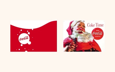
4.1 Building Visual Extras Into Your Brand Identity
Okay, a little question for you to ponder. What makes a brand look like a brand? What elements can you point to and go, yep, that is what makes that brand look like that brand. Is it a logo, is it the fonts that the brand uses? Well sure, in a way it is, but it's not simply just one of those things on its own. Official brand is made up of a large range of elements all of which adds something to the brand identity and all of which work together in sync to make the brand look complete. In this lesson I want to talk to you about the branding extras that go into flashing our brand and making it feel more whole and unified. Okay, so what are some of these branding extras that I'm talking about? In addition to a logo and icon and brand type faces, you've also got a brand color palette. This is a set of colors that might be lifted from your logo or from a broader range of sources that can be used flexibly across branded items, such as adverts, websites, and print stationery. Some brands have only a few brand colors. Others can have a huge spectrum of colors, some of which may represent sub-brands, sister brands, or particular products that they sell. Brand color plays a similar role to brand typefaces, in that it will bring a very distinctive personality to your brand. We perceive color psychologically and emotionally, so we might see yellow as being optimistic and warm, while we will see green as being peaceful and healthy. Take a look at some of the best known brands and other colors that they use in their logos and media. So Easy Jet and Nickelodeon they know that orange is friendly, cheerful, and confident. While Oral B and Facebook have tapped into the fact that blue is often perceived as being trustworthy, strong and very forward thinking. This psychology of color is not set in stone and much the way that we perceive color is conditioned by our own personal experiences and childhood memories, but some colors that become so fundamentally intertwined with particular browns that we lift the qualities of that brand and apply it to others that share the same color palette. So, you'll notice that a lot of car mechanics brands use yellow in the branding such as Ferrari, Cats and Good Year. This is partly because of the innate qualities yellow has that is optimistic and clear, but also because they are forging a whole branch of color branding. That's when you see yellow that equates to reliable quality car or mechanics products. So when you come to choose a color palette for your own brand identities, you should be aware of two things. One, the psychological effect of the colors on the consumer. And two, the relevance of the colors to a particular industry or product. So keep that in mind. We will look at how to go about creating a color palette that's ready if you use that either both studio or your own brand over the next lesson. Let's go back to our list of brand extras. So what else makes up a brand identity aside from color? Okay, well we've also got shape. So this is a bit of a tricky one as not all brands you shape to define their visual identity. But it's something to be aware of as it can be a really effective and easy to create part of any brand identity. So what exactly do I mean by shape? Well let's take an example. Okay, so here's our old friend Coca-Cola. I come back to Coca-Cola quite a lot in example, just because the branding is so refined. They've actually not changed a huge amount over the decades. We have the main Coca-Cola logo and we also have the brand colors, that punchy bright red and the very clean white, but what we also have is the use over time of a simple brand shape. So Coke bottles got a round red bottle cap. And Coca-Cola also like to make a feature of the ground bubbles that pop out when you open the bottle. This simple red circle off to move the logo superimposed over it has become a trademark of the brand's advertising campaigns. It's evolved from a simple circular icon design to creative elements of Coke's branding evoking bubbles or bottle caps. And Coca-Cola haven't stopped there with their use of shape in the branding, they've lifted the distinctive swish of the capital C from their logo and evolved it into shape of its own core. Which is often rendered in white and stretched across bottle packaging and apps. What's great about developing distinctive shapes is part of your brand identity, is that they are so flexible and so so useful. You don't need to reinvent the wheel every time you want to create a new business card or a new web banner. The shapes are ready for you to use, they add an extra visual element to the usual logo and colors we've all seen the need for actual graphics. They also have a lot more flexibility compared to other elements of your brand. While the logo type faces and color need to be set in stone and remain unchanged, shape can be much more changeable and creative. Okay, so shape, we like shape a lot is really flexible, and it's going to be one of the work horses of your brand identity. In the next lesson we'll take a look at how you can develop shapes for your brand and how you can use them in your branded materials. So we've still got a final question mark hanging over our brand extra's diagram. What else do we need to flush our brand a make it complete? The final thing we need to think about is graphics. So graphics can be anything more directly image based so are the illustrations or photography. It could even encompass video content as well. When you are actively using your brand and putting together materials whether that's a social media page or a company magazine, your going to have to make images a part of how you represent your brand. This is often something brand designers can neglect until last minute. As other brand elements like the logo and color seem much easier to control. So this stage of the branding process, you might not be generating images such as commissioning photographers or illustrators or buying stock images but you do need to be thinking about setting down the rules for how images should be used in the context of your brand. Okay, so let's take a look at a very helpful example. So Waitrose, Waitrose is a supermarket chain in the U.K. It practices very specific rules for how it presents graphics in its advertising and on packaging. First of all, for photos Waitrose has a few general rules that it always follows. So photos are always in full color and they have a tendency to focus on the every day family life, children, home cooking and just the comforts of everyday life. Portraits of people are always smiling, relaxed and natural and the shots of food look enticing but they're not overly fancy or unachievable. For TV ads, the approach is very similar and images are always anchored with a logo set in white over the top. Now Waitrose has an entirely different set of rules for how it approaches project photography. So products are always photographed from above, given an aerial view in their full packaging. They teamed it with other products on a pale gray or white background. On top of this, the art designers can add the logo, prices, and headers in the brand typeface. And Waitrose also have a branded approach to illustration. Which is used most often across the product packaging. So that's another rule for you right there. Photography is always used for advertising but illustration is always used for packaging. The illustration style for standard product is very minimal, simple and modern but the illustrations for Christmas products tend to be quite different. They have a more whimsical collage like style which helps to market the product as being particularly special or seasonal. So setting rules for how photographs are taken or selected and where they are used or the style in which illustrations are designed. And where they are applied is a really important part of creating a brand that has a strong identity across the board. We'll take a look at how you can set down rules for graphics in section five of the course, when we look at how to put together a style guide for our brand. In the meantime, we're going to focus on how we can build these two brand extras, the color palette and the brand shapes. The next lesson is going to be project based. So stick around and I'll see you there in just a moment.


