
 Lessons: 17Length: 2.6 hours
- Overview
- Transcript
5.1 PROJECT: Create a Brand Guidelines Template
Fantastic work so far—you’ve designed a logo and icon, drafted a type style master, created an ASE colour palette, and created branded shapes. Now it’s time to pull all those elements together into a brand guidelines (or styleinstr guide) document, which is the true hallmark of a professionally designed brand. This will be a useful handbook for using your brand in practice and for laying down the law for using your brand elements.
1.Introduction
1.1Introduction01:32
1.2What Is a Brand?07:45
1.3Your Essential Checklist04:55
1.4What You’ll Need to Take This Course02:34
2.Logos and Icons
2.1What Are Logos and Icons?10:48
2.2PROJECT: Design a Logo and Icon19:51
2.3PROJECT: Finishing Up the Logo and Icon08:07
3.Brand Typefaces
3.1What Do Fonts Say About Your Brand?11:40
3.2Choosing Your B-Font06:30
3.3PROJECT: Choose and Format Brand Type18:08
4.Branding ‘Extras’: Color, Shape, and Graphics
4.1Building Visual Extras Into Your Brand Identity09:17
4.2PROJECT: Create Your Brand ‘Extras’08:23
4.3PROJECT: Create Your Brand ‘Extras’, Continued11:54
5.Brand Guidelines (Style Guides)
5.1PROJECT: Create a Brand Guidelines Template11:16
5.2PROJECT: Finishing Up Our Brand Guidelines Template08:38
5.3PROJECT: Going Digital: Creating a Brand Toolbox11:02
6.Conclusion
6.1Evolving Your Brand (and Knowing When to Rebrand!)02:20
5.1 PROJECT: Create a Brand Guidelines Template
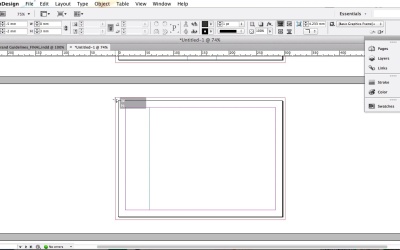
Hey guys. Welcome to the fifth section of the course which is going to be about pulling together everything we've worked on so far for a brand identity and making it into something that you're going to be able to use as a reference to. So far we've looked at how to create a logo and icon how to choose create a style master for our brandy typography. And in the last lesson we looked at adding to these with some branding extras like a brand color palette and some branded shapes. And this is all fantastic stuff but it won't be any use if you can't remember how to use elements of your brand. Or if you can't share those rules that you have in your head with colleagues or clients and this is where a brand guidelines document comes in. So a Brand Guidelines documents sometimes also called a style guide is going to be the encyclopedia for your brand. It will act as an instruction manual for how your branding should be applied. In this project last I'm going to set up a simple template for brand guidelines document in Adobe InDesign, and I'm going to show you what the guidelines should include and how they should be organized. We'll also add in a section about brand photography rules, which is probably best tackled directly here straight into the guidelines document. Okay, so let's not be surround the bush anymore. Let's dive in so open up Adobe InDesign. Pause the video while you do so and I'll see you in just a moment. Okay, so here we are with InDesign opened up. Let's head up and create a new document, so File > New > Document. What I like to do with these brand guidelines documents to have something that's easy to print and easy to flick through. So deselect facing pages, Increase the number of pages to 17, and for page size choose A4, and then switch it to landscape orientation to give ourselves a bit more room. Okay, so keep the margins at their default 12.7-mm width. And we might want to get some of these guidelines professionally printed, so add a bleed as well of five millimeters all the way around, and then click OK, great. What I'm going to take you through here is how to organize these brand guidelines and take you through the photography pages. It's going to take a bit more time to fill up all of these pages, but what I've done because I'm super nice is provided you with the completed studio brand guidelines attached to this lesson as a source file. Even though I'm creating guidelines for the best brand here which you can do too. The structure of the guidelines can be the same for any brand. So if you've been working on your own brand identity follow it along with me and just adapt the styling to your own formatting. So don't download those completely brand guidelines quite yet. But at the end of the lesson you can open the full InDesign version up, and feel free to use that as a reference tool for completing your own brand guidelines document. For now, let's work on building up the structure of our brand guideline's document, so expand the pages panel. And this will show you the full range of pages that we have in our document. So, page one and page seventeen will form the front and the back cover of our guideline, and this is a nice little place to get a bit creative and apply some of the brand colours and brown shapes that you've already put together. For now what's vital to include is text. So to specify what the document is let's take the type tool and just put this in draft format now. So type up brand guidelines, paragraph break and then put the brand name. And you must always remember to include the year as well, and this is so when you come to revise elements of your brand in the future, you can keep track of which brand guidelines are older versions. Okay, great, so let's leave that for now. Lets scroll down to page two. Now this is going to be a really important part of your document because this is where you're going to have your contents page. First up, let's bring in our brand colors to the InDesign document, so we can start applying them to the pages. It's going to be really important that your guideline documents follow all the rules of your brand. So head is just basic things like contents list need to be formatted in your brand colors and brand fonts. So let's expand the Swatches panel, and from the Panels drop down menu choose Load Swatches. And then navigate to the BrandSwatches.ase file that we saved earlier and click Open. Okay, so we have those watches now loaded in the panel back to our contents page. So first for the header take the type tool or hit T on your keyboard, drag and then type in contents. An set this in the brand header forms that's not the semi bold and set the tracking to 44-0. And then right click, if you're on a P.C. or control click if you're on a Mac transform, and rotate 90 degrees counter clockwise, and the position is text frame against the left hand margin, and let's increase the font size to 96 points, and set the color in paper. Then I'll take the rectangle tool and bring in a bit more of our brand color. So drag set the filter to orange and sat behind by right clicking or control clicking and arrange and center back. Okay cool, now to the important bit which is our actual contents list. So let's create a new text frame using the type tool and place over here on the right hand side. I'm going to set my type cursor in there and set the formatting to will not, semi bold, size 20 points given a generous letting of 66-0 tracking to 40 and set it to all caps and also get a nice orange text color. Okay, let's type. So first we're going to want to tell people about the core elements of our brand identity which is the logo and then connected to this is the icon, then next up on the list is type faces. Okay, and then color palettes then shape. We can add page numbers to accompany this list later on once we finish the guidelines. But for now let's just our page numbers to the whole document to help people navigate their way through. To do this we need to place the page numbers on the master page. So go to the pages panel and double click on the A-Master page at the top of the panel. So from here you want to create a new text frame, position it right in the bottom right corner of the page and zoom right in there if you need to. Insert your type cursor in the frame, and then head up to type insert special character markers, and choose current page number, and then you can format this text to match your branding. So they are not semi-bold, 15 points. All caps and orange color and position that text align right and I'm going to type in page as well just before the number, returns the main document by clicking on page two in the pages panel. We don't want to apply the master's page numbers to the front cover page and the contents page. So drag down the non-master page and drop this onto page one and then page two. So, now we have page three starting on page three, but we actually want this to be page one, so click on page three in the pages panel to select it. Then from the menu click on numbering and section options. Make sure the start section is checked and then check the box next to start page numbering at and, set this to one, and then click OK, perfect. Okay, let's now start adding in headers for each page. So, take the title again and drag on to the top left corner of the page. Type in Logo, and at your formatting Zola, not semi bold, all caps, forty tracking, an orange color, and let's also increase the font size Size to 27 points. And then head up to edit and copy to copy the header, and we can repeat this across the other pages so edit paste in place on to what is now page two of your document. And edit the text to read logo-colorways, and set that subtitle color ways in the other brand color that off black page three is going to be the same, so copy and paste in place onto the page below. Then we want to have a page that lays out the rules for how the logo should be used. So, let's edit the page for headers to read logo rules of use on page five icon. And then on the page below, icon variations where we can put some optional variations of the icon in different color ways for example, and below this on page seven, typefaces. This is where we will lift the A font contact sheet from the type style master that we created back in lesson three point two. And then on the page below this, typefaces example where we're going to put an example of how the A font should be used. On the next page down Typefaces again and below this on page ten Typefaces Example again. These two pages will be for the Bee font contact sheet, as well as an example of the Bee font in use. So next page down is going to be Color Palette, and here we'll lay out samples of each brand color with CMYK, OGB, pan tone and hex code values for each. On page 12 let's dedicate a page to brand shape and use this space as an example of how the shapes can be arranged as a source of branded backdrop. On the next page down we want to move on to talk about graphics, and specifically for this brand photography, and we'll come back to this soon, and develop this some detail. On the next page after that we want to devote a bit more space to talk about the rules of use of brand photography. So let's add it had to read that. Okay and this final page will be our back cover so we'll still use it. So that's the basic structure of our brand guidelines document. Now we can start to build up the content of the guidelines. I'll take you through how to do this in the next lesson. Keep your InDesign document open. Save it just to be safe. And head straight over to the next lesson.


