
 Lessons: 11Length: 1.4 hours
- Overview
- Transcript
3.1 Designing a Magazine Cover: Tips and Tricks
We will begin the design portion of this course by designing a cover for our magazine. We will talk about choosing the right image, breaking cover rules, and the essential elements you need to include. I'll also give you a few tips and tricks to enhance the look of the cover.
Related Links
Photos
- Snowboarder on a Snow Hill
- A Man in the City Fashion Shoot
- Ballet Dance Practice
- Portrait of Caucasian Young Man
- Snowboarder Jumping
- Skateboarding Practice
- Female Rock Climber
- Young Man Climbing
- Surfer
- Surfer 2
Fonts
1.Introduction
1.1Introduction to Creative Magazine Layout Design01:24
1.2Design Assets and Software01:21
2.Setting Up an InDesign File for Magazines
2.1Creating an InDesign File, Creating Grids, and Organizing Layers03:56
2.2Typographic Hierarchy: Designing a Preliminary Article and Paragraph Styles12:00
2.3Creating and Grabbing Color Swatches05:13
2.4Creating Master Pages and Consistent Folios05:05
3.Designing a Magazine Cover
3.1Designing a Magazine Cover: Tips and Tricks09:03
4.Creating Layouts
4.1Designing a Contents Page08:39
4.2Designing an Article10:58
4.3Breaking the Rules23:48
5.Conclusion
5.1Conclusion01:55
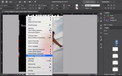
3.1 Designing a Magazine Cover: Tips and Tricks
Hi there, welcome back to this course, in the last lesson, we learned the advantages of creating master pages and using different panels to format an editorial piece. In this lesson, we will design the cover of the magazine by choosing the right image, breaking the rules, and talking about what essential elements you need on a cover, let's take a look. In InDesign, select the first page on the Pages panel, head over to the Layers panel, select the background layer and using the rectangle tool, draw a background on the whole page, make sure that is covering all of the bleeds, and choose a black color. Lock the background image so that way the rectangle doesn't move around, select the images layer and press Cmd+D to place an image. So here, we will choose the snowboarders writing from a hill image, the reason why I'm choosing this image is because the subject is in action, and he's wearing bright colored clothes so it looks really great behind the white snow. At the same time, there is movement because of the slope of the mountain. So it's not a static shot and hopefully, this will attract the audience. Click Open and draw a rectangle on the page to place the image. Using the selection tool, resize the frame to roughly 16 by 27 centimeters, and you can check that on the Options bar. Using the direct selection tool, select the image and resize it, hold down Shift as you resize to resize the image evenly. And here, I just want to make this subject bigger. Maybe let's lower the top a little bit and we can have the name of the magazine there. I just want to fix the margins really quick, head over to Layout, Margins and Columns, and set all the margins to 1.5 centimeters. Here, I just want to resize a few things, so let's leave this for now, we'll come back to it later when we have the rest of the elements in place. Using the text tool, create a frame, in here, let's add the name of the magazine, in my case it will be Connect, set a size to 72 points. Make sure that the tracking is zero, and select BW gradual black, let's change the color here. Open this Swatches panel, here, you'll see that there is no color so we have to activate a text, press J on your keyboard, there we go and click on Paper. Double-click on the corner of the text frame to resize the frame to the content on let's place this just under the margin. Duplicate the frame by pressing Option and click and drag, set the size to 24 points, and here, we will add the name of the issue, so for me, that will be The Discovery Issue. And we'll change the font to Redtowns, this font combination is great because we have something a little bit more freestyle and handwritten. And then we have a Sans Serif that is different from your regular Sans Serif so it has some kind of personality in there. Let's duplicate another frame, change the size to 14 points, and we'll add a tag line here, the Magazine for Visionaries. In here, we can explore a little bit more, we can break the rules by placing this near the spine, it's unusual to see it but there are a few magazines that do it. And for that, you need a really good relationship with your printing house. In many of the cases, they'll be open to try something new and something different, something creative, duplicate another frame here and add a date. This could be January, 2019, or it could be issue number 1 of 2019. We can create a short table of contents or headlines on the cover. This is great to attract readers, I just want to rotate this to very more comfortably, so let's add a page number, maybe a section. Make the text frame just a tiny bit shorter so we can add some content, right-click and select fill with placeholder text. Select the placeholder text and change the style to medium. Let's change the size of everything to nine points, space under the page so that way there's some breathing room. I'll just add a little bit more content. Press R and rotate the frame, and here, we can do maybe three or four columns to add headlines, make sure that the text frame is extended all the way to the top of the margin. So let's move this down a little bit more. Open the online panel by going to Window > Object and Layout > Align, and click on the align bottom edges to just make sure that everything is aligned properly. Select the headlines or the tag line frame, and press Cmn+B to open the Text Frame Options. Set the number of columns to three, we can add more gutter to make sure that there is plenty of space between each of the columns and set the gutter to one centimeter. Let's align the tagline to the second column, we need just a little bit more spacing in between because the letters are heavy. They need more spacing in between, set the tracking of the tag line to 400. Select the image and we will leave that on the images layer, hold down Shift and select the rest of the elements on the page. That will activate the elements that we haven't clicked on and will deactivate the image. Head over to the Layers panel, move the square to the copy layer, lock the images layer so that way we can work on the copy. Here, I will copy and paste, and quickly change the numbers and the sections of the magazine. So now that we have all the elements in place, let's go back to the image, unlock the images layer. And using the direct selection tool, resize the image and try to make the subject occupy most of the frame. That looks much, much better. Here, we'll make a quick makeshift bar code, usually, the printing house takes care of this. Okay, that looks good and we'll place that at the bottom. The only thing that doesn't look right to me is the white type over the image, the words are getting lost in the sky so maybe we can darken that a little bit more. Lock the copy layer, duplicate the image frame by pressing Option+N click and drag, with the Direct Selection tool, delete the image of that new frame, let's move to frame back in place and set the fill color to blue. Select the gradient feather tool from the tool bar or press Shift+G on your keyboard, and it's okay if this takes a few tries, draw a vertical line on the blue rectangle and this will feather the color. So here is a little bit too dark, maybe one more time, that looks better. Open the effects panel, set the blending mode to multiply, lower the opacity to about 50%, 48%, and here, you can see the difference. I'll make this smaller so the color doesn't affect the subject and it only affects the sky, this looks too artificial so I'll lower the opacity to 30% maybe, and that is just enough that it makes the title of the magazine pop more. So here is the before and the after. So this lesson, we created a very quick cover design for our magazine. We broke a few of the rules, by placing the headline vertically, and a tagline near the gutter, by superimposing the title of the magazine over the image, it gives a little bit more of a rough look. And we have successfully used the layers to our advantage, to keep an organized file. In the next lesson, we will create a really cool contents page. There, you'll learn how to create custom grades and use the Glyphs panel, I'll see you there.


