- Overview
- Transcript
4.1 Designing a Contents Page
In this lesson, we will create a contents page for the magazine. You’ll learn how to highlight the main stories in your magazine, how to create custom grids, and how to use the Glyphs panel. You’ll also learn how to keep this spread interesting after designing a powerful cover.
1.Introduction2 lessons, 02:45
1.1Introduction to Creative Magazine Layout Design01:24
1.2Design Assets and Software01:21
2.Setting Up an InDesign File for Magazines4 lessons, 26:14
2.1Creating an InDesign File, Creating Grids, and Organizing Layers03:56
2.2Typographic Hierarchy: Designing a Preliminary Article and Paragraph Styles12:00
2.3Creating and Grabbing Color Swatches05:13
2.4Creating Master Pages and Consistent Folios05:05
3.Designing a Magazine Cover1 lesson, 09:03
3.1Designing a Magazine Cover: Tips and Tricks09:03
4.Creating Layouts3 lessons, 43:25
4.1Designing a Contents Page08:39
4.2Designing an Article10:58
4.3Breaking the Rules23:48
5.Conclusion1 lesson, 01:55
5.1Conclusion01:55
4.1 Designing a Contents Page
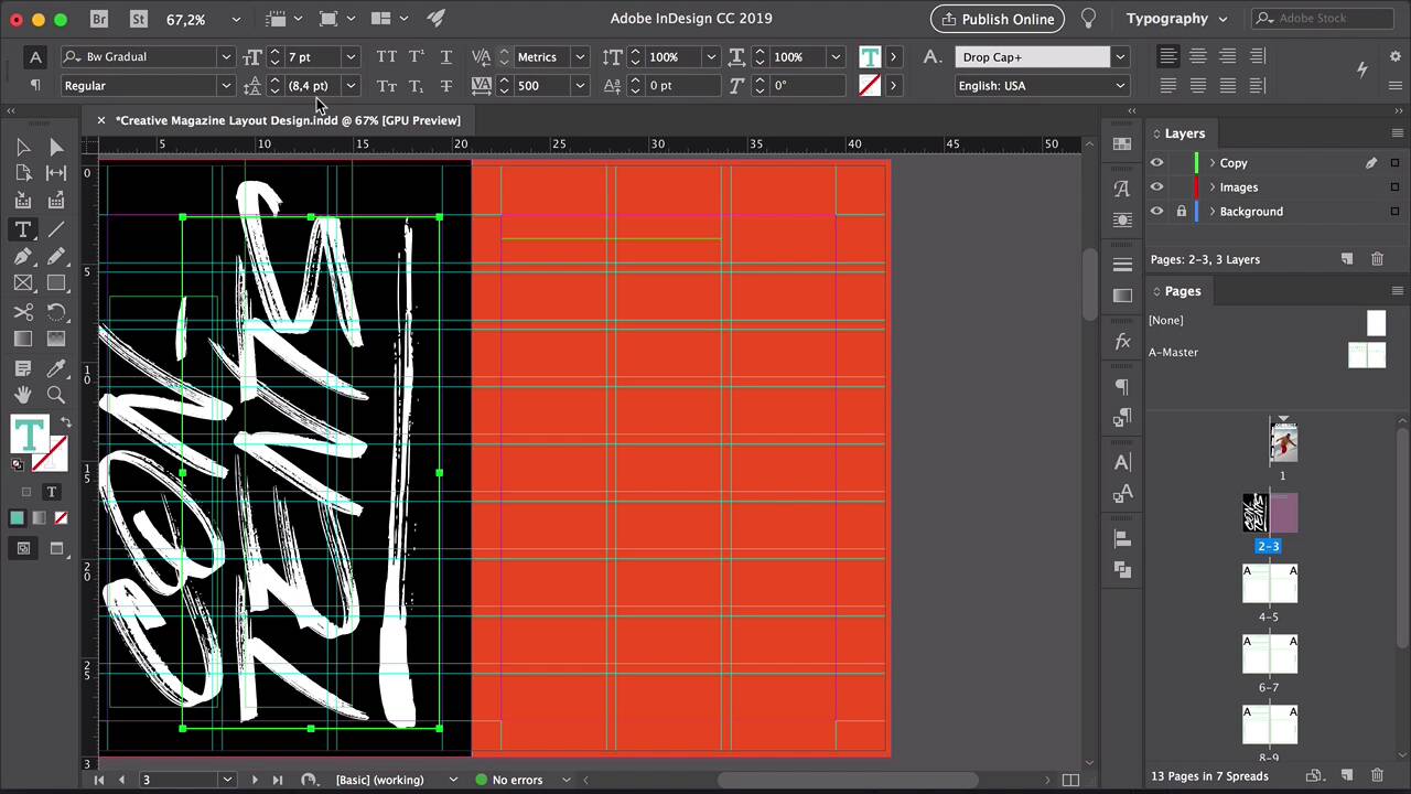
Hi, there. Welcome back to this course. In the last lesson, we designed a magazine cover, and went over the essential elements you need on it. We broke a few of the rules of cover design and learned how to choose the right image. In this lesson, we'll take a look at the Contents page. We'll use a custom grade, and learn how to use the Glyphs Panel. Let's take a look. In InDesign, select pages 2 and 3 from the pages panel. Using the Rectangle Tool, draw a rectangle on the first page. And duplicate it by pressing Option, and drag to the second page. Select the rectangle on the second page and open the Swatches panel. Set the color to orange. Let's move these two elements to the background layer. Lock the layer, select a copy layer. Using the Text Tool, draw a text box. And here, I'll write con. And on a separate text frame, I'll have tents. So the words will be broken up to be placed on the left side. Change the font to Red Towns. Set the szie to 72 points. And make sure that the tracking is 0. Set the color to paper on the Swatches panel. And rotate this by pressing R, rotate. And here, I will resize the text frame by pressing Comd+Shift, and drag from one of the corners so this will help you resize it evenly. Duplicate the text frame. And here, we will write tents. Let's make this bigger. Maybe just a little bit lower. And here, we can ignore the margins. Let's just pay attention to the actual page. Okay, I think we got it. So let's rotate this one more time so we can play with it glyphs. This font Red Towns contains swatches. A swatch is a typographical flourish that is used to exaggerate the ends of some of the characters. So let's duplicate here one more text frame. Select Red Towns swatches. Delete all of the contents on this frame, and just type any of the letters on your keyboard. So each letter or your keyboard will have a different swatch. Now, since we don't know which swash belong to which letter on your keyboard, for that, we can use the Glyphs Panel. If you don't have it open, head over to Window > Type and Tables > Glyphs. In here, the panel will show you the entire swatches selection. Now, depending on the font that you're using, some of the characters might have a secondary option. So for example here, if we select the C character, there is no other options for C. But we have a couple for A, a couple for B. So let's select something that we can change. For example, the S. We have a second option here. So double-click and it will automatically change into the other S. Let's go back to the swatches. Select the swatches. And here, we'll get all of the options that we have. So you can choose any that you like. I kinda like this one where the brush stroke is stronger at the beginning and it just washes out at the end. So let's select everything. Press R to rotate. I'll press Cmd+G to group this. And then, I'll place it back to where I want it to be. Okay, we're done with the left page. Now, let's work on the right page. For this, I would like to create a series of rows where I'll have the pages and the stories listed. But a couple of them, I will highlight them by making them bigger. For that, we need a custom grid. So head over to Layout > Create guides. Check the preview box to see what we're doing. And set the number of rows to 9. Fit guides to margin. And number of columns to 3. Click OK. Using the text, we'll create a text frame that covers the first two columns. Let's set this to 30 points. And change the font style to black. We'll fill with placeholder text. Let's make sure that our tracking is 0. Insert a few more words here. Change the color on the swatches panel to paper. Maybe that is a little bit too bright. Maybe we can use that for the headline. Let's try black. Duplicate this. Let's make it fit on the last column. And add a number there. Center align. Using the Line Tool, create a stroke right under that goes from margin to margin. Place this stroke just under the content and above the row guide. Set the stroke color to black. Open the Stroke Panel by going to Window > Stroke. And set the weight to 0.5 points, perfect. Select the three elements. Press Option, and drag to duplicate them. In here, make sure that the top of the text frames is right on the row guide. Let's duplicate again. Make this just a little bit different so that way it looks more like a real contents page. I think three's enough to start with. Now, let's create the highlight stories. So using the Text Tool, create a text frame. Let's copy and paste this here. To highlight this, maybe we can add a little bit of a description on the story. It looks a little bit too cramped, so let's add a space in between. Duplicate the stroke so that way we know the space that we'll be working with. Move this up. Expand the text frame so that way it touches the top and bottom strokes. Press Cmd+B to open the text frame options. And here, under Vertical Justification, Align to Center. Click OK. That will help us align this automatically right to the middle. Duplicated page number. Set the size to 100. And this will help draw more attention to this story specifically. Perfect. Let's select this, and change the color to paper on the swatches panel. That will help draw even more attention. Let's duplicate this section one more time. Change the page number. And now, let's duplicate the top at the bottom again. And this will help frame the main stories. Let's change the page numbers really quick. Something helpful here is that if you want to change the title of the stories to go from regular sentences to title sentences, you can select all of them, head over to Type > Change case > Title case. And that will change the first letter of lowercase to uppercase. And we can also change this back to sentence case. So that means that the only capital will be the very first letter of the paragraph. There we go, perfect. In this lesson, we learned how to quickly create a typographical content page. Using the Glyphs Panel allowed us to use a couple of different styles on page two, and the custom grids helped keep page three organized while highlighting a couple of the main stories in the magazine. These two pages are a nice contrast as page two is a little bit more out there compared to page three, which is a very organized on a grid. In the next lesson, we'll dive into designing the first story of this creative magazine layout. I'll see you there.


