
 Lessons: 11Length: 1.4 hours
- Overview
- Transcript
4.3 Breaking the Rules
Now that you’ve learned how to design a basic article, it’s time to break the rules.
In this lesson, we will design three spreads where the only rule is to break the rules. We’ll create a daring design that will add an interesting spin to our pages.
As inspiration, we take a look at the work of David Carson.
1.Introduction
1.1Introduction to Creative Magazine Layout Design01:24
1.2Design Assets and Software01:21
2.Setting Up an InDesign File for Magazines
2.1Creating an InDesign File, Creating Grids, and Organizing Layers03:56
2.2Typographic Hierarchy: Designing a Preliminary Article and Paragraph Styles12:00
2.3Creating and Grabbing Color Swatches05:13
2.4Creating Master Pages and Consistent Folios05:05
3.Designing a Magazine Cover
3.1Designing a Magazine Cover: Tips and Tricks09:03
4.Creating Layouts
4.1Designing a Contents Page08:39
4.2Designing an Article10:58
4.3Breaking the Rules23:48
5.Conclusion
5.1Conclusion01:55
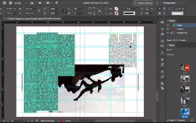
4.3 Breaking the Rules
Hi there, welcome back to this course. In this course we learned all of our editorial design and how to set up a basic article. In this last lesson, we will go a step ahead and design a creative article. In this last three spreads, we'll break the rules of design. As inspiration, we'll look at some of the work of David Carson. He's iconic work perfectly encapsulates the grunge era of the 90s. David Carson favorite expressive typography that oftentimes compromise legibility. And as a founding director of Raygun Magazine, David Carson threw away the great system and embraced experimental typography. For this last part of the course, we will use agreed to a minimum and experiment with design elements. Let's get started. In this last lesson we'll work on pages 8 through 13. Select the background layer. And use of Rectangle tool to create a background on the whole spread. On the Swatches panel change the color to blue. Lock the background layer, override the text frames by pressing Shift command and click. Here I'll extend a copy frames so I can copy and use it for the three spreads. I think what I wanna do is add some images to the left page and then start the copy on the right page. And have the headline maybe go across both pages. Press Cmd+D to place an image and choose this snowboarder-is-jumping image. We'll make this picture frame bigger to go across the spread. To get a little more grungy, I'll duplicate his image, And place it right on top of the first image and maybe to create something a little bit more different. Rotate the image of the back. And I want this image to be closer to the gutter. They look somewhat balanced. Let's place another image here, press Cmd+d and and choose this skateboarding practice image, do the same hero. Duplicate it but I'll zoom into one of the images more than the other. So maybe the one on the background. We can highlight the shoe. Let's add a headline here and maybe we can use hard races as the headlines since all the photos that we have are related to extreme sports. So here we'll chose a different font. Let's do Broken Mono. Make this bigger and change the color on the Swatches panel to orange. David Carson uses a lot of different font styles on words. So maybe we can do that here. So I'll change a couple of this to semi bold, italic, so that way the letters are different. Let's add some tracking here. 250 seems right. Now the T is going over the image. And it might get lost, the same with the second word, races, that I want to put under this headline. So select the text frame, head over to swatches, and select the blue color, so we have a background on the word. Duplicate the word by pressing Option and Drag. And you will have races and we'll do the same. We'll change the font styles and move this up a little bit more So that way it looks more like a unit. Let's work on the body copy. Select all of the body copy by clicking on the text frame and press Cmd+A. Change the font to Bergen Mono regular. It will leave the size as is. Press Cmd+B to change the number of columns to one. It will make this column narrower. I would say about the size of one column in one third. I want to add a drop cap here. So let's select everything and change it to copy regular. Select the first paragraph and charge you to copy drop cap, and then we can change back to Bergen Mono. So that way we make sure that it's applied to everything. Since we have a blue background, change the color of the body copy to paper, but leave the drop cap as orange. Let's see, now this looks too monotone. So maybe we can experiment here. So select the text frame, change the color of the text frame to paper and have the body copy in black. So that looks like it's more layered. We can add a small caption frame here so duplicate this text frame. Let's add some placeholder text, and change the color of the frame to white to match the body copy. Maybe let's lower this a little bit more. And that way we can add another element here so it could be an introduction, or it can be a byline. So let's go for a byline, head over to a paragraph styles, and select the byline style. Let's add a photo credit in the story credit. Change the color to paper and set the font to Bergen Mono bold. Let's make the frame smaller and we can experiment here with different sizes, lighting, tracking. It's all experimental. So there is really no right or wrong. Anything really goes as long as it looks good. So use your eye and you're the judge of how you want this to look. Let's set out really wide tracking here so it doesn't get lost. Well, let's zoom here to the copy. The copy looks very monotone. It feels like it needs more texture, so maybe we can add a few pull quote. So duplicate the byline frame. Let's delete the content. Click on pull quote under paragraph seller's panel. Let's add some placeholder text and head over to the paragraph style. Press option and click on the style to override the font that we're using. Let's make this all caps, 11 points and black Italic. This gives more of the feeling of an action story rather than something static. And that's what we need in this body copy. So let's still lean here a few words. Double click at the corner of this text frame to make it smaller and place it over the body copy. Bring the object to frame by pressing Cmd+Shift and closing bracket. That way we can bring the text frame over the body copy. Open the text rock panel and choose the rubber and bounding box button. And now we can place this on, it could be any of the paragraphs really depending on the content. Though we want to experiment here, here we can add a margin if we want to. Let's see what happens if we add a negative margin. That works better we can see that the lines can get closer to the text frame on top, so or the pull quote. So let's place this here. Let's do minus point two on the side so that way there is more of a margin. Now let's do the other pull quotes so let's do this in three lines. And place it over the body copy. Maybe let's move this here to the side. That looks more balanced. That looks pretty good. So now we can add the smaller details to kind of adorn the spread. So using the rectangle tool here I'll add a few rectangles or lines to either grab more attention or create more prominence on the images. Let's move on to the second spread. Overwrite the items on this spread and we can delete them. Click on the plus sign on the text frame from the first spread and proceed to draw a text frame on the first page of the second spread. Here we can do three columns so we don't follow the two columns grade that we did before. Let's narrow this column, so here instead of using the text frame options to add three columns, we will do three separate text frames that way we can experiment more. So let's thread another text frame here. This one I'll make a little bit wider compared to the first one, and we'll leave no gutter. So the three columns will be completely touching. And let's add one last one here. So because of the baseline grid all the lines are matching so I'll want them to be off, open the paragraph panel, select all of the text by pressing command A, and click on the do not align to base in grid. Here we can move the columns so the lines are misaligned. We can highlight some of this text by selecting it and change the font style to bold. You could adjust as much or as a little text as you want. This will also help create some contrast. Here I'll change the size to eleven points and change the text frame color on the swatches panel to green. I'll unlock the images layer. And lock the copy layer so we can add a few images here. Place the single layer for young female hiking image on the right page, and you can also extend it towards the left. I want this subject to still be visible so I'll keep the subject towards the right. Here maybe we can shorten the last column, so we can see some more of the picture, And thread the text to a new text frame. We can rotate this 90 degrees Let's see maybe we can do a second text frame as well. And place this at the bottom, And let's place this one at the top. Let's try to overlap this over the image so that way it adds more depth. We can add another image here. Place a young man hiking image. Send this image to the back by pressing command shift open bracket. And since we want the subject to be the center of the image, we can make it larger and try to make the subject visible. Lock the images and copy layer, so like the background layer and using the rectangle tool, create a background. Set the color on the swatches panel to the cream color and let's extend this starting at the margin of the left page all the way to the edge of the right page. So we can see that all around the margin, we have kind of respected the margin. So maybe let's grab this image and extend it all the way to the edge and let's do the same with this text frame. We're breaking boundaries, let's copy the pull quote from the first spread, paste it on the second column. And since we have a lot of black already, we can change this into orange. To add more texture, let's change this size here to 21 points and 14 points letting and extended text frame. Let's try breaking the columns as well so that way they extend past the the boundaries. Center a line, adjust like in the first spread with the headline here we can add a sub-headline but this one can go on the side and not really integrated into the body copy, so duplicate the pull quote. Let's add the rush, change the text color to black on the Swatches panel. Double click on the corner of the text frame to fit it to the content, rotate it. Impressed, Command+Option+Shift to resize it. In this case, I'll resize this to fit from the edge of the page to the margin. Let's tighten the tracking, let's change the font style to something thinner maybe bold italic, extra bold italic seems to work better. I don't double space. So there are ways more legible. So like the align left button. Let's see maybe we can go back to black italics. So there is no right or wrong here, just find something that works better for your layout or something that you like better. I just want to extend this all the way to the bleeds. So there is no white line at the top of the the letters. Now that I have that set, I want the text to appear like it's being cut. So let's rotate this back again, duplicated. I'll turn both frames into outlines by pressing Shift+Command+O, using the rectangle to create a rectangle that covers the bottom half of one of the elements. Let's duplicate the rectangle to cover the top half of the other element. Now select one of the headlines in one rectangle, open the path, find your panel. If you don't have it open head over to Window, object and layout, Pathfinder, and select this subtract button so that the other two combinations and also press the subtract button. So, now you have a top and a bottom separately. Bring the bottom to the top and just slightly misalign it to the right. And now the techs will appear to be cut. Rotate this 90 degrees again to place it on the page. Perfect, and now it looks perfectly jagged. Now, let's see what else we're missing here. Maybe we can add some pull quotes here at the bottom just to add more weight or we're looking for here as balance. So, between heavy elements or colors duplicate the pull quote that we created before by pressing option Drag. Extend the tax frame all the way to the edge of the right page. And we want this to cover both pages, so go across the spread. Change the size of the font 245 points and letting 231. Let's extend this a little bit more since the tax is so big on the swatches panel, so none for the frame color. Press Option and left or right arrow to play with a tracking. So, here I just need to a add a little bit more. I'm extending this text frame over the bleed because I wanted to look more spontaneous. So, we're not displaying all of the words, everything is just a little bit cut. And what we're missing is a few elements to tie it all together. So copy and paste the orange rectangles from the first spread. Looking at one here on the last column, we don't wannna make it too perfect. So some of them can be shorter or longer than others. Let's add one here. Let's move these text frame up so we can add a caption at the bottom. So, copy and paste the caption. Let's align it to this. And let's just resize it to align it to the text from above it. Perfect, now we can move on to the third and last spread. Since we have smaller images on the last two spreads, we're gonna add a full page image here on page 12. So press Cmd+D, place the surfer image, click Open. This is a landscape image, but I want to use it as a portrait on page 12 using the Direct Selection to move the image around. And since we are not following any rules really, allow the image to just go over the garter into page 13. Not fully covering it, but just enough that when people fold the magazine, they can see that the images taking over another page. The poll quote on page 11 is overflowing. So we can click on the plus sign and thread the text to continue it on this spread. I'll add a little bit more text here. And the blue seems to be vibrating too much with the color behind it, so let's change the color to black. The body copies are also overflowing on the last page. So click on the plus sign and create a text frame on page 13. Now, here we'll create two columns, but both of them are going to be different widths. And let's misalign this to add more movement. Change the text frame color to teal. Since we have a space at the top right of page 13, let's place another image. Select the surfer image and using the Direct Selection to make it bigger to highlight the subject more here. Here I wanted to take over the background, so I'll extend it all the way past the pull quote. Let's add a caption and copy and paste this from the previous page and place it at the bottom left of page 13. Since there is an empty space there. These two columns are looking static, so we can replicate what we did on these three columns. Select some of the text. Change the font style to bold and size to 11 points. Let's do the same on this other column. Set the font style to bold, and this one we can do 12 points, just to do something different, why not? And now it's time to tie it all together with some orange rectangles. Bring this object to the front by pressing Cmd+Shift closing bracket, and you'll notice that now the text is being covered. Let's extend this first and use the Text wrap panel. So like the rubber round bounding box, and now the text is going to be visible. Maybe that's too prominent. Let's move this here to the side. Maybe we just want a little peek of it, not too much. That's better. Now it feels like we need something here at the bottom. So let's copy and paste this pull quote, Change the text frame color to none and the content to black, set the tracking to 200. And lets add some just random spaces in between the letters. Make the text frame smaller and duplicated. And here change the font style to fit italic and then change the placement of the spaces. Let's see what we can create here. Maybe we can place this on top of the first frame. Let's cancel out the wraparound bounding box. And that looks cool, that looks random. Let's duplicate this one more time. Changed the placement of the spaces and changed the font style to medium. Maybe we can mirror this, head over to the Options bar and click on the Mirror button. Yeah, so that looks very experimental. Group all of these by selecting the frames and pressing Cmd+G to group. Let's make this bigger and moving more towards the left. Duplicate by pressing Cmd+Shift+G. I'll take out the mirrored frame and change the font style to bold italic. And I'll move one of the other frames over and make this smaller. And that's our last spread. In this lesson we'll learn how to create an experimental layover amazing article. By multiplying elements and combining and challenging the fundamental rules of design, we created something that could not be replicated. In the next video we will recap what we've learned in this course. See you there.


