
 Lessons: 11Length: 1.4 hours
- Overview
- Transcript
2.3 Creating and Grabbing Color Swatches
In this lesson, we will take a quick look at color swatches. You'll learn how to use the Color Theme Tool to grab colors off an image and how to create Color Swatches to use throughout the design.
Photos
1.Introduction
1.1Introduction to Creative Magazine Layout Design01:24
1.2Design Assets and Software01:21
2.Setting Up an InDesign File for Magazines
2.1Creating an InDesign File, Creating Grids, and Organizing Layers03:56
2.2Typographic Hierarchy: Designing a Preliminary Article and Paragraph Styles12:00
2.3Creating and Grabbing Color Swatches05:13
2.4Creating Master Pages and Consistent Folios05:05
3.Designing a Magazine Cover
3.1Designing a Magazine Cover: Tips and Tricks09:03
4.Creating Layouts
4.1Designing a Contents Page08:39
4.2Designing an Article10:58
4.3Breaking the Rules23:48
5.Conclusion
5.1Conclusion01:55
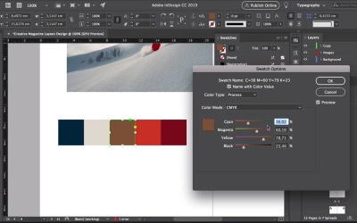
2.3 Creating and Grabbing Color Swatches
Hi there and welcome back to this course. In the last lesson, we learned about keeping an InDesign file organized with layers and styles. In this lesson, we'll take a quick look at color swatches, how to use the color theme tool to rip colors off an image, and how to incorporate them in paragraph styles. Let's take a look. For this lesson, open the folder with the images that you downloaded for this course and select the snowboarder riding from a snow hill image. Drop it into InDesign, and open the color swatches panel by going to Window > Color > Swatches. Do the default color swatches by selecting the last one, press Shift and then select the first color swatch. Click on the delete button, on the delete swatches window, click OK. Head over to the Tools panel and hold and click on the eyedropper tool to select the color theme tool, or press Shift+I. And now click on the image, this will pick up different colors from the image to create swatches. Click on the Expand button to view all the other themes that the tool created, based on the image. So it gives us here a few different options. This is a good starting point, but we will tweak these colors to create something a little bit brighter. Click on the second button to add the theme to the swatches panel. To close the color theme swatches, go back to the Tools panel, hold and click on the Color Theme Tool, and select the Eyedropper Tool. Now let's tweak these colors, using the rectangle tool I'll draw five squares and I'll color each one with a different color from the swatches that we just grabbed. Select first square and double click on the first swatch to change the values. Here I'm looking for something darker and blue, more blue than this. This looks more blue grey. So let's do 100, 0, 0, 90. This color's a little bit too close to white, so maybe we'll change it into something cream, check the preview box. Let's move this to the side. Let's do 10, 10,15. So the yellow is more prominent. This brown color is too muddy. So double click there. Now let's do something a little bit more on the yellow, pale yellow side. So let's do 5, 25 and 65. This orange is too close to red, I would like it to be more on the bright orange side. Let's do 0 on cyan, lower the magenta, so that weighs less orange. And let's get rid of the black. We can do it before and after by checking the preview and unchecking it. That's better, click OK. We have a few warm colors and one cold. I feel like we need something a little bit brighter. So let's go maybe for a teal, let's up the cyan and lower the yellow, and get rid of the black. That looks better, it really brings up the other colors better, okay. Click OK. You can also grab specific colors from the image. So I'll duplicate one of the squares here. Select the eyedropper tool by pressing I on your keyboard. And just click on any point of the image. In this case, you will notice that on the Swatches panel, the red color has an RGB mix, so you have to double click on the swatch and select Color Mode CMYK. Otherwise, the colors are going to look off on-screen and when you print them, they'll be very different. Okay, so let's delete this. And now let's incorporate some color into our paragraph styles. So for instance, I would like the drop cap to be orange and the folio to be teal. Head over to the character styles panel. Double-click on drop cap, select character color from the left side menu, select orange and click OK. Let's click here on a different paragraph. Click on the Paragraph Styles panel and select the copy Drop Cap styles and we can see that now, the drop gap is orange. On the Paragraph Styles panel, double click on the folio style. Select the character color from the left side menu. Select the teal color click OK. Let's test it on one of two paragraphs here to see if it works. Click on folio, perfect. So now we have paragraph styles, we have color swatches and on the next lesson, I will show you how to create master pages. I'll see you there.


