
 Lessons: 12Length: 38 minutes
- Overview
- Transcript
2.2 Type Families
In this lesson, we’ll expand on the different collections of faces that were designed together to work together. We’ll talk about the different font weights, font styles, and proportions (condensed, narrow, extended).
Related Links
1.Introduction
1.1Introduction00:53
1.2A Brief History of Type04:27
1.3Typeface vs. Font01:26
2.Type Classification and Type Families
2.1Type Classification09:44
2.2Type Families02:46
2.3Font File Types02:43
3.Legibility and Readability
3.1Legibility and Type Anatomy02:45
3.2Readability and Typesetting Basics03:33
3.3Common Typesetting Mistakes02:15
4.Choosing Fonts and Font Combinations
4.1Choosing the Right Fonts03:31
4.2Font Combinations02:59
5.Conclusion
5.1Conclusion01:16
2.2 Type Families
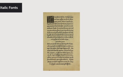
Hi there? And welcome back to this course the Ultimate Guide to Typography. In this lesson, we will expand on the different collections of faces. We'll talk about the different font weight, font style and proportion. The concept of large type families was proposed by Morris Fewer Benton in the late 19th century and early 20th centuries. The idea behind his concept was that characters within the family would share a common DNA with slight distinctions. So having such a wide range of typeface weights gives us the ability to create hierarchy. Large type families usually have a wide range of font weights,, font styles, and proportions. Let's start with this first feature, Font Weight. Having such a wide range of font weights gives us the ability to create a hierarchy within a page. Well, the most common weights we see in a typeface are regular and bold. Some include much more than that. Neue Haas Unica is a great example. This typeface includes font weights like ultra light, thin, light, regular, medium bold, heavy black, and extra black. With this many font weights, you can make content pop or stay quiet. Using heavier weight will attract attention. When type was invented, all fonts were designed as Roman. Italic fonts, were introduced around the 16th century. By the 18th century, foundries started pairing Roman and Italic designs. Italics were used to emphasize certain points in a text block, true Italics or angle typefaces strongly influenced by calligraphy. This style is specifically designed to much the Roman fonts. Some characters like a, f, and g are very different from their Roman versions. So there is thought behind the design. Oblique fonts are less organic and less calligraphic inside. None of the oblique fonts go through the cursive transformation. Instead, they can look like they're a Roman character with a slight slant. Oblique fonts are usually normal in Sans Serif fonts. And last we have proportion this refers to the width of a character in relation to its height. Font families don't usually come in different widths, but there are a few famous ones that include a huge priority. In this lesson we looked at typography more in detail. Large type families can have different weight, style, and widths, while still sharing a common DNA. With a single large family, you have enough variation to create hierarchy or keeping a minimal design. In the next lesson, we will look at the specific font file types. We'll see you there.


