
 Lessons: 12Length: 38 minutes
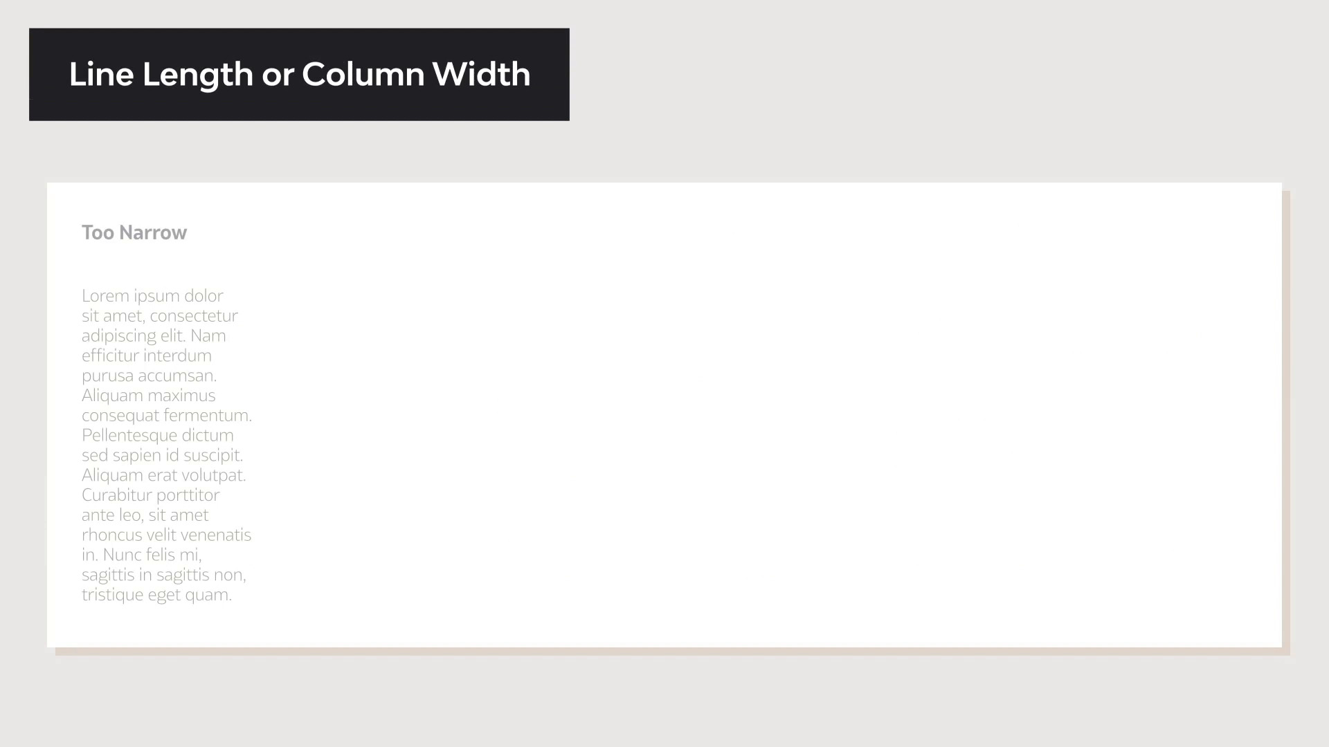
- Overview
- Transcript
3.2 Readability and Typesetting Basics
Readability dictates how clear and easy it is to read a paragraph. In this lesson, we’ll take a look at the elements that make a text readable. We’ll look at elements like size and line length, and we'll answer questions like:
- What is leading in typography?
- What is tracking in typography?
- What is kerning in typography?
We'll also give a few rules of thumb to get you started on basic typesetting and help people enjoy reading your text.
1.Introduction
1.1Introduction00:53
1.2A Brief History of Type04:27
1.3Typeface vs. Font01:26
2.Type Classification and Type Families
2.1Type Classification09:44
2.2Type Families02:46
2.3Font File Types02:43
3.Legibility and Readability
3.1Legibility and Type Anatomy02:45
3.2Readability and Typesetting Basics03:33
3.3Common Typesetting Mistakes02:15
4.Choosing Fonts and Font Combinations
4.1Choosing the Right Fonts03:31
4.2Font Combinations02:59
5.Conclusion
5.1Conclusion01:16
3.2 Readability and Typesetting Basics
[MUSIC] Hi, welcome back to the Ultimate Guide to Typography. In this lesson, we will take a look at readability. Readability relates to how type is set on the page. It is the arrangement of fonts or words in order to make a written content flow in a simple and easy to read manner. There are a few factors that contribute to good readability, so let's take a look. Type size, taking consideration who you're designing the content for, who's your audience. The smaller the text size, the more difficult to read, especially if your audience are elderly, children or visually impaired individuals. As a rule of thumb, normal body copy text size should be set between 8 points to 11 points. 12 points tend to be a little bit too big, but that also relates on the font. If your font has a large x height, then it will be easier to read at a smaller point size. Type case, all caps text tends to be challenging to read because there is not much distinction between the shapes of each character. For lengthy text, try using upper and lowercase also named the sentence case. The ascenders and descenders help distinguish characters easily. Line spacing, also known as leading. The amount of leading you will need for a textbox is based on the type size and the x height of a specific typeface. To maximize readability, make sure there's enough line spacing. Our general rule of thump, is to have a leading value between 1.25 and 1.5 times greater than the font size. Line length, also known as column width. When the column width is too narrow, it can result in many hyphenated words forcing the eyes to jump to the next line more often. On the other hand, very long lines can cause confusion when trying to follow the next line of text. A basic rule here, is to aim for a number of characters between 45 and 70. Kerning and tracking, kerning is the adjustment of the space between two individual characters within a word. This is mostly used in logos or headings. Most typefaces need kerning adjustment, because a few characters could be either too close together or too far apart, so you want to find a balance. Tracking or letter spacing, refers to the space between a group of letters in a line of text. This is particularly helpful when working with type that is setting all caps, or heavier weights that require more spacing in between the characters. Color and contrast, these refers to the color of the text in comparison to the background. Make sure there's enough contrast between these two, and that the colors that you're using don't vibrate against each other. Vibrating colors happens when two directly adjacent colors appear to blur or glow giving the illusion of motion. The mix of these colors have usually the same high saturation and they are opposite on the color wheel. In this lesson, we define what is readability, we outline the elements and the rules that can help you get started with typesetting text. In the next lesson, we will take a look at common typesetting mistakes to avoid. We'll see you there.


