
 Lessons: 12Length: 38 minutes
- Overview
- Transcript
3.1 Legibility and Type Anatomy
Legibility depends on the common DNA that a set of characters carry. There are multiple elements that contribute to the legibility of a typeface. In this lesson, we’ll take a look at type anatomy and how this affects legibility.
1.Introduction
1.1Introduction00:53
1.2A Brief History of Type04:27
1.3Typeface vs. Font01:26
2.Type Classification and Type Families
2.1Type Classification09:44
2.2Type Families02:46
2.3Font File Types02:43
3.Legibility and Readability
3.1Legibility and Type Anatomy02:45
3.2Readability and Typesetting Basics03:33
3.3Common Typesetting Mistakes02:15
4.Choosing Fonts and Font Combinations
4.1Choosing the Right Fonts03:31
4.2Font Combinations02:59
5.Conclusion
5.1Conclusion01:16
3.1 Legibility and Type Anatomy
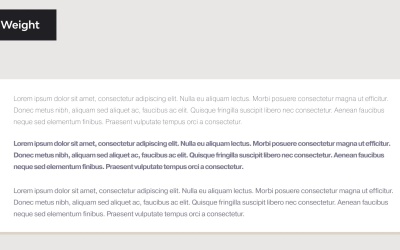
[MUSIC] Hi there, and welcome back to the Ultimate Guide to Typography. In this lesson, we will take a look at legibility and how type anatomy can affect it. Legibility is how a typeface functions. It is a measure of how easy it is to recognize one letter or word from another and how easy blocks of text are to read. If a text can be easily recognized by the reader, it is legible. There are different factors that contribute to a typeface legibility. Here we'll use different characters to point out parts of the type anatomy. X- Height refers to the height of the lowercase characters in proportion to the capitals. The taller the X- Height, the more legible the typeface tends to be. This is because at a smaller point size, the taller X- Height helps the reader distinguish the characters. Character width, this plays an important role in legibility typefaces with an overall average width are easier to read and those that are condensed extended, specifically for body text. Weight, very light or heavy weights are extremely hard to read, try using one that falls in the middle. Book weight or regular weight are often used to typeset books. If you use a thin weight instead of at about 10 to 12 points, they will disappear on the page, try using a weight that holds up nicely. Design Traits, the overall shape of the character design should be something more or less neutral, nothing too quirky as it can reduce legibility and add too much personality. Stroke Contrast, this can reduce legibility, especially in modern fonts like Bodoni, which has a very thin strokes. When printed they become challenging to read. The combination of heavy weight and small counters results in hard to read texts especially if it is used as small point size. Serifs or Lack of, serifs are generally believed to enhance legibility because of the small fit. Sans serifs have become more popular in the last few years for body text. So consider all the traits mentioned before to decide what font to use and how legible it is. Keep in mind that not all typefaces are designed to be legible. Consider the text you're designing, the length, and the audience that will be reading it. In the next lesson we will take a look at readability and how it relates to typesetting. We'll see you there.


