
 Lessons: 12Length: 38 minutes
- Overview
- Transcript
2.1 Type Classification
There’s no single type classification system, but many have been proposed. There are different variables, so it’s difficult to classify them in a specific group. However, it's important to understand the different font types when learning typography, so in this video, I'll give a general overview of the different types of fonts and when to use them.
Featured Fonts and Templates
- Addington CF
- Arkibal Serif
- Proposal
- Resume
- Physis
- Love Letter Wedding Invitation
- Feather Watercolor Wedding Invitation
- Castinos
- Billow
- Summer Font Pack
- Summer Handwriting Font
- The Crow
- Sea Horse
- Southsider
Related Links
1.Introduction
1.1Introduction00:53
1.2A Brief History of Type04:27
1.3Typeface vs. Font01:26
2.Type Classification and Type Families
2.1Type Classification09:44
2.2Type Families02:46
2.3Font File Types02:43
3.Legibility and Readability
3.1Legibility and Type Anatomy02:45
3.2Readability and Typesetting Basics03:33
3.3Common Typesetting Mistakes02:15
4.Choosing Fonts and Font Combinations
4.1Choosing the Right Fonts03:31
4.2Font Combinations02:59
5.Conclusion
5.1Conclusion01:16
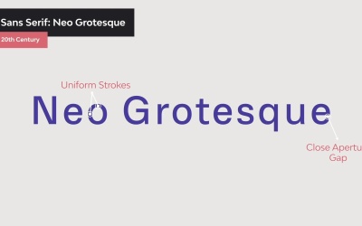
2.1 Type Classification
Hi there and welcome back to this course the Ultimate Guide to Typography. In this lesson, we will take a look at the different type classifications. There are different variables so it's difficult to classify them in a specific group. This is a general overview of the different types of fonts. Many typeface have been influenced by history and come in all different shapes and sizes. Depending on their characteristics and uses, we can classify typefaces into seven big groups, and each one may contain subgroups with more specific details. So let's start with the first group, serifs. Serif are small feet at the end of a stroke on the letter. Going back in history, characters used to be created by chiseling on stone. The chisel created small feet at the end of each stroke. Serifs helped the reader follow the letter forms easily making them highly legible. Serif fonts convey a very traditional vibe. You can find serif fonts being used in long form copy like books, magazines, and newspapers. Serif fonts are divided into subgroups, the first one is old style. Old style fonts were developed between the 15th and 18th century to be used as middle type for early printing processes. A few of their characteristics are, serifs can be slightly round, cupped, and slightly inclined. The characters have a diagonal stretch rather than vertical to emulate a calligraphic field. Low contrast between thick and thin strokes. A great example of an old style font is Goudy Bookletter. Next, we have transitional, this font came into picture in the 18th century. There were a transition between the old style font and the modern style. Since printing processes became more refined, it allowed for finer details on the fonts. A few of the characteristics are sharper serifs, near if not completely vertical stress, higher contrast between thick and thin strokes. Baskerville is a perfect example of a transitional fund. The next subgroup is a modern style serif. These fonts became even more refined and more detailed due to the printing processes advances. Some of the characteristics are serifs were completely straight and flat, complete vertical stress, much higher contrast between thick and thin strokes. An example of a modern style serif font is LTC Bodoni 175. And last we have the slab serif. These fonts are the easiest to identify from this category as they set themselves apart from the rest of the serif fonts. Some of the characteristics are, the serifs have a square shape and are heavier and thicker, the stroke is uniform throughout the characters, characters include a complete vertical stress. A great example from Envato Elements is Arkibal Serif. With the exception of slab serif, serif fonts can be used as body copy as they're easy to read and comfortable for the reader size. The next category is Sans Serif Fonts. Sans comes from the French without. Sans serif fonts are like the name describes, without serifs. These were considered informal serifs and first used in the fifth century BC. The first sans serif printing type was developed by William Caslon in the 18th century. This is the most versatile category. Use this as display or for a long form copy. These letter forms are clean, minimal, and modern looking. Sans serifs are divided into four big categories. The first one grotesque. The grotesque style was commercially popular in the 1900s. Some of the features are, slight contrast between thick and thin strokes, open aperture gap in characters like a and e, and the double story g from the serif fonts. BW Glenn sans is a grotesque style example from Envato Elements. Next up, we have Neo grotesque fonts. These were a refined version that came later in the 1900s. Designers wanted sans serifs to be legible in nature, so much of their personality was stripped away. A few of the characteristics are, the stroke is uniform throughout the characters, close aperture gap in characters like a and e, and a single-story character g. A great example here is physis. The last subgroup from this category is humanist sans serif. These were based on the proportions of Roman style capitals. Some of the details on the characters had a calligraphic influence. Here are some characteristics. The contrast between thick and thin strokes becomes more apparent, there is a slight stress on the vertical axis similar to the old style serifs. Wide aperture on letters like a an s to improve legibility, the g goes back to being a double story character. A great example of a humanist font is Gill sans Nova. And last we have geometric fonts, these are exactly what the name suggests. Some of the characteristics are, characters typically have optically circular bowls and tend to be very rectangular. Little to no stroke contrast, typically has a complete vertical axis, usually feature a single story lowercase a. A great example here is the Futura. With the exception of geometric typefaces, sans serif aim for high eligibility at long distances and in body copy. The next subgroup we have is script fonts. These are based on the flow of cursive handwriting and divided into two big categories, formal and casual. These fonts are not suitable for body copy, instead use them for display texts headlines, titles or very short copy. Formal scripts are elegant typefaces used on wedding invitations and diploma. They're inspired by writing from the 17th and 18th century. Each character includes an entail for fluidity. Flourishes and swatches are mainly features in script fonts to adorn characters. An example here is Bickham Script Pro 3. Casual script fonts are inspired by what brushstrokes in the 20th century. These typefaces tend to be more relaxed and friendly compared to formal scripts. We have Castinos from Envato Elements as an example. The next category is calligraphic fonts. These have become very popular in the last few years. While these fonts try to mimic brush and nib strokes, the letter forms are quite contemporary. Billow is an awesome example of calligraphic fonts. Next up, we have handwriting. These fonts are also fairly new. Hand writing fonts, lack of clear structure and definition that script fonts have, handwritten fonts are much more informal and laid back. A good example here from Envato Elements is Summer. Next up we have Blackletter or Gothic. These fonts date back to the 1400s, and are based on medieval calligraphy. The style are all from illuminated manuscripts. They were mainly used in Germany for the Gutenberg 42 aligned Bible, the first book ever printed in movable type. Blackletter fonts were drawn with a flat nib pen, held at an angle, and due to the nib pen, there is a high contrast between thick and thin strokes. And last but not least, we have display or decorative. These fonts don't really fit into any of the previous categories. It is perhaps one of the most diverse and largest. These fonts are not suitable for body copy and are often experimental. Fonts like graffiti style or tattoo fonts and many more can be included in this category. So how do you choose the right typeface? With this classification, we can see that fonts come in all shapes and sizes and can evoke specific feelings. If you're looking for typefaces suitable for long copy like books, blogs, magazines, or newspapers, you'll want to use a serif or a sans serif font. With the exception of slab serifs and geometric fonts, these tend to be legible at a smaller size. Anything outside of these two categories can be used as display fonts. These should be used sparingly and only to attract attention because they tend to be more elaborated. In this lesson, we took a look at the type classifications and some of the characteristics that make these fonts suitable for body copy or display. In the next lesson, we will get more into the details of type families, weight, style, and width. We'll see you there


