- Overview
- Transcript
4.2 Font Combinations
Typography is one of the most important components of graphic design. The font selection process can be difficult, even for the most seasoned designers. Good font pairings will show your design knowledge. In this lesson, we’ll show you a few tips and tricks you can use when it’s your turn to combine fonts.
Featured Fonts and Templates
1.Introduction3 lessons, 06:46
1.1Introduction00:53
1.2A Brief History of Type04:27
1.3Typeface vs. Font01:26
2.Type Classification and Type Families3 lessons, 15:13
2.1Type Classification09:44
2.2Type Families02:46
2.3Font File Types02:43
3.Legibility and Readability3 lessons, 08:33
3.1Legibility and Type Anatomy02:45
3.2Readability and Typesetting Basics03:33
3.3Common Typesetting Mistakes02:15
4.Choosing Fonts and Font Combinations2 lessons, 06:30
4.1Choosing the Right Fonts03:31
4.2Font Combinations02:59
5.Conclusion1 lesson, 01:16
5.1Conclusion01:16
4.2 Font Combinations
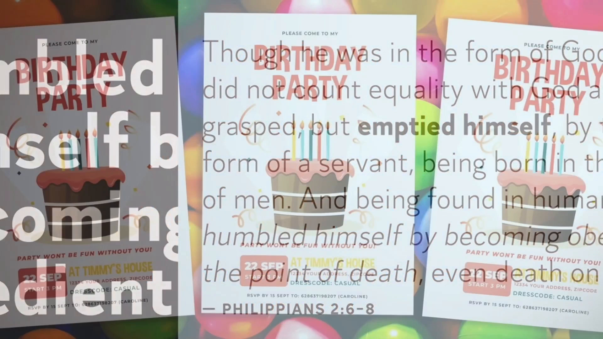
[MUSIC] Hi there, and welcome back to the Ultimate Guide to Typography course. Combining fonts can be difficult even for the most seasoned designers. Good form pairing dictates how professional, readable, and aesthetically pleasing your design is. Here are some tips and tricks on how to pair fonts. Use a single font family. If you're still unsure about how to combine fonts, take the same route, use super families and you will be one step closer to creating a minimalist layout. They usually come with many weights and styles so you can experiment by using a couple of them and creating a great minimal piece. Use variables like size, color and weight to create a visually strong layout with hierarchy. Keep it minimal. Combine only two to three fonts. Mix fonts that have different anatomy. For instance, a serve with a sans serif. The more fonts to use in your project, the more confusing it is for the audience to get a feel of the personality of the text. Avoid mixing fonts from the same category that look alike. This can look like a mistake. You can also try combining a display font with a serif or a san serif. Pay attention to the content. Fonts are like humans, each one has its own personality and character. For instance, use decorative fonts for a kid's birthday party invitation. But you wouldn't want to use the same font in a formal document like a resume or a high end restaurant menu. Combine fonts from the same designer. If you're still learning how to pair fonts, try mixing fonts from the same designer. Designers have a particular style and vision and this also applies to type designers. And vital elements has some of the best type designers with awesome font libraries. Try Font Duos. At Envato elements, designers have already gone through the rigorous process of finding the best font combinations. And these parents can come in handy. Whether you're designing a wedding invitation, social media posts, or even logos. If you're looking for a specific mood, this is an awesome way to choose fonts. Trust your gut in practice. Like any skill, phone pairing requires practice. Try out and combine fonts on your own. Try crazy combinations with traditional fonts to see how they work. There's no exact science as to what font pairings will perfectly work together. It is based on content and the mood you want to evoke. There are many viable options you can take that will help you avoid mistakes when pairing fonts. Envato element has an extensive library of fonts that you can explore and experiment with. In the next video, we'll wrap up this course and show you everything we learned.


