
 Lessons: 7Length: 47 minutes
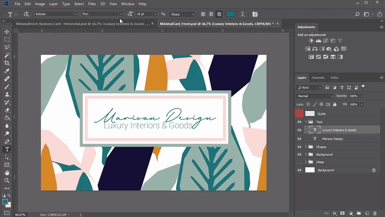
- Overview
- Transcript
2.3 Minimalist Business Card Design
For our first business card design, we'll create a colorful card inspired by a beautiful set of jungle patterns from Envato Elements. Learn how to build this clean, minimalist business card from scratch, using simple shape tools and more incredible resources.
Related Links
2.3 Minimalist Business Card Design
Hello everyone, and welcome back to this course. Now that we've gone through an overview of our designs, let's dive right into the first business card, inspired by beautiful tropical patterns. Create a new document in Photoshop at 3.75 by 2.25 inches. Set the resolution to 300 PPI, and make sure that the CMYK option is selected for the color mode. I'll write down the title real quick as the minimal card. And I'll also include that this will be the front side of the card, so that I can find it easily within my files. Now let's move on to the guidelines for the bleed. Create a new layer and name it either Guide or Bleed. Then right click the visibility icon and change the layer color to red. Now set up a new set of guides. Go to View > New Guide, setting a vertical guide at 0.125 inches. Then go to View > New Guide again, setting a horizontal guide at 0.125 inches. Repeat this process for the last two. Go to View > New Guide and create a horizontal guide at 2.125 inches. Then finish up with the last vertical guide at 3.625 inches. Mark this area with a simple black border. Select the rectangular marquee tool, and make a selection. Right click to stroke the selection with a black stroke of two pixels. You can either use the blue guides or this border to help you design the card. For our first business card, we'll be basing the majority of this design, including the theme and colors on this incredible pack of jungle patterns from Envato Elements. So open jungle pattern 2 and hold Ctrl + A to select the pattern. Copy and paste the pattern onto a new layer before inserting the layer into a new group named background. You'll notice that we'll definitely need to resize it. But for the moment, I wanna take this opportunity to play with the design of the card. So hold Ctrl + J to make two more copies of this background. Once they're copied, we can now change the size of each one so that we now have three different versions to choose from for our final background. Use the move tool to move the pattern around the canvas. See which parts of the pattern would look best for this card. Here's what I'll settle on for the first background. Now unhide background number two and use Ctrl + T to resize the pattern. Make it only slightly smaller this time as you push it around the canvas to find the sweet spot. Just tap a few times or hold the arrow key for the direction you would like to push the pattern in place. Now resize the third image. Unhide background three and hold Ctrl + T to make it much smaller than the other ones. Now that we have all three options ready, I'm gonna experiment really quickly with another pattern. I also really love pattern number three from the same jungle pack. I'll create a new group dedicated to this new background ideas then I'll copy and paste pattern number three onto a new layer and make three separate copies scaled to three different sizes. When we're through, we'll also have another great set of backgrounds we can use as a quick alternative. Once the other details of the card are complete, I'll then show you how these new patterns look. Start building the rest of the card. So make a new group called Shapes. Then select the rectangle tool and click on the canvas. Create a rectangle at 755 by 281 pixels, then change the color fill to white. Center it easily using the smart guides. This simple rectangle will hold the branding of our logo name and tagline, so let's create a quick border. Right click the layer and go to blending options. Add the stroke option, and use the eye dropper tool to pick up this light green color directly from the leaves. Make sure the position is set for the inside, and the size set to 15 pixels. Position it a little higher by selecting the move tool and tapping the up arrow key. Let's add another shape. Select the rectangle tool and create a rectangle at 704 by 226 pixels. You don't necessarily have to include the numbers after the decimal, those are just the ones from my original template. Now position the new rectangle within the first. It'll briefly disappear, so let's right click the layer and go to Blending Options to add another border. Select Stroke and use the eyedropper tool to grab this light salmon color from one of the flowers. Keep the rest of the settings the same, then reposition the shape for more balance. Now this whole time, we've been designing with this particular background pattern, but I've decided to change my mind. So go back into the background group and hide the third one so we can use the second image as the final background. Instantly, it already starts to feel a little better for the composition. All we have left to do for the front of the card is add the text. Create a new group named Text. Then select the text tools and write the words Marison Design. For the color, I just grab this nice green color right from the center of the leaves. We'll be using its Marison Brainy from Envato Elements, and the regular style at 25 point. The next step we'll take is to adjust the kerning or spacing between the letters. Right now the letter E in the word design is a lot further away from the D letter than I'd like. So to adjust this, I'll position a text marker between the letters, then hold the Alt key while tapping the left arrow to bring the letter D much closer. Now let's add the tag line. I've created this car with the idea in mind that this would be for an interior designer's business. So right below the words Marison Design, we'll write luxury interiors and goods. In the case that you're unsure of which font to choose, just cycle through all the fonts on your computer to find the one that works best. I'll go with this Roboto font in a thin style at 4.5 point. We'll add the color by playing around with the colors already on the canvas. So let's choose this beautiful salmon color from the border as the official tagline color. This last detail completes the design of our front business card. All you have to do now is get ready for the back. But instead of going through the same old steps we did before for meticulously setting up each document, I'll show you a quick cheat. Make a copy of this exact same file by going to Save As and changing the name to the back of the minimal card. This simple cheat means that we now have a card that automatically has the bleed guide set up and keeps our original background images in place in case we wanna use them again. So get started with this next composition by deleting all the other groups except for the original background patterns. I decided to go with the larger background pattern, background one, because I really like the idea of letting this subtle change elevate the total experience of the card. Create a new group for the shape layers, then select the rectangle tool and create a white rectangle at 1010 by 561 pixels. Position this rectangle in the center of the card, since we used borders on the front of the card, let's try them out on the back. Right click the layer and go to Blending Options. Add a new stroke with a size of 10 pixels this time, in the same light green color from the leaves. Now create three more new groups, one for the location map, the second for the icons, and the last one for the text. Let's add the logo from before. Just like the front design, we'll write, Marison Design on the back and the same Marison Brieny font at a regular style, but this time much smaller at 15.5 point. Position the company name in the upper left corner and don't forget to add the tagline. Write Luxury Interiors & Goods beneath it in the Roboto Thin font with a size of five point. I won't change the tagline color because it might be hard to read at a much smaller size. Moving on to the card holder's name, we'll switch things up by throwing a new font into the mix. So write Sam Smith or your name in the upper right corner in Bambi regular at a size of 29 point. To make this font appear a little thinner, we'll add a quick border. So right click the text layer and go to blending options. Add a stroke of one and the same light green as before. Finely tune the spacing between the letters using the Alt and arrow keys depending on how you would prefer your name to look on the card. Next we'll write the job title. This card doesn't belong to the company owner but rather an employee. So we'll write the words Creative Director with the Enrique Light Round font at a size of six point. Position this title right in the center below the card holder's name. Select the line tool and create a black horizontal line with a weight of one pixel. Adjust the width to 350 pixels and change the color to the same light green from before. Now for the contact details. Let's start with the map. Click on the map group and select the rectangle tool. Create a new rectangle at 400 by 250 pixels. Then change the color to salmon and position it on the left side. We'll be using this layer to insert a map for our business' location. Right click the layer and select convert to smart object. Go back to the shape group select the line tool. Create a new vertical light green line at a weight of one pixel. This will help separate the main contact details from the map. So before we write even more information, let's include the icons next. Here I'll be using the PNG versions of these 50 business glyph icons from Envato Elements. Hold Ctrl + A to select each icon and copy and paste each one onto their own new layers. Use the arrow keys to position each one, making sure there is enough equal balance between the icons. Their original color is black, but you can easily adapt them to your brand by adding a new adjustment layer. So add a new adjustment layer of hue and saturation, and set it as a clipping mask to the group. Change the hue to 138, the saturation to 82, and lower the lightness to negative eight. Now we have three icons in a nice green color scheme that matches our brand style. Let's move on to our final text. Just like before, we'll be using the Enrique Light Brown font, this time at a size of six point. Write out the phone number, the email address, and then the website URL. Position each one to match up with their corresponding icon as best as you can. The final details we'll need for this card are the address and the map. First, type out the location underneath the salmon rectangle with the same Enrique font, but this time at a size of 5 point. For the location map, we'll be taking a simple screenshot from the OpenStreetMap website, which is a free resource we can use for this special detail. Then hit the Print Screen key on your keyboard, and copy and paste the result into a new document. Make a quick selection to grab the area you need then copy and paste the result within the smart object layer designated to the map. Resize the map until you have the business location well within view and make sure to save the smart object when you're finished. You have now just completed the back of this design. Feel free to try out other pattern options by unhiding the other layers within the background group. You can also experiment with different patterns from the same jungle pack, like this beautiful, rich blue design. With all the elements and colors already in place, you'll see that the new pattern still matches the style we're going for. This completes the lesson for our first business card. Let's dive into our next design which features a fun photographer's theme that's great for all creatives.


