
 Lessons: 7Length: 47 minutes
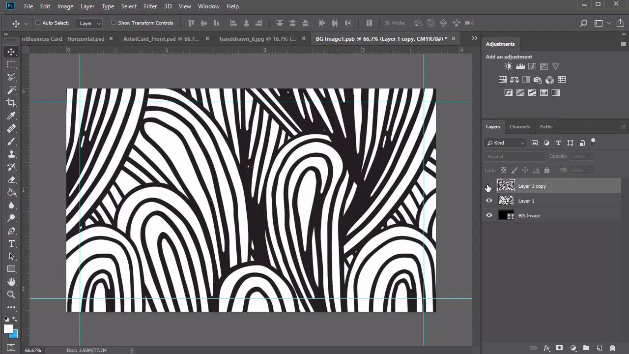
- Overview
- Transcript
2.5 Creative Business Card Design
Our final card is inspired by business owners who want a simpler composition. Great for artists, such as children's book illustrators, this simple, creative business card design features an incredible doodle pattern and clean typefaces from Envato Elements. Learn how to design a business card that really showcases your creativity.
Related Links
2.5 Creative Business Card Design
Hello everyone and welcome back to this course. I hope you've enjoyed making two incredible business cards with me so far. Let's complete the experience with one more design, inspired by a quick artistic theme. Since Photoshop saves our recent documents, let's create a new one at the same dimensions as before. Now give this card a name, making sure to include that it will be the front side of this card. Let's get started with the bleed lines, create a new layer and name it Bleed. Then right click the visibility icon and select red. Now create a new set of guidelines with the same values as before. Go to View > New Guide, setting a Vertical guide at .125 inches. Then go to View > New Guide again, setting a Horizontal guide at .125 inches. Repeat this process for the last two. Go to View > New Guide and create a Horizontal Guide at 2.125 inches. Then finish up with the last Vertical guide at 3.625 inches. Select the rectangular marquee tool, and make a selection. Right click to stroke the selection with a black stroke of two pixels. Feel free to hide this layer if need be, and use the blue guidelines as your reference. Now set up your first group. Create a new group and name it Vackground. Select the rectangle tool and make a black rectangle that stretches across the entire card. If you're worried that the square might not cover the background completely, just check it by changing the color of the art board. If any white is showing just resize it again, with the free transform tool. Rename this layer background image. Just like with our photographer card, we'll be using this layer as a placeholder for any graphic you would like to use for the background. To do this turn the shape into a smart object by right clicking the layer and selecting convert to Smart Object. Now double-click the smart object icon, so we can insert the background image. So this particular card features a few of the sketches from this incredible hand-drawn doodle patterns pack from Envato Elements. Once you download the file, you'll be presented with all these patterns in both JPEG and PNG format. Select hand drawn pattern 3 and open it into Photoshop. Hold Ctrl+A to select this background, then copy and paste it onto a new layer above your rectangle placeholder. Once you place it, you'll notice that you're viewing the pattern at a much bigger size. But Save the smart object first, and check to see how it looks on the card. If you want more options for this pattern arrangement, select Layer 1 and hold Ctrl +J to create a copy. Resize this copy to make the pattern appear much smaller, allowing more doodles to take up space. Then select the move tool and use the arrow keys to finely tune the position of the sketch. Personally I like the size of the second pattern much better, so don't forget to Save the smart object to apply the new background. Now let's set up our shapes. Create a new group and rename it Shapes. Then select the rectangle tool and click on the canvas. Create a new rectangle at 420 by 199 pixels in this bright blue color. Since the file is in CMYK mode, bright colors don't show up as well. So we'll bring out the intensity of this color by right clicking the layer and going to blending options. Create a color overlay with this new blue color setting the blend mode to overlay. Now use the move tool to position a rectangle in low right corner using the arrow keys to help. Select the rectangle tool again and click on the canvas. Create a new rectangle at 33 by 713 pixels with the same pastel blue color fill. Then move it to the left side of the card, making sure to give a plenty of room away from the edges. To apply the same layer style, right-click the first rectangle and click, Copy Layer Style. Then go to the skinnier rectangle, and now right-click to paste that same layer style. All we have left for this side of the card is to add your name and tag line. So create a new group for the text layers, select the text tool, and set the foreground color to white. Here I'll be using this font bright chalk font at a size of 15 pixels, placing the name MARY JONES on the lower right rectangle when we're finished. This playful font matches the casual look of the background. But as we flip through some other font choices, you'll also see that some set of fonts might work here as well. Create a new text layer at a size of 5 point for the job title or tag line. I'll set this font to Roboto Regular using the move tool and arrow keys to center it underneath the name. We are almost finished with our font card, but if you'd like, you could also see how the background would look, with other background choices. To do this, double-click the background smart object and save it with a different pattern or size. Here is what it would look like with the original pattern scaled at a much bigger size. And also what it could look like if you add one of the other doodle patterns from the same pack. Since I still like our first choice, I'll now add a quick drop shadow to this blue rectangle to create a little depth. Right-click the layer, and go to Blending Options. Then, add a black drop shadow with the following settings. Feel free to take this moment to color code these groups before moving on to the back of the card. Here is our completed front design. So just like before, we'll use a little file trick to help us make the back of this design with the exact same dimensions. So save a copy of this file by renaming it as the back of the of the artist card. Now go through all the layers and start deleting the details we no longer need. To keep inline with our branding and color scheme, let's change the color of the back to the same bright blue from before. Select the shape layer and set it to the first pastel blue, and now right click to paste that same layer style. Save the smart object to see the new background. Now select this leftover shape group and rename it Patterns. Open the graphic for the handdrawn 2 doodle in PNG format. The PNG versions are made on a transparent background, so they'll be much easier to insert right into our card. Select the rectangular marquee tool and make a selection around one of the middle sketches. Then copy and paste it onto a new layer inside the pattern group. Hold Ctrl+T to resize the pattern making sure it stretches across the top of the card. Now open a second pattern, handdrawn number 4 into Photoshop. Use the rectangular marquee tool to make a selection around any of these doodles that you like. Then copy and paste it onto a new layer within the Patterns group. Resize this pattern, letting it stretch across the bottom for more balance. Creating a group above the patterns one dedicated to the shape layers. Then select the rectangle tool and click on the canvas. Create a black rectangle at a size of 401 by 110 pixels, and place it in the top centre of the card. Here is where you will write your name and job title for some contrast against the bright blue background. Now use the rectangle tool again to create another black one and a much smaller size of 307 by 51 pixels. Place it off to the right. Next, let's create the last shape in this group select the line tool and create a black line with the weight of one pixels right down the center. Readjust the height to 200 pixels, then use the move tool and arrow keys to position this line right where you need it. To finish this card, all we really need is the text. Unhide the text group from earlier, we won't need to adjust the size of the name, so just position it within the top rectangle. For a slight change, feel free to switch the tagline to Roboto Italic. Now the details of your card may vary from business to business but I would suggest highlighting the things you're proud of. I'll create new text layers on the left side dedicated to being an author. So write out author of in Roboto Italic at a size of six point. Now add the titles of the books or articles you love best. For this card, these book titles are totally made up, but I've still made sure to keep the children's book theme going by writing them all with silly and playful names. So create each new book title with a Robotic Italic font at a size of 8 point. To speed things up, I duplicated the text layers until I got to the word and, which I then lowered to a size of 7 point for a subtly change. Then create the last text layer, Drawing with Ms. Patience with the same settings as before. Feel free to take this moment to adjust the alignment of your text. Let's move on to the right side. So start by adding the website address, write your website name, or mayjones.com in Roboto Regular with a size of 7 point. Then position it within a smaller black rectangle. Now include the phone number, email, and street address in the same font and size, but just bolded for more clarity. Keep aligning your text and shapes until you're happy with the result, then finish up by color coding the layers for more organization. Here is the final back design of this card. Now that all the details are in place, you can try out different colors easily by simply clicking the smart object background and changing of the shape layer. Here is what it would look like in yellow, purple and with a fun gradient overlay. You can customize it even further by checking with your printer. Add beautiful details like a raised-ink effect to make your details even more tangible. Here's our complete artist card design. Now let's move on to the conclusion of this course, where we'll go over a final recap of everything we've learned.


