
 Lessons: 7Length: 52 minutes
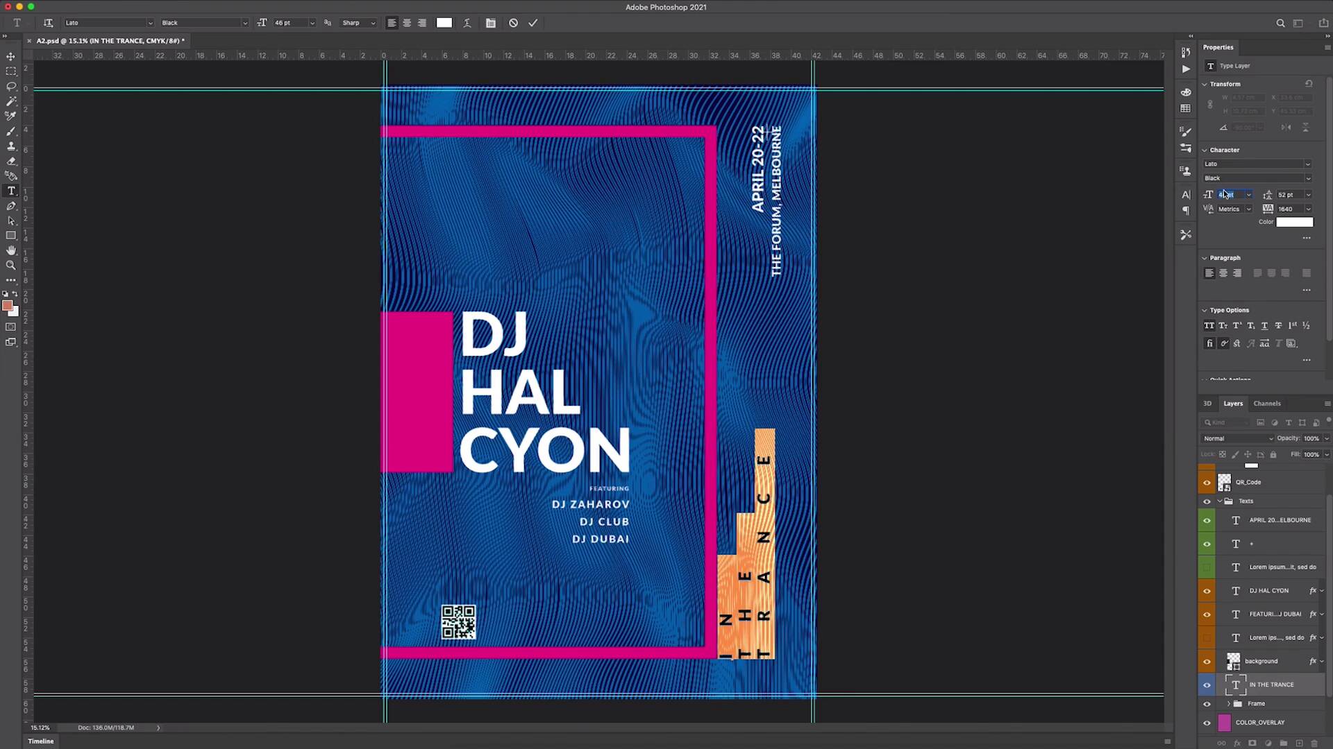
- Overview
- Transcript
2.2 Inserting and Organising Content
In this lesson we'll go through the basics of designing a music event poster for print and digital, familiarise ourselves with the traditional structure of a poster, and insert and organise our copy on the template.
1.Introduction
1.1Introduction00:39
2.Create a Minimalist Poster Design
2.1How to Make a Poster in Photoshop06:20
2.2Inserting and Organising Content09:22
2.3Adding a New Font04:01
2.4Customising the Colour03:57
3.Create a Music Event Poster
3.1How to Create a Poster in Photoshop13:07
3.2How to Add a Promoter Logo14:38
2.2 Inserting and Organising Content
So in the last video, we downloaded a pre-made event poster template with a bold but minimalist design. We found our way around the Photoshop file by using the layers and finding out where everything is, and we inserted our content. And now, as you can see, it's a little bit not quite right, it's a little bit messy with our content in there. So it's time to start cleaning things up and adjusting the poster design structure to clearly communicate our event. So the first thing I'm going to do, is add some hierarchy to the information in the design. Now the DJ HALCYON is kind of our main act here, but as you can see, the copy is looking a little bit sort of odd and out of place, mainly because of the way that it's sitting in front of that sort of pink rectangle. And that's because that pink rectangle is meant to house any sort of two lines of text. We're also seeing that the support arcs there is extremely small, we can sort of barely read that information. So we're going to need to do a little bit of sort of resizing and realigning here, to make the hierarchy of that section and those two bits of information a fair bit clearer. So the first thing I'm going to do, is actually take that DJ HALCYON text, then sort of move it a little bit, I might center it there. And then I'm going to take that rectangle, which is this sort of background layer here, and I'm just going to resize that and sort of move it a little bit. So let's make sure our move tool is selected, this move tool in the top left corner here, or you can press V on your keyboard, I'm just gonna move that to the side, and make sure that that's aligned to the left there. You can see a little purple line pop up there when it hits the edge of the canvas, and that's what we want to see. And if you can see that purple line in the middle there, you can see that it's centered vertically. So I'm just going to hit Command + T, that is your resizing tool, so if you ever need to resize something, you can just hit that. And I'm also going to hit Shift on the new version of Photoshop, if you hit Shift, you can kind of do a bit of free resize. And if you hit Alt at the same time, it resizes from the center of the shape, and that's what we want here. So we just want it to match the, you can feel it clicking into place there, we want it to match the height of that DJ HALCYON text. And we're just going to move that, no, we don't want that. We're just going to move that and press Shift which is going to move that to the side of the DJ HALCYON text there, and that's just made that a little bit clearer. Now we're going to take those support arcs that you can barely see right now, and we're going to move that underneath the sort of main DJ HALCYON title. So that's this featuring layer here, going to move that down here. And let's use that Command + T function yet again, in fact, what we're going to do is just clean that text book up a little bit by pressing T and see, that's just a little bit messy. We're going to rush a line, this, just, so that we use this DJ HALCYON as a bit of an anchor point. So it's right up to the edge of that end, and it's also aligned, this text is aligned to the edge of that end, so I think that that looks a little bit clearer now. If we press Command + T, and we pull from the side, we can also make that a little bit bigger. And we're also, again, just going to get into that text box there, and we're just gonna select all of that text. And I think we can both make some of it a little bit bigger by going to the character section and resizing and slap it up here. I think we gonna add a little bit of hierarchy by reducing the size of this featuring text. And we're going to move these lines together, using this function here in the character section, so it's a line spacing section. And if you say that, that's starting to become a little clearer, it's a little clearer that they're related, this text here, and you can ray that just a little bit easier. Beautiful, that's starting to look like there's a bit more structure there already, and this text up here in the corner is really falling completely off of the screen, so let's have a look at that, so there it is. We're just going to use the align tool again for that, the paragraph line that'll pop up up here when you select the actual text. Or it'll be here always, sort of below the paragraph section, if you have that open in your text font properties, so let's hit that. And you can see we can now see that text, we're just going to do a couple of things here. The first thing I wanna do is just make the April section just a little bit bigger, because I think that that is a little bit more important than the venue information. The date is very important if you're gonna go and decide whether to say a gig, are you free? And then secondary information, where is it? And we're just gonna drag that up here, and you can see that we can find that those purple line scan, you can see that it's aligning to the top of that pink frame, and that's what we want. So let's just leave it there for now. It's kind of over this little plus symbol there, but we'll address that in just a second, let's get all the text kind of in the right place. The next thing we wanna address is this little in the trans section, which is almost unreadable at the moment, so I'm going to drag that, I'm going to reposition that. Again, I'm gonna align it with the bottom of this pink frame here, but I'm also going to select that text. And I'm going to use the spacing again here to move this text just together a little bit more, I'm gonna move the lines together as well. So we still have a similar effect to what was happening before, but I just wanna be able to read it a little bit more, and I'm gonna make the character slightly bigger in size. So let's just adjust that a little bit. [MUSIC] And I just wanna make sure that this end of the transaction here is actually centered in this space on the side there, I'm just a bit obsessive compulsive like that. So what I'm gonna do, is just a little deciders trick, I'm gonna take a shape, the shape tool here, and I'm just gonna draw a rectangle from the edge of that frame to the edge of the canvas, it's not quite right. But we can just resize that by going Command + T. And just dragging that until you see those purple lines, yep. So now we know that that's kind of the space that's left over here, we're using it as a ruler. What we're going to do is just a little trick, it's Command and click on that kind of icon next on the left of the layer, that'll select, you can see those dotted lines around it, that selects that shape, basically. And we can actually use that to help center this in the trans section here, you see, so that wasn't quite in the center of the bit on the edge there. So now we know that with that space left over, and the trans is now centered there. And Command + D will get you out of that dotted lines kind of selection there. So in the trans is now centered and we're going to, again, just realign, we're actually gonna use in the trans. So we Command click, we'll select, so in the trans is now selected, we'll select the April section and we'll just make sure that that's right to the bottom of the in the trans or the right, if you will, also be in the trans section. And then that's actually not looking too bad, that's got a bit more structure to it now. And then the last thing that we're going to do in this section is just get rid of that QR code. So that's just a little layer here, just get rid of that. Now, we're starting to see things take a bit of structure, it's a bit clearer, it's a bit easier to see what's happening, there's less information on the screen, and it's pretty easy to read.


